MockFrame
Device mockups for React. Showcase your apps in realistic phone, tablet, and laptop frames. Perfect for SaaS landing pages, product demos, and marketing websites.



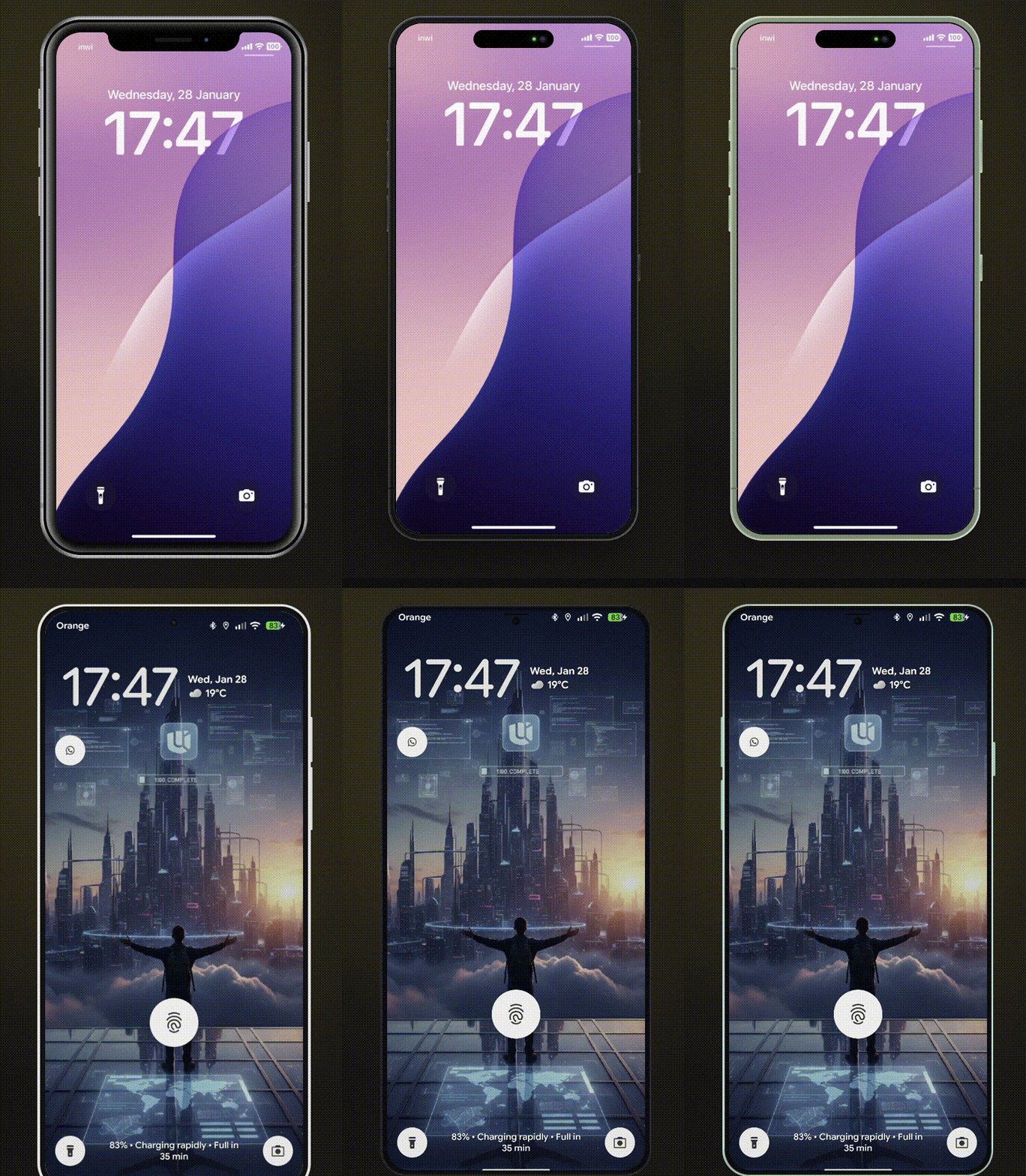
Features
- 10 Modern Devices - iPhone 8/8 Plus, iPhone X, iPhone 17, Pixel 10, Galaxy S25, iPad Mini, iPad Pro, MacBook Pro 2020, MacBook Pro
- Multiple Color Variants - Authentic device colors for each model
- Landscape Mode - Rotate phones and tablets
- Notch/Dynamic Island Toggle - Show or hide notches
- Smooth Animations - Optional animated transitions
- Custom Device Frames - Create your own frames with
CustomMockFrame
- Modular CSS - Import only the device families you need
- TypeScript First - Full type safety with discriminated unions
- Lightweight - ~9.5KB ESM (~2.4KB gzipped), tree-shakeable
Supported Devices
| iPhone X | - | Yes | Notch |
| iPhone 8 | black, silver, gold | Yes | - |
| iPhone 8 Plus | black, silver, gold | Yes | - |
| iPhone 17 | black, white, mist-blue, sage, lavender, cosmic-orange, deep-blue | Yes | Dynamic Island |
| Pixel 10 | obsidian, porcelain, mint, rose | Yes | - |
| Galaxy S25 | phantom-black, icy-blue, navy, silver, mint | Yes | - |
| iPad Mini | black, silver | Yes | - |
| iPad Pro | space-gray, silver | Yes | - |
| MacBook Pro 2020 | - | - | - |
| MacBook Pro | space-gray, silver | - | Notch |
Installation
npm install react-mockframe
pnpm add react-mockframe
yarn add react-mockframe
Quick Start
import { MockFrame } from 'react-mockframe'
import 'react-mockframe/styles/mockframe.css'

export default function App() {
  return (
    <MockFrame device="iPhone 17" color="mist-blue">
      <YourAppContent />
    </MockFrame>
  )
}
Usage Examples
Basic Device Frame
<MockFrame device="iPhone X">
  <img src="screenshot.png" alt="App screenshot" />
</MockFrame>
Device with Color
<MockFrame device="iPhone 17" color="lavender">
  <YourApp />
</MockFrame>
Landscape Mode
<MockFrame device="iPad Pro" color="space-gray" landscape>
  <YourTabletApp />
</MockFrame>
Hide Notch / Dynamic Island
<MockFrame device="iPhone X" hideNotch>
<YourApp />
</MockFrame>
<MockFrame device="iPhone 17" color="black" hideNotch>
<YourApp />
</MockFrame>
<MockFrame device="MacBook Pro" color="space-gray" hideNotch>
<YourDesktopApp />
</MockFrame>
Custom Zoom & Dimensions
<MockFrame
  device="Pixel 10"
  color="mint"
  width={360}
  height={800}
  zoom={0.8}
>
  <YourApp />
</MockFrame>
Animated Transitions
<MockFrame
  device="Galaxy S25"
  color="icy-blue"
  zoom={zoomLevel}
  animated
>
  <YourApp />
</MockFrame>
Landing Page Hero
<section className="grid md:grid-cols-2 gap-10 items-center px-6 py-20">
  <div>
    <h1 className="text-4xl font-bold mb-4">Your product headline</h1>
    <p className="text-lg text-gray-600 mb-6">
      Describe your product value proposition here.
    </p>
    <button className="bg-blue-600 text-white px-6 py-3 rounded-lg">
      Get Started
    </button>
  </div>

  <MockFrame device="iPhone 17" color="black">
    <img src="/app-screenshot.png" alt="App preview" />
  </MockFrame>
</section>
Dashboard Showcase
<div className="flex justify-center py-16">
  <MockFrame device="MacBook Pro" color="space-gray">
    <img src="/dashboard-screenshot.png" alt="Dashboard preview" />
  </MockFrame>
</div>
Props
MockFrame
device | DeviceName | Required. The device model to render |
color | string | Device color variant (required for devices with colors) |
landscape | boolean | Rotate to landscape orientation (phones/tablets only) |
hideNotch | boolean | Hide the notch or dynamic island |
width | number | Override screen content width in pixels |
height | number | Override screen content height in pixels |
zoom | number | Scale the entire device frame (e.g., 0.75 for 75%) |
animated | boolean | Enable smooth transitions for zoom changes |
children | ReactNode | Content to render inside the device screen |
The color prop is type-safe - TypeScript only allows valid colors for each device:
<MockFrame device="iPhone 17" color="lavender" />
<MockFrame device="iPhone X" color="black" />
<MockFrame device="iPhone 17" color="pink" />
Custom Device Frames
Create your own device frames with CustomMockFrame:
import { CustomMockFrame } from 'react-mockframe'

<CustomMockFrame
  width={375}
  height={812}
  bezelWidth={12}
  borderRadius={44}
  screenBorderRadius={40}
  bezelColor="#1a1a1a"
  zoom={0.8}
  animated
>
  <YourContent />
</CustomMockFrame>
CustomMockFrame Props
width | number | Required | Screen content width in pixels |
height | number | Required | Screen content height in pixels |
bezelWidth | number | object | 12 | Bezel thickness (uniform or per-side) |
borderRadius | number | 44 | Outer frame corner radius |
screenBorderRadius | number | auto | Screen corner radius |
bezelColor | string | #1a1a1a | Bezel background color |
zoom | number | - | Scale factor for the frame |
animated | boolean | - | Enable smooth transitions |
landscape | boolean | - | Display in landscape orientation |
frameClassName | string | - | CSS class for the outer frame |
screenClassName | string | - | CSS class for the screen area |
Per-side bezel example:
<CustomMockFrame
  width={375}
  height={812}
  bezelWidth={{ top: 60, right: 12, bottom: 60, left: 12 }}
>
  <YourContent />
</CustomMockFrame>
Modular CSS Bundles
Import only the device families you need to reduce bundle size:
Sizes below are minified (gzipped in parentheses).
import 'react-mockframe/styles/mockframe.css'
import 'react-mockframe/styles/mockframe-iphones.css'
import 'react-mockframe/styles/mockframe-android.css'
import 'react-mockframe/styles/mockframe-tablets.css'
import 'react-mockframe/styles/mockframe-laptops.css'
TypeScript
The library exports helpful types:
import type {
DeviceName,
MockFrameProps,
DeviceConfig,
DeviceColor,
DeviceHasLandscape,
CustomMockFrameProps,
} from 'react-mockframe'
type iPhone17Colors = DeviceColor<'iPhone 17'>
type CanRotate = DeviceHasLandscape<'iPad Pro'>
Access device data programmatically:
import { DeviceNames, DeviceOptions } from 'react-mockframe'
console.log(DeviceNames)
const config = DeviceOptions['iPhone 17']
console.log(config.colors)
console.log(config.width)
console.log(config.height)
Demo Website
The interactive demo website includes:
- Device Preview - Switch between all devices and colors in real-time
- Orientation Toggle - Portrait and landscape modes
- Notch Toggle - Show/hide notch and dynamic island
- Auto-Fit Zoom - Automatically scale device to fit the viewport
- Screenshot Upload - Drag & drop images into the device frame
- Image Controls - Zoom, pan, and reposition uploaded images
- Background Options - Solid colors and gradient presets
- Export to PNG/WebP - Download mockups with transparent backgrounds
- Live Code Preview - Copy-paste ready code snippets
- Dark/Light Theme - Full theme support
Browser Support
- Chrome 95+
- Firefox 95+
- Safari 15+
- Edge 95+
Credits
Device frame styles are adapted from Marvel devices.css (MIT © 2014 Marvelapp). Newer device frames (iPhone 17, Pixel 10, Galaxy S25, iPad Pro, MacBook Pro) and all React/TypeScript code are original to this project.
Author
Mohammed Banani — @mbdev3
Contributing
Contributions are welcome! Please open an issue or submit a pull request.
License
MIT License — see LICENSE for details.