
Research
Security News
Malicious npm Package Targets Solana Developers and Hijacks Funds
A malicious npm package targets Solana developers, rerouting funds in 2% of transactions to a hardcoded address.
By Socket Research Team - Dec 02, 2024
react-native-a11y-slider
Advanced tools
An accessible range slider that supports assistive devices like screen readers
A slider that supports assistive devices, like screen readers, out of the box.
The slider can be setup to either have a single value or define a two value range (min/max).


yarn add react-native-a11y-slider
or
npm install -S react-native-a11y-slider
Creates a basic slider that with a min/max slider and a total range from 1 to 100.
import Slider from "react-native-a11y-slider";

function Example() {
  return <Slider min={1} max={100} values={[10, 87]} />;
}
| Prop name | Default | Type | Description |
|---|---|---|---|
| values | [0] | number[] | The initial values of the sliders. If the array has two values, there will be two slider markers |
| min | number | The minimum value of the slider scale | |
| max | number | The max value of the slider scale | |
| increment | 1 | number | If min and max are defined, this is the increment between slider steps |
| sliderValues | number[] | Hardcode the slider step values. If this is used, min and max are ignored | |
| markerColor | #333333 | 'string' | The hex color to use for the slider marker thumb |
| style | ViewStyle | The style to apply to the slider container | |
| trackStyle | ViewStyle | The style to apply to the slider track | |
| labelStyle | ViewStyle | The style to apply to the floating label | |
| labelTextStyle | ViewStyle | The style to apply to the floating label text | |
| selectedTrackStyle | ViewStyle | The style to apply to the selected section of the slider track | |
| showLabel | true | boolean | Show the floating marker label over the slider marker |
| onChange | (values) => void | Fired when the slider value changes | |
| onSlidingStart | (type) => void | Fired when one of the markers starts to be dragged | |
| onSlidingComplete | (type) => void | Fired when one of the markers finishes being dragged | |
| labelComponent | src/Label | Component | The component used for the floating marker label |
| markerComponent | srv/Marker | Component | The component used for the marker thumb. Note, this needs to have a static size property. (see below) |
| setA11yMarkerProps | Function | Customize the accessibility values (see below) | |
| hitSlop | Insets | Defines how far a touch event can start away from the marker |
You can customize the marker dot (also known as a "thumb") by passing a custom Marker Component in the props.
NOTE: In order for the slider to know how to calculate steps without unnecessary rendering flashes, your component MUST define a static size property.
You can use Marker.tsx as an example
import React from "react";
import { View } from "react-native";
import { MarkerProps } from "react-native-a11y-slider";

function MyMarker({ color }: MarkerProps) {
  return (
    <View
      style={{
        backgroundColor: "red",
        height: MyMarker.size,
        width: MyMarker.size,
      }}
    />
  );
}
Marker.size = 30;
export default MyMarker;
import Slider from "react-native-a11y-slider";
import MyMarker from "./MyMarker";

function SliderExample() {
  return (
    <Slider min={1} max={100} values={[10, 87]} markerComponent={MyMarker} />
  );
}
For a screen reader, each slider marker thumb will have the following accessibility attributes defined:
[{ name: "increment" }, { name: "decrement" }]<internal function>(learn more about React Native accessibility attributes)
If you want to customize any of the values (except for accessibilityActions and onAccessibilityAction), you can define a setA11yMarkerProps callback function. This function will be called each time the marker is rendered or moved.
import React from "react";
import Slider, {
  MarkerType,
  setA11yMarkerPropsFunctionArgs,
} from "react-native-a11y-slider";
import MyMarker from "./MyMarker";

function DistanceSlider() {
  const setA11yProps = useCallback(
    ({ markerType, value, minValue, maxValue }: setA11yMarkerPropsFunctionArgs) => {

      let accessibilityLabel = "Min distance";
      if (markerType === MarkerType.UPPER) {
        accessibilityLabel = "Max distance";
      }

      const accessibilityValue = {
        min: minValue,
        max: maxValue,
        now: value,
        text: `${value} miles`,
      },

      return {
        accessibilityLabel,
        accessibilityValue
      };
    },
    []
  );

  return (
    <Slider
      min={1}
      max={100}
      values={[10, 87]}
      setA11yMarkerProps={setA11yProps}
    />
  );
}
FAQs
An accessible range slider that supports assistive devices like screen readers
The npm package react-native-a11y-slider receives a total of 729 weekly downloads. As such, react-native-a11y-slider popularity was classified as not popular.
We found that react-native-a11y-slider demonstrated a not healthy version release cadence and project activity because the last version was released a year ago. It has 1 open source maintainer collaborating on the project.
Did you know?

Socket for GitHub automatically highlights issues in each pull request and monitors the health of all your open source dependencies. Discover the contents of your packages and block harmful activity before you install or update your dependencies.
Research
Security News
A malicious npm package targets Solana developers, rerouting funds in 2% of transactions to a hardcoded address.

Security News
Research
Socket researchers have discovered malicious npm packages targeting crypto developers, stealing credentials and wallet data using spyware delivered through typosquats of popular cryptographic libraries.
Security News
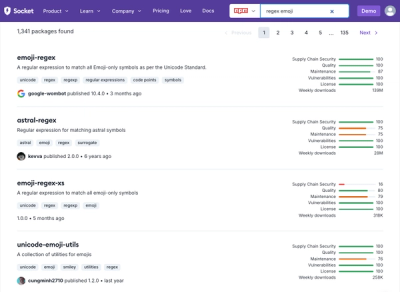
Socket's package search now displays weekly downloads for npm packages, helping developers quickly assess popularity and make more informed decisions.