react-native-accordion-list-view
A high performance, beautiful and fully customizable Accordion list for React Native.
Implemented using react-native-vector-icons.


Getting started
npm install react-native-accordion-list-view-view --save
or
yarn add react-native-accordion-list-view
Now we need to install react-native-vector-icons.
npm install react-native-vector-icons --save
or
yarn add react-native-vector-icons
Demo
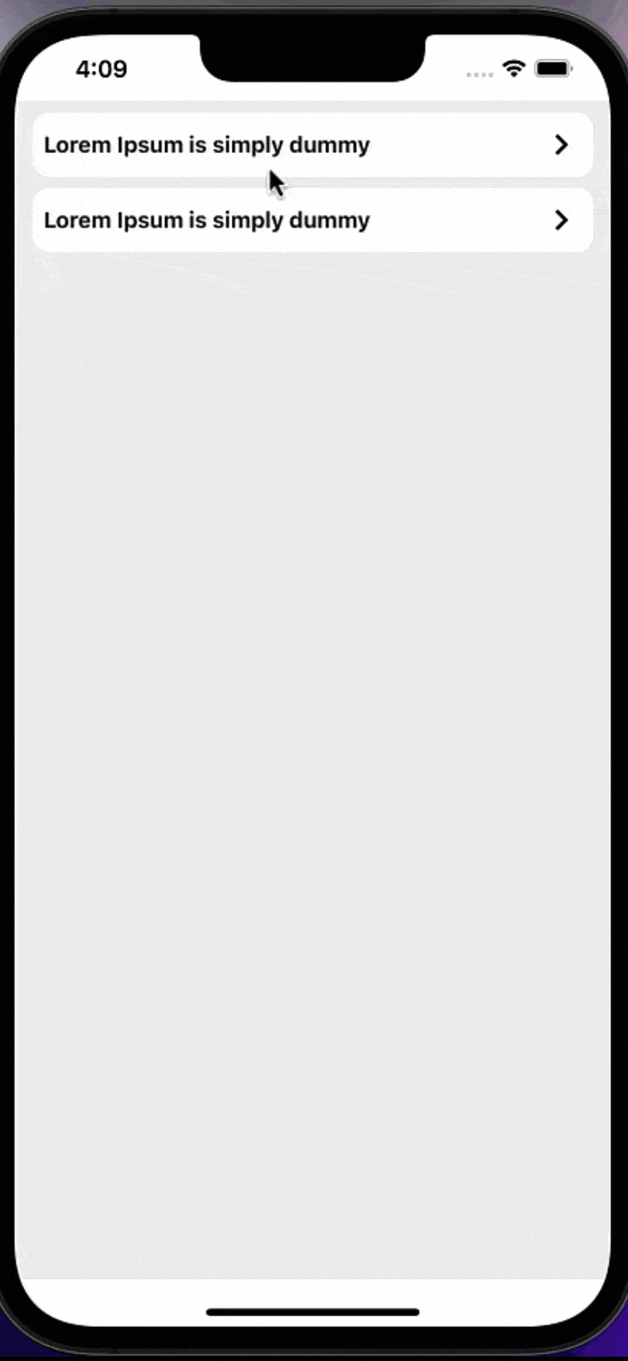
Accordion list
| Props | Params | isRequire | Default | Description |
|---|
| data | Array | Yes | | For simplicity, data is a plain array. If you want to use something else, like an immutable list |
| customTitle | (item) => JSX.Element | Yes | | Function that returns a React element to display as Accordion title |
| customBody | (item) => JSX.Element | Yes | | Function that returns a React element to display as Accordion body |
| customIcon | () => JSX.Element | No | keyboard-arrow-left | Function that returns a React element to display as Accordion icon |
| containerItemStyle | ViewStyle | No | {} | Styling for Accordion item container view |
| style | ViewStyle | No | {} | Styling for container view |
| animationDuration | Number | No | 300 | Accordion animation duration |
| isRTL | Boolean | No | false | Support RTL |
###More props
This is a wrapper around Flatlist, all their props works well and the inherited props too (from ScrollView and VirtualizedList).
Example
import React from 'react';
import {View, SafeAreaView, StyleSheet, Text} from 'react-native';
import {AccordionList} from 'react-native-accordion-list-view';

const App = () => {
    const data = [
        {
            id: 0,
            title: 'Lorem Ipsum is simply dummy',
            body: "Lorem Ipsum is simply dummy text of the printing and typesetting industry. Lorem Ipsum has been the industry's standard dummy text ever since the 1500s, when an unknown printer took a galley of type and scrambled it to make a type specimen book. It has survived not only five centuries, but also the leap into electronic typesetting, remaining essentially unchanged. It was popularised in the 1960s with the release of Letraset sheets containing Lorem Ipsum passages, and more recently with desktop publishing software like Aldus PageMaker including versions of Lorem Ipsum.",
        },
        {
            id: 1,
            title: 'Lorem Ipsum is simply dummy',
            body: "Lorem Ipsum is simply dummy text of the printing and typesetting industry. Lorem Ipsum has been the industry's standard dummy text ever since the 1500s, when an unknown printer took a galley of type and scrambled it to make a type specimen book. It has survived not only five centuries, but also the leap into electronic typesetting, remaining essentially unchanged. It was popularised in the 1960s with the release of Letraset sheets containing Lorem Ipsum passages, and more recently with desktop publishing software like Aldus PageMaker including versions of Lorem Ipsum.",
        },
    ];
    return (
        <SafeAreaView>
            <View style={styles.container}>
                <AccordionList
                    data={data}
                    customTitle={item => <Text>{item.title}</Text>}
                    customBody={item => <Text>{item.body}</Text>}
                    animationDuration={400}
                />
            </View>
        </SafeAreaView>
    );
};

export default App;
const styles = StyleSheet.create({
    container: {
        paddingVertical: '2%',
        paddingHorizontal: '3%',
        height: '100%',
        backgroundColor: '#e7e7e7',
    },
});
Accordion Item
This component allows you to use Accordion Item component in any place if you have your own wrapper or if you have a problem with using FlatList in your screen.
| Props | Params | isRequire | Default | Description |
|---|
| customTitle | (item) => JSX.Element | Yes | | Function that returns a React element to display as Accordion title |
| customBody | (item) => JSX.Element | Yes | | Function that returns a React element to display as Accordion body |
| customIcon | () => JSX.Element | No | keyboard-arrow-left | Function that returns a React element to display as Accordion icon |
| containerStyle | ViewStyle | No | {} | Styling for Accordion item container view |
| animationDuration | Number | No | 300 | Accordion animation duration |
| isRTL | Boolean | No | false | Support RTL |
Example
import React from 'react';
import {View, SafeAreaView, StyleSheet, Text, ScrollView} from 'react-native';
import {AccordionItem} from 'react-native-accordion-list-view';

const App = () => {
  const data = [
    {
      id: 0,
      title: 'Lorem Ipsum is simply dummy',
      body: "Lorem Ipsum is simply dummy text of the printing and typesetting industry. Lorem Ipsum has been the industry's standard dummy text ever since the 1500s, when an unknown printer took a galley of type and scrambled it to make a type specimen book. It has survived not only five centuries, but also the leap into electronic typesetting, remaining essentially unchanged. It was popularised in the 1960s with the release of Letraset sheets containing Lorem Ipsum passages, and more recently with desktop publishing software like Aldus PageMaker including versions of Lorem Ipsum.",
    },
    {
      id: 1,
      title: 'Lorem Ipsum is simply dummy',
      body: "Lorem Ipsum is simply dummy text of the printing and typesetting industry. Lorem Ipsum has been the industry's standard dummy text ever since the 1500s, when an unknown printer took a galley of type and scrambled it to make a type specimen book. It has survived not only five centuries, but also the leap into electronic typesetting, remaining essentially unchanged. It was popularised in the 1960s with the release of Letraset sheets containing Lorem Ipsum passages, and more recently with desktop publishing software like Aldus PageMaker including versions of Lorem Ipsum.",
    },
  ];
  return (
    <SafeAreaView>
      <ScrollView style={styles.container}>
        {data.map(item => (
          <AccordionItem
            key={item.id}
            customTitle={() => <Text>{item.title}</Text>}
            customBody={() => <Text>{item.body}</Text>}
            animationDuration={400}
          />
        ))}
      </ScrollView>
    </SafeAreaView>
  );
};

export default App;
const styles = StyleSheet.create({
  container: {
    paddingVertical: '2%',
    paddingHorizontal: '3%',
    height: '100%',
    backgroundColor: '#e7e7e7',
  },
});


