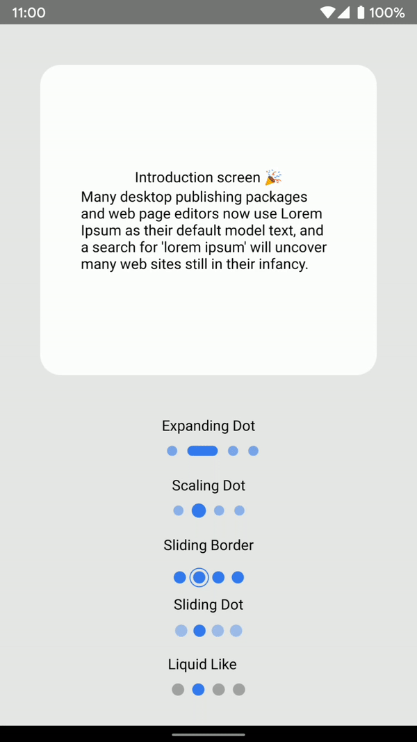
FlatList animated pagination dots. Some (maybe all)
ideas and credits goes to
Catalin Miron 👏.
This package does not use any dependencies but Animated API.
Now uses react-native-svg for the LiquidLike
Few days ago I made a reddit post,
and people requested to open source it.
For more Copy & Paste stuff, go check example folder
TODO
-
iOS Device Test
-
Worm Dot Indicator
-
Liquid Like Indicator
-
Next, Prev, Skip button implementation
-
Landscape test
-
Dots direction such as Vertical and Horizontal
Installation
npm install react-native-animated-pagination-dots
yarn add react-native-animated-pagination-dots
Usage
For the ViewPager, check their own repo
import {ExpandingDot} from "react-native-animated-pagination-dots";

const SLIDER_DATA = [
  {
    key: '1',
    title: 'App showcase ✨',
    description:
      'Lorem Ipsum is simply dummy text of the printing and typesetting industry.',
  },
  {
    key: '2',
    title: 'Introduction screen 🎉',
    description:
      "Many desktop publishing packages and web page editors now use Lorem Ipsum as their default model text, and a search for 'lorem ipsum' will uncover many web sites still in their infancy. ",
  },
];
  const scrollX = React.useRef(new Animated.Value(0)).current;

<FlatList
    data={SLIDER_DATA}
    keyExtractor={keyExtractor}
    showsHorizontalScrollIndicator={false}
    onScroll={Animated.event(
      [{ nativeEvent: { contentOffset: { x: scrollX } } }],
      {
        useNativeDriver: false,
      }
    )}
    pagingEnabled
    horizontal
    decelerationRate={'normal'}
    scrollEventThrottle={16}
    renderItem={renderItem}
/>

<ExpandingDot
    data={SLIDER_DATA}
    expandingDotWidth={30}
    scrollX={scrollX}
    inActiveDotOpacity={0.6}
    dotStyle={{
        width: 10,
        height: 10,
        backgroundColor: '#347af0',
        borderRadius: 5,
        marginHorizontal: 5
    }}
    containerStyle={{
        top: 30,
    }}
/>
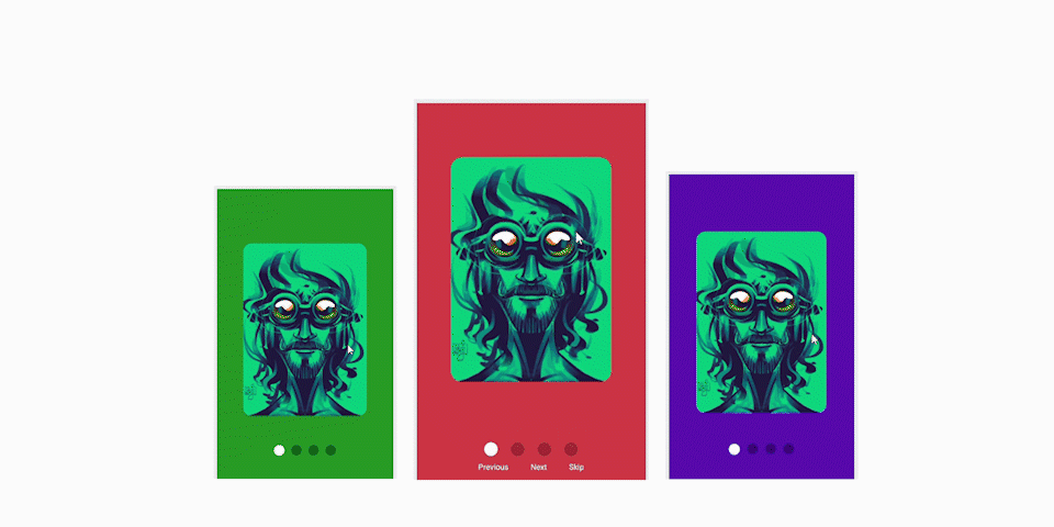
Button Navigation Example
import React from 'react';
import {
StyleSheet,
View,
Dimensions,
Animated,
TouchableOpacity,
Text,
StatusBar,
} from 'react-native';
import { LiquidLike } from 'react-native-animated-pagination-dots';
const { width } = Dimensions.get('screen');
const data = [
{
image:
'https://cdn.dribbble.com/users/3281732/screenshots/13661330/media/1d9d3cd01504fa3f5ae5016e5ec3a313.jpg?compress=1&resize=1200x1200',
backgroundColor: '#7bcf6e',
},
{
image:
'https://cdn.dribbble.com/users/3281732/screenshots/11192830/media/7690704fa8f0566d572a085637dd1eee.jpg?compress=1&resize=1200x1200',
backgroundColor: '#4654a7',
},
{
image:
'https://cdn.dribbble.com/users/3281732/screenshots/9165292/media/ccbfbce040e1941972dbc6a378c35e98.jpg?compress=1&resize=1200x1200',
backgroundColor: '#7370cf',
},
{
image:
'https://cdn.dribbble.com/users/3281732/screenshots/11205211/media/44c854b0a6e381340fbefe276e03e8e4.jpg?compress=1&resize=1200x1200',
backgroundColor: '#db4747',
},
];
const imageW = width * 0.7;
const imageH = imageW * 1.4;
const ButtonNavigation = () => {
const scrollX = React.useRef(new Animated.Value(0)).current;
const keyExtractor = React.useCallback((_, index) => index.toString(), []);
const [activeIndex, setActiveIndex] = React.useState(0);
let flatListRef = React.useRef(null);
const gotoNextPage = () => {
if (activeIndex + 1 < data.length) {
flatListRef.current.scrollToIndex({
index: activeIndex + 1,
animated: true,
});
}
};
const gotoPrevPage = () => {
if (activeIndex !== 0) {
flatListRef.current.scrollToIndex({
index: activeIndex - 1,
animated: true,
});
}
};
const skipToStart = () => {
flatListRef.current.scrollToIndex({
index: data.length - 1,
animated: true,
});
};
const onViewRef = React.useRef(({ viewableItems }: any) => {
setActiveIndex(viewableItems[0].index);
});
const viewConfigRef = React.useRef({ viewAreaCoveragePercentThreshold: 50 });
const renderItem = React.useCallback(({ item }) => {
return (
<View style={[styles.itemContainer]}>
<Animated.Image
style={{
width: imageW,
height: imageH,
borderRadius: 20,
resizeMode: 'cover',
}}
source={{ uri: item.image }}
/>
</View>
);
}, []);
return (
<View style={[styles.container]}>
<StatusBar hidden />
<View style={[StyleSheet.absoluteFillObject]}>
{data.map((item, index) => {
const inputRange = [
(index - 1) * width,
index * width,
(index + 1) * width,
];
const colorFade = scrollX.interpolate({
inputRange,
outputRange: [0, 1, 0],
});
return (
<Animated.View
key={index}
style={[
StyleSheet.absoluteFillObject,
{ backgroundColor: item.backgroundColor, opacity: colorFade },
]}
/>
);
})}
</View>
<Animated.FlatList
ref={flatListRef}
onViewableItemsChanged={onViewRef.current}
viewabilityConfig={viewConfigRef.current}
data={data}
renderItem={renderItem}
keyExtractor={keyExtractor}
showsHorizontalScrollIndicator={false}
pagingEnabled
horizontal
decelerationRate={'normal'}
scrollEventThrottle={16}
onScroll={Animated.event(
[{ nativeEvent: { contentOffset: { x: scrollX } } }],
{
useNativeDriver: false,
}
)}
/>
<LiquidLike
data={data}
scrollX={scrollX}
dotSize={18}
dotSpacing={6}
lineDistance={7}
lineHeight={4}
inActiveDotOpacity={0.2}
activeDotColor={'#fff'}
containerStyle={{ flex: 1 }}
/>
<View style={[styles.buttonContainer]}>
<TouchableOpacity
style={[styles.button]}
onPress={() => gotoPrevPage()}
>
<Text style={[styles.buttonText]}>Previous</Text>
</TouchableOpacity>
<TouchableOpacity
style={[styles.button]}
onPress={() => gotoNextPage()}
>
<Text style={[styles.buttonText]}>Next</Text>
</TouchableOpacity>
<TouchableOpacity style={[styles.button]} onPress={() => skipToStart()}>
<Text style={[styles.buttonText]}>Skip</Text>
</TouchableOpacity>
</View>
</View>
);
};
const styles = StyleSheet.create({
container: {
flex: 1,
justifyContent: 'center',
alignItems: 'center',
},
itemContainer: {
flex: 1,
width,
justifyContent: 'center',
alignItems: 'center',
},
buttonContainer: {
flexDirection: 'row',
},
button: {
margin: 20,
fontWeight: '700',
},
buttonText: {
color: '#fff',
},
});
export default ButtonNavigation;
Props
Expanding Dot
| Name | Type | Default | Description |
| inActiveDotOpacity | number | 0.5 | In active dot opacity |
| expandingDotWidth | number | 20 | Active dot width |
| data | Array<Object> | required | Array which is used for flatlist iteration |
| scrollX | Animated.Value | required |
Gestures, like panning or scrolling, and other events can map directly to animated values using Animated.event().
For example, when working with horizontal scrolling gestures, you would do the following in order to map event.nativeEvent.contentOffset.x to scrollX (an Animated.Value)
|
| dotStyle | ViewStyle |
width: 10,
height: 10,
backgroundColor: '#347af0',
borderRadius: 5,
marginHorizontal: 5
|
Basic styling for each dot.
|
| containerStyle | ViewStyle |
position: "absolute",
bottom: 20,
flexDirection: "row",
|
Basic styling for dots container.
|
Scaling Dot
| Name | Type | Default | Description |
| activeDotScale | number | 1.4 | Active dot scale number |
| inActiveDotOpacity | number | 0.5 | In active dot opacity |
| data | Array<Object> | required | Array which is used for flatlist iteration |
| scrollX | Animated.Value | required |
Gestures, like panning or scrolling, and other events can map directly to animated values using Animated.event().
For example, when working with horizontal scrolling gestures, you would do the following in order to map event.nativeEvent.contentOffset.x to scrollX (an Animated.Value)
|
| dotStyle | ViewStyle |
width: 10,
height: 10,
backgroundColor: '#347af0',
borderRadius: 5,
marginHorizontal: 5
|
Basic styling for each dot.
|
| containerStyle | ViewStyle |
position: "absolute",
bottom: 20,
flexDirection: "row",
|
Basic styling for dots container.
|
Sliding Dot
| Name | Type | Default | Description |
| dotSize | number | 12 | Each dot size !IMPORTANT Do not adjust dot size through dotStyle, otherwise it'll misbehave |
| marginHorizontal | number | 3 | Margin between dots !IMPORTANT Do not adjust dot margin through dotStyle, otherwise it'll misbehave |
| data | Array<Object> | required | Array which is used for flatlist iteration |
| scrollX | Animated.Value | required |
Gestures, like panning or scrolling, and other events can map directly to animated values using Animated.event().
For example, when working with horizontal scrolling gestures, you would do the following in order to map event.nativeEvent.contentOffset.x to scrollX (an Animated.Value)
|
| dotStyle | ViewStyle |
backgroundColor: '#347af0',
opacity: 0.4,
|
Basic styling for each dot.
|
| containerStyle | ViewStyle |
position: "absolute",
bottom: 30,
flexDirection: "row",
alignSelf: "center"
|
Basic styling for dots container.
|
| slidingIndicatorStyle | ViewStyle |
backgroundColor: '#347af0',
zIndex: 99,
alignItems: 'center',
justifyContent: 'center',
alignSelf: 'center'
|
Basic styling for Sliding indicator dot.
|
Sliding Border
| Name | Type | Default | Description |
| dotSize | number | 24 | Each dot size !IMPORTANT Do not adjust dot size through dotStyle, otherwise it'll misbehave |
| borderPadding | number | -5 | Padding between dot and border. Should be good between -5 and 3, test it out. |
| data | Array<Object> | required | Array which is used for flatlist iteration |
| scrollX | Animated.Value | required |
Gestures, like panning or scrolling, and other events can map directly to animated values using Animated.event().
For example, when working with horizontal scrolling gestures, you would do the following in order to map event.nativeEvent.contentOffset.x to scrollX (an Animated.Value)
|
| dotStyle | ViewStyle |
backgroundColor: '#347af0'
|
Basic styling for each dot.
|
| containerStyle | ViewStyle |
position: "absolute",
bottom: 20,
flexDirection: "row",
alignSelf: "center"
|
Basic styling for dots container.
|
| slidingIndicatorStyle | ViewStyle |
borderWidth: 1,
borderColor: '#347af0',
alignItems: 'center',
justifyContent: 'center',
alignSelf: 'center'
|
Basic styling for sliding bordered dot style.
|
Liquid Like
| Name | Type | Default | Description |
| dotSize | number | 12 | Each dot size |
| dotSpacing | number | 3 | Margin between dots |
| inActiveDotOpacity | number | 0.5 | In active dot opacity |
| inActiveDotColor | string | #000 | In active dot color |
| activeDotColor | string | #347af0 | Active dot color |
| data | Array<Object> | required | Array which is used for flatlist iteration |
| scrollX | Animated.Value | required |
Gestures, like panning or scrolling, and other events can map directly to animated values using Animated.event().
For example, when working with horizontal scrolling gestures, you would do the following in order to map event.nativeEvent.contentOffset.x to scrollX (an Animated.Value)
|
| lineHeight | number |
4
|
Line height for sliding dot
|
| lineDistance | number |
8
|
Line travel distance between dots
|
| containerStyle | ViewStyle |
flexDirection: "row"
|
Basic styling for dots container.
|
Contributing
See the contributing guide to learn how to contribute to the repository and the development workflow.
License
MIT


