Security News
Create React App Officially Deprecated Amid React 19 Compatibility Issues
Create React App is officially deprecated due to React 19 issues and lack of maintenance—developers should switch to Vite or other modern alternatives.
react-native-bottom-toolbar
Advanced tools
Bottom toolbar styled as in iOS, implemented in JS. Configurable text, icons and events.
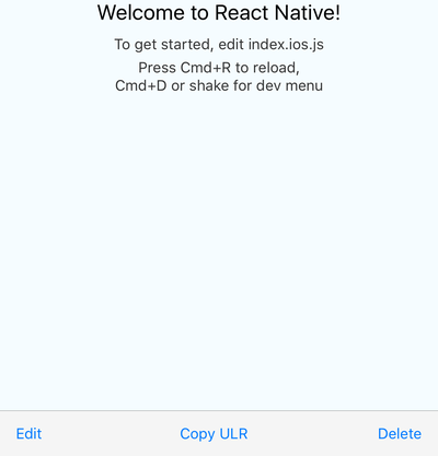
Bottom toolbar styled as in iOS, implemented in JS, typed with Flow. Highly configurable with text or icons (I recommend react-native-vector-icons) and nested actions that display in ActionSheetIOS (iOS only). You can also render your own components as content.
here, code for the demo is in the example folder
npm i react-native-bottom-toolbar
or
yarn add react-native-bottom-toolbar
import BottomToolbar from 'react-native-bottom-toolbar'

<BottomToolbar>
  <BottomToolbar.Action
    title="Edit"
    onPress={(index, propsOfThisAction) =>
      console.warn(index + ' ' + JSON.stringify(propsOfThisAction))}
  />
  <BottomToolbar.Action
    title="Copy ULR"
    onPress={(index, propsOfThisAction) =>
      console.warn(index + ' ' + JSON.stringify(propsOfThisAction))}
  />
  <BottomToolbar.Action
    title="Delete"
    onPress={(index, propsOfThisAction) =>
      console.warn(index + ' ' + JSON.stringify(propsOfThisAction))}
  />
</BottomToolbar>

The component accepts these props:
type BottomToolbarProps = {
  IconComponent?: React.ComponentType<*>, // use this together with `color` prop and `iconName` from `BottomToolbar.Action`
  iconSize: number,
  onPress: (number, Object) => any,
  wrapperStyle?: ViewStyleProp,
  textStyle?: ViewStyleProp,
  buttonStyle?: ViewStyleProp,
  color: string,
  disabledColor: string,
  showIf: boolean,
  children: React.Node,
};

type ActionProps = {
  IconElement?: React.Node, // use this to provide your own custom react element (e.g. icon with text)
  IconComponent?: React.ComponentType<*>, // overrides `IconComponent` from `BottomToolbar`
  title: string,
  iconName?: string,
  disabled?: boolean,
  onPress?: (number, Object) => any,
  color?: string,
  testID?: string,
  iconSize?: number,
  actionSheetTitle?: string,
  actionSheetMessage?: string,
};

type NestedActionProps = {
  title: string,
  onPress?: (number, Object) => any,
  style?: 'cancel' | 'destructive',
};
The onPress function can be specified on three different levels: you may pass it as a prop to the component itself (see the first example), you may include it in the BottomToolbar.Action (see the first example), or may include it in the BottomToolbar.NestedAction (see the second example).
The function has to be specified on at least one level. You may combine the levels together - the onPress of a BottomToolbar.NestedAction overrides the onPress of an BottomToolbar.Action, and the onPress of a BottomToolbar.Action overrides the onPress of the component. This gives you a lot of flexibility - you can have one event handler for all actions and nested actions, or you can specify the handlers separately. The onPress function always receives the action / nested action it was triggered from, so you can easily distinguish the event source.
I suggest you pick an approach that works best for a given scenario and stick with it so you keep you code easy to understand.
MIT
FAQs
Bottom toolbar styled as in iOS, implemented in JS. Configurable text, icons and events.
The npm package react-native-bottom-toolbar receives a total of 92 weekly downloads. As such, react-native-bottom-toolbar popularity was classified as not popular.
We found that react-native-bottom-toolbar demonstrated a not healthy version release cadence and project activity because the last version was released a year ago. It has 1 open source maintainer collaborating on the project.
Did you know?

Socket for GitHub automatically highlights issues in each pull request and monitors the health of all your open source dependencies. Discover the contents of your packages and block harmful activity before you install or update your dependencies.

Security News
Create React App is officially deprecated due to React 19 issues and lack of maintenance—developers should switch to Vite or other modern alternatives.

Security News
Oracle seeks to dismiss fraud claims in the JavaScript trademark dispute, delaying the case and avoiding questions about its right to the name.

Security News
The Linux Foundation is warning open source developers that compliance with global sanctions is mandatory, highlighting legal risks and restrictions on contributions.