Security News
GitHub Removes Malicious Pull Requests Targeting Open Source Repositories
GitHub removed 27 malicious pull requests attempting to inject harmful code across multiple open source repositories, in another round of low-effort attacks.
react-native-dropdown-picker
Advanced tools
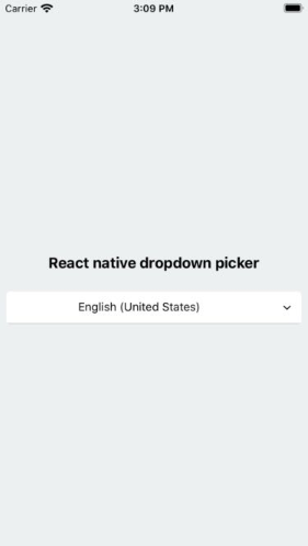
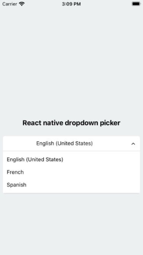
A picker (dropdown) for react native which supports both Android & iOS.
A picker (dropdown) component for react native which supports both Android & iOS.


npm install react-native-dropdown-picker --save
yarn add react-native-dropdown-picker
First of all import the package.
import DropDownPicker from 'react-native-dropdown-picker';
Render the component. Read the docs to avoid mixing up props.
<DropDownPicker
    items={[
        {label: 'Item 1', value: 'item1'},
        {label: 'Item 2', value: 'item2'},
    ]}
    defaultValue="item1"
    containerStyle={{height: 40}}
    style={{backgroundColor: '#fafafa'}}
    dropDownStyle={{backgroundColor: '#fafafa'}}
    onChangeItem={item => console.log(item.label, item.value)}
/>
The only thing you have to avoid is borderRadius. All the corners must be set separately.
style={{
    borderTopLeftRadius: 10, borderTopRightRadius: 10,
    borderBottomLeftRadius: 10, borderBottomRightRadius: 10
}}
dropDownStyle={{
    borderBottomLeftRadius: 20, borderBottomRightRadius: 20
}}
A lot of users use the containerStyle property to style the picker which results in unexpected behaviors like untouchable scrollviews.
The style and dropDownStyle properties must be used instead.
Use the containerStyle prop to adjust the outer part of the picker such as margin, width, height, flex, ...
You may want to select one of the items as default.
Use one of these ways:
Add selected: true to the object.
items={[
    {label: 'Item 1', value: 'item1'},
    {label: 'Item 2', value: 'item2', selected: true},
]}
The defaultIndex property.
defaultIndex={1}
The defaultValue property.
defaultValue="item2"
You may want to have a placeholder while the default value is null.
Add the following properties to the component.
...
defaultNull
placeholder="Select an item"
...
Take note of the defaultNull property.
state = {
    item: null
}

<DropDownPicker
    items={[
        {label: 'Item 1', value: 1},
        {label: 'Item 2', value: 2}
    ]}
    defaultNull={this.state.item === null}
    placeholder="Select an item"
    placeholderStyle={{fontWeight: 'bold'}}
    onChangeItem={(item)=> {
        this.setState({
            item: item.value
        });
    }}
    dropDownMaxHeight={240}
/>
In some cases you're going to create two or more pickers which are linked together.
Think of a country picker and city picker, whenever you're changing the country, the city picker should be reset and show the placeholder.
import React from 'react';
export default class MyComponent extends React.Component {
    constructor(props) {
        super(props);

        this.state = {
            country: null,
            city: null,
            cities: []
        };
    }

    changeCountry(item) {
        let city = null;
        let cities;
        switch (item.value) {
            case 'fr':
                cities = [
                    {label: 'Paris', value: 'paris'}
                ];
            break;
            case 'es':
                cities = [
                    {label: 'Madrid', value: 'madrid'}
                ];
            break;
        }

        this.setState({
            city,
            cities
        });
    }

    changeCity(item) {
        this.setState({
            city: item.value
        });
    }

    render() {
        return (
            <>
                <DropDownPicker
                    items={[
                        {label: 'France', value: 'fr'},
                        {label: 'Spain', value: 'es'},
                    ]}
                    defaultNull={this.state.country === null}
                    placeholder="Select your country"
                    containerStyle={{height: 40}}
                    onChangeItem={item => this.changeCountry(item)}
                />
                <DropDownPicker
                    items={this.state.cities}
                    defaultNull={this.state.city === null}
                    placeholder="Select your city"
                    containerStyle={{height: 40}}
                    onChangeItem={item => this.changeCity(item)}
                />
            </>
        );
    }
}
Adding borders to the component will separate or overflow elements. to solve this issue you just need to add marginTop to the dropDownStyle and specify the value which fits your component well.
dropDownStyle={{marginTop: 2}}
You have 9 options to style the component.
The style property.
Use this to adjust the inner part of the picker.
style={{paddingVertical: 10}}
The dropDownStyle property.
Additional styles for the dropdown box.
dropDownStyle={{backgroundColor: '#fafafa}}
The containerStyle property.
Use this to adjust the outer part of the picker such as margin, width, height, flex, ...
containerStyle={{width: 150, height: 70}}
The itemStyle property.
If you want the labels on the left and right side or to centerize them:
itemStyle={{alignItems: 'flex-start|flex-end|center'}}
The labelStyle property.
This property gives full control over the label.
labelStyle={{fontSize: 14, color: '#000'}}
The placeholderStyle property.
It is possible to style the placeholder text with this property.
placeholderStyle={{fontWeight: 'bold'}}
The activeItemStyle property.
This property allows you to style the active item.
activeItemStyle={{alignItems: 'center'}}
The activeLabelStyle property.
This property allows you to style the active label.
activeLabelStyle={{color: 'red'}}
The arrowStyle property.
Adds your additional styles to the View element of the arrow.
arrowStyle={{marginRight: 10}}
| Name | Description | Type | Default | Required |
|---|---|---|---|---|
items | The items for the component. | array | Yes | |
defaultIndex | The index of the default item. | number | 0 | No |
defaultValue | The value of the default item. | any | No | |
defaultNull | This sets the choice to null which should be used with placeholder | bool | true | No |
placeholder | Default text to be shown to the user which must be used with defaultNull | string | 'Select an item' | No |
dropDownMaxHeight | Height of the dropdown box. | number | 150 | No |
style | Additional styles for the picker. | object | {} | No |
dropDownStyle | Additional styles for the dropdown box. | object | {} | No |
containerStyle | Additional styles for the container view. | object | {} | No |
itemStyle | Additional styles for the items. | object | {} | No |
labelStyle | Additional styles for the labels. | object | {} | No |
placeholderStyle | Additional styles for the placeholder text. | object | {} | No |
activeItemStyle | Additional styles for the active item. | object | {} | No |
activeLabelStyle | Additional styles for the active label. | object | {} | No |
arrowStyle | Additional styles for the arrow. | object | {} | No |
arrowColor | The color of arrow icons | string | #000 | No |
arrowSize | The size of the arrow. | number | 15 | No |
showArrow | An option to show/hide the arrow. | bool | true | No |
customArrowUp | Customize the arrow-up. | jsx | null | No |
customArrowDown | Customize the arrow-down. | jsx | null | No |
zIndex | This property specifies the stack order of the component. | number | 5000 | No |
disabled | This disables the component. | bool | false | No |
onChangeItem | Callback which returns item and index. The item is the selected object. | function | No |
FAQs
A single / multiple, categorizable, customizable, localizable and searchable item picker (drop-down) component for react native which supports both Android & iOS.
The npm package react-native-dropdown-picker receives a total of 36,542 weekly downloads. As such, react-native-dropdown-picker popularity was classified as popular.
We found that react-native-dropdown-picker demonstrated a not healthy version release cadence and project activity because the last version was released a year ago. It has 2 open source maintainers collaborating on the project.
Did you know?

Socket for GitHub automatically highlights issues in each pull request and monitors the health of all your open source dependencies. Discover the contents of your packages and block harmful activity before you install or update your dependencies.

Security News
GitHub removed 27 malicious pull requests attempting to inject harmful code across multiple open source repositories, in another round of low-effort attacks.

Security News
RubyGems.org has added a new "maintainer" role that allows for publishing new versions of gems. This new permission type is aimed at improving security for gem owners and the service overall.

Security News
Node.js will be enforcing stricter semver-major PR policies a month before major releases to enhance stability and ensure reliable release candidates.