React native dropdown picker v4
A single / multiple, categorizable & searchable item picker (dropdown) component for react native which supports both Android & iOS.
Screenshots
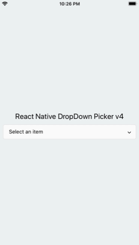
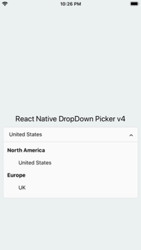
Table of contents
Dependencies
Make sure react-native-vector-icons is installed.
https://github.com/oblador/react-native-vector-icons
Changelog
- @petkovv submitted PR #228 [March 20, 2021]
- Added
noTopRadius. [March 17, 2021] - Added
noBottomRadius. [March 17, 2021] - @antoinebrtd submitted PR #218 [March 09, 2021]
- @Maclay74 submitted PR #216 [Februrary 26, 2021]
- Added
childrenContainerStyle. [Februrary 13, 2021] - Added
textStyle viewStyle & untouchable props to items. [Februrary 13, 2021] - Added category support. [Februrary 13, 2021]
- Added
globalTextStyle. [February 11, 2021] - Added
onSearch. [January 27, 2021] - Added
labelProps. [January 06, 2021] - Some bug-fixes. [January 06, 2021]
- Added
containerProps. [December 21, 2020]
Getting Started
Installation
via NPM
npm install react-native-dropdown-picker --save
via Yarn
yarn add react-native-dropdown-picker
Basic Usage
The first step is to import the package.
import DropDownPicker from 'react-native-dropdown-picker';
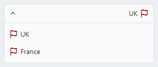
Single Item
Select a single item.
import Icon from 'react-native-vector-icons/Feather';

this.state = {
    country: 'uk'
}

<DropDownPicker
    items={[
        {label: 'USA', value: 'usa', icon: () => <Icon name="flag" size={18} color="#900" />, hidden: true},
        {label: 'UK', value: 'uk', icon: () => <Icon name="flag" size={18} color="#900" />},
        {label: 'France', value: 'france', icon: () => <Icon name="flag" size={18} color="#900" />},
    ]}
    defaultValue={this.state.country}
    containerStyle={{height: 40}}
    style={{backgroundColor: '#fafafa'}}
    itemStyle={{
        justifyContent: 'flex-start'
    }}
    dropDownStyle={{backgroundColor: '#fafafa'}}
    onChangeItem={item => this.setState({
        country: item.value
    })}
/>
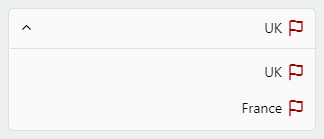
Multiple Items
Select multiple items.
import Icon from 'react-native-vector-icons/Feather';
this.state = {
selectedCountriesValues: ['uk'],
selectedCountries: [{label: 'UK', value: 'uk', icon: () => <Icon name="flag" size={18} color="#900"/> }]
}
<DropDownPicker
items={[
{label: 'UK', value: 'uk', icon: () => <Icon name="flag" size={18} color="#900" />},
{label: 'France', value: 'france', icon: () => <Icon name="flag" size={18} color="#900" />},
]}
multiple={true}
multipleText="%d items have been selected."
min={0}
max={10}
defaultValue={this.state.countries}
containerStyle={{height: 40}}
itemStyle={{
justifyContent: 'flex-start'
}}
onChangeItem={item => this.setState({
selectedCountriesValues: item
})}
onChangeItemMultiple={item => this.setState({
selectedCountries: item
})}
/>
Available Item Properties
Here's the type definition of an item.
type ItemType = {
label: any;
value: any;
icon?: () => JSX.Element;
hidden?: boolean;
untouchable?: boolean;
parent?: any;
disabled?: boolean;
selected?: boolean;
viewStyle?: StyleProp<ViewStyle>,
textStyle?: StyleProp<TextStyle>,
};
Category Support
As of v4.x, You can simply categorize your items.
<DropDownPicker
items={[
{label: 'North America', value: 'na', untouchable: true},
{label: 'United States', value: 'us', parent: 'na'},
{label: 'Canada', value: 'canada', parent: 'na'},
{label: 'Mexico', value: 'mexico', parent: 'na'},
{label: 'Europe', value: 'eu', untouchable: true},
{label: 'UK', value: 'uk', parent: 'eu'},
{label: 'Germany', value: 'germany', parent: 'eu'},
{label: 'Russia', value: 'russia', parent: 'eu'},
]}
...
/>
The parent property must be equal to the value property of the parent item.
The untouchable property makes the item untouchable.
Searchable Items
Search for specific items.
searchable={true}
searchablePlaceholder="Search for an item"
searchablePlaceholderTextColor="gray"
seachableStyle={{}}
searchableError={() => <Text>Not Found</Text>}
onSearch={text => {
if (this._API.isFetching())
this._API.abort();
this._API = this.fetchFromServer(text, (items) => {
this.controller.resetItems(items);
});
}}
Default Item
You may want to select one of the items as default.
Use one of the following options:
-
Add selected: true to the object. (This method is not state-friendly!)
items={[
    {label: 'Item 1', value: 'item1'},
    {label: 'Item 2', value: 'item2', selected: true},
]}
-
The defaultValue property.
defaultValue = 'uk';
defaultValue = ['uk'];
Placeholder
You may want to have a placeholder while the default value is null or an empty array.
Add the following properties to the component.
this.state = {
data: null,
data: []
}
...
defaultValue={this.state.data}
placeholder="Select an item"
...
Controller
The controller property gives you full access to the DropDownPicker methods and properties.
Class Components
constructor(props) {
this.state = {
value: null,
items: []
}
this.controller;
}
<DropDownPicker
items={this.state.items}
controller={instance => this.controller = instance}
onChangeList={(items, callback) => {
this.setState({
items
}, callback);
}}
defaultValue={this.state.value}
onChangeItem={item => this.setState({
value: item.value
})}
/>
Functional Components
const [value, setValue] = useState(null);
const [items, setItems] = useState([ {...}, ... ]);

const controller = useRef(null);

<DropDownPicker
    items={items}
    controller={instance => controller.current = instance}
    onChangeList={(items, callback) => {
        Promise.resolve(setItems(items))
            .then(() => callback());
    }}

    defaultValue={value}
    onChangeItem={item => setValue(item.value)}
/>
in Class components you can call methods using this.controller.METHOD_NAME() and controller.current.METHOD_NAME() in Functional components.
-
Reset the state.
You may want to reset the state of your picker.
this.controller.reset();
-
Reset items.
The second argument is your default value. (Optional)
this.controller.resetItems([{}, {}, ...]);
this.controller.resetItems([{}, {}, ...], 'uk');
this.controller.resetItems([{}, {}, ...], ['uk', ...]);
-
Select an item manually.
You may want to select an item manually.
this.controller.selectItem('uk');
this.controller.selectItem(['uk', 'france']);
-
Add items manually.
There are two methods to help you add items manually.
this.controller.addItem({
  label: 'UK',
  value: 'uk',
  icon: () => {},
});
this.controller.addItems([
  {
    label: 'UK',
    value: 'uk',
    icon: () => {},
  },
]);
-
Remove items
this.controller.removeItem('uk', {
changeDefaultValue: true,
});
-
Check if the dropdown is open
this.controller.isOpen();
-
Open, close or toggle.
this.controller.open();
this.controller.close();
this.controller.toggle();
Styling The Component
There are 14 props to style the component.
-
The style property.
Use this to adjust the inner part of the picker.
style={{paddingVertical: 10}}
-
The dropDownStyle property.
Additional styles for the dropdown box.
dropDownStyle={{backgroundColor: '#fafafa'}}
-
The containerStyle property.
Use this to adjust the outer part of the picker such as margin, width, height, flex, ...
containerStyle={{width: 150, height: 70}}
-
The itemStyle property.
If you want the labels on the left and right side or to centerize them:
itemStyle={{justifyContent: 'flex-start|flex-end|center'}}
-
The labelStyle property.
This property gives full control over the label.
labelStyle={{
    fontSize: 14,
    textAlign: 'left',
    color: '#000'
}}
-
The selectedLabelStyle property.
Changes the style of the selected item label.
selectedLabelStyle={{
    color: '#39739d'
}}
-
The placeholderStyle property.
Style the placeholder text with this property.
placeholderStyle={{
    fontWeight: 'bold',
    textAlign: 'center'
}}
-
The activeItemStyle property.
This property allows you to style the active item.
activeItemStyle={{justifyContent: 'center'}}
-
The activeLabelStyle property.
This property allows you to style the active label.
activeLabelStyle={{color: 'red'}}
-
The arrowStyle property.
Adds your additional styles to the View element of the arrow.
arrowStyle={{marginRight: 10}}
-
The searchableStyle property.
Additional styles for the TextInput
searchableStyle={{backgroundColor: '#dfdfdf'}}
-
The searchablePlaceholderTextColor property.
Assigns a new color to the placeholder text.
searchablePlaceholderTextColor="silver"
-
The globalTextStyle property.
You can style <Text /> elements globally.
globalTextStyle={{
    fontFamily: "MyFontName",
    fontSize: 15
}}
-
The childrenContainerStyle property.
Style the children container View (See Category Support)
childrenContainerStyle={{
    paddingLeft: 30
}}
RTL Support
-
The selected item
style={{
    flexDirection: 'row-reverse',
}}
labelStyle={{
    textAlign: 'right',
}}
-
The dropdown items
itemStyle={{
    flexDirection: 'row-reverse',
    justifyContent: 'flex-start',
}}
FAQ
How to close other pickers when opening another picker?
this.state = {
isVisibleA: false,
isVisibleB: false,
...
}
changeVisibility(state) {
this.setState({
isVisibleA: false,
isVisibleB: false,
...state
});
}
<DropDownPicker
isVisible={this.state.isVisibleA}
onOpen={() => this.changeVisibility({
isVisibleA: true
})}
onClose={() => this.setState({
isVisibleA: false
})}
...
/>
<DropDownPicker
isVisible={this.state.isVisibleB}
onOpen={() => this.changeVisibility({
isVisibleB: true
})}
onClose={() => this.setState({
isVisibleB: false
})}
...
/>
borderRadius
Avoid using borderRadius and all the corners must be set separately.
style={{
    borderTopLeftRadius: 10, borderTopRightRadius: 10,
    borderBottomLeftRadius: 10, borderBottomRightRadius: 10
}}
dropDownStyle={{
    borderBottomLeftRadius: 20, borderBottomRightRadius: 20
}}
zIndex conflicts (Untouchable Items, Overlapping pickers)
-
Using the containerStyle property to style the picker results in unexpected behaviors like untouchable items.
The style and dropDownStyle properties must be used instead.
Use the containerStyle prop to adjust the outer part of the picker such as margin, width, height, flex, ...
-
Nested Views
You have to add zIndex to the nested views which contain the picker.
Note! zIndex locks the picker on Android, The solution is to use the Platform.OS
import { Platform } from 'react-native';

<View
    style={{
        ...(Platform.OS !== 'android' && {
            zIndex: 10
        })
    }}
>
    <DropDownPicker ... />
</View>
Demo: https://snack.expo.io/@hossein-zare/823437
-
DropDownPicker wrapped by <View style={{backgroundColor: ..., border[...]: ..., elevation: ...}}>
These props will make your dropdown untouchable.
Remove all the backgroundColor, border[...], elevation, ... style properties from the parent element.
https://github.com/hossein-zare/react-native-dropdown-picker/issues/40#issuecomment-651744446
-
Multiple Pickers
<DropDownPicker zIndex={5000} />
<DropDownPicker zIndex={4000} />
<DropDownPicker zIndex={3000} />
Dropdown Overflow
Adding borders to the component separates elements or may overflow. To solve this issue add marginTop to the dropDownStyle and specify the value which fits your UI well.
dropDownStyle={{marginTop: 2}}
Props
| Name | Description | Type | Default | Required |
|---|
items | The items for the component. | array | | Yes |
defaultValue | The value of the default item. (If multiple={true}, it takes an array of pre-selected values: ['uk']) | any | | Yes |
placeholder | Default text to be shown to the user when defaultValue={null} or defaultValue={[]} | string | 'Select an item' | No |
dropDownMaxHeight | Height of the dropdown box. | number | 150 | No |
style | Additional styles for the picker. | object | {} | No |
globalTextStyle | Global text style. | object | {} | No |
dropDownStyle | Additional styles for the dropdown box. | object | {} | No |
containerStyle | Additional styles for the container view. | object | {} | No |
itemStyle | Additional styles for the items. | object | {} | No |
labelStyle | Additional styles for the labels. | object | {} | No |
selectedLabelStyle | Additional styles for the selected label. | object | {} | No |
placeholderStyle | Additional styles for the placeholder text. | object | {} | No |
activeItemStyle | Additional styles for the active item. | object | {} | No |
activeLabelStyle | Additional styles for the active label. | object | {} | No |
arrowStyle | Additional styles for the arrow. | object | {} | No |
arrowColor | The color of arrow icons | string | #000 | No |
arrowSize | The size of the arrow. | number | 15 | No |
showArrow | An option to show/hide the arrow. | bool | true | No |
customArrowUp | Customize the arrow-up. | func | (size, color) => ... | No |
customArrowDown | Customize the arrow-down. | func | (size, color) => ... | No |
customTickIcon | Customize the tick icon for multiple item picker. | func | () => ... | No |
zIndex | This property specifies the stack order of the component. | number | 5000 | No |
disabled | Disables the component. | bool | false | No |
isVisible | Open or close the dropdown box. | bool | false | No |
autoScrollToDefaultValue | If true, automatically scroll to defaultValue/first defaultValue (multiple) during first render of dropdown | bool | false | No |
multiple | If set to true selecting multiple items is possible. | bool | false | No |
multipleText | a Text to inform the user how many items have been selected. | string | %d items have been selected | No |
min | Minimum number of items. | number | 0 | No |
max | Maximum number of items. | number | 10000000 | No |
searchable | Shows a TextInput to search for specific items. | bool | false | No |
searchablePlaceholder | Default text to be shown to the user. | string | Search for an item | No |
searchablePlaceholderTextColor | TextInput placeholder text color. | string | gray | No |
searchableStyle | Additional styles for the TextInput | object | {} | No |
searchableError | Shows a jsx element when nothing found. | func | () => <Text>Not Found</Text> | No |
onSearch | Fires when you type something in the TextInput. | func | (text) => {} | No |
selectedLabelLength | Specify length for the selected label. | number | 1000 | No |
labelLength | Specify length for the labels. | number | 1000 | No |
labelProps | Add props to the labels. | object | {} | No |
scrollViewProps | Add props to the ScrollView | object | {} | No |
searchTextInputProps | Add props to the search TextInput | object | {} | No |
offsetBottom | Extra space on the bottom of the screen which is not possible to show dropdown on (bottom bar) | number | 0 | No |
containerProps | Add props to the container view. | object | {} | No |
renderSeperator | Separate items. | func | undefined | No |
controller | Gives you access to the methods and properties. | func | (instance) => {} | No |
onOpen | Fires when you open the picker. | func | () => {} | No |
onClose | Fires when you close the picker. | func | () => {} | No |
onChangeItem | Callback which returns item and index. The item is the selected object or an array of the selected values. | func | (item, index) => {} | No |
onChangeItemMultiple | Callback which returns item. The item is an array of the selected objects. Only when multiple={true}. | func | (item, index) => {} | No |
onChangeList | Changes the list of items. | func | (items, callback) => {} | No |
noTopRadius | Removes the top radius when the picker is open. | boolean | true | No |
noBottomRadius | Removes the bottom radius when the picker is open. | boolean | true | No |


