Security News
PyPI Introduces Digital Attestations to Strengthen Python Package Security
PyPI now supports digital attestations, enhancing security and trust by allowing package maintainers to verify the authenticity of Python packages.
react-native-dropdown-picker
Advanced tools
A single / multiple, categorizable & searchable item picker (dropdown) component for react native which supports both Android & iOS.
A single / multiple, categorizable & searchable item picker (dropdown) component for react native which supports both Android & iOS.


Make sure react-native-vector-icons is installed.
https://github.com/oblador/react-native-vector-icons
noTopRadius. [March 17, 2021]noBottomRadius. [March 17, 2021]childrenContainerStyle. [Februrary 13, 2021]textStyle viewStyle & untouchable props to items. [Februrary 13, 2021]globalTextStyle. [February 11, 2021]onSearch. [January 27, 2021]labelProps. [January 06, 2021]containerProps. [December 21, 2020]npm install react-native-dropdown-picker --save
yarn add react-native-dropdown-picker
The first step is to import the package.
import DropDownPicker from 'react-native-dropdown-picker';
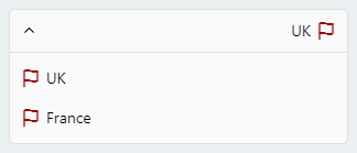
Select a single item.
import Icon from 'react-native-vector-icons/Feather';

this.state = {
    country: 'uk'
}

<DropDownPicker
    items={[
        {label: 'USA', value: 'usa', icon: () => <Icon name="flag" size={18} color="#900" />, hidden: true},
        {label: 'UK', value: 'uk', icon: () => <Icon name="flag" size={18} color="#900" />},
        {label: 'France', value: 'france', icon: () => <Icon name="flag" size={18} color="#900" />},
    ]}
    defaultValue={this.state.country}
    containerStyle={{height: 40}}
    style={{backgroundColor: '#fafafa'}}
    itemStyle={{
        justifyContent: 'flex-start'
    }}
    dropDownStyle={{backgroundColor: '#fafafa'}}
    onChangeItem={item => this.setState({
        country: item.value
    })}
/>
Select multiple items.
import Icon from 'react-native-vector-icons/Feather';

this.state = {
    selectedCountriesValues: ['uk'],
    selectedCountries: [{label: 'UK', value: 'uk', icon: () => <Icon name="flag" size={18} color="#900"/> }]
}

<DropDownPicker
    items={[
        {label: 'UK', value: 'uk', icon: () => <Icon name="flag" size={18} color="#900" />},
        {label: 'France', value: 'france', icon: () => <Icon name="flag" size={18} color="#900" />},
    ]}

    multiple={true}
    multipleText="%d items have been selected."
    min={0}
    max={10}

    defaultValue={this.state.countries}
    containerStyle={{height: 40}}
    itemStyle={{
        justifyContent: 'flex-start'
    }}
    onChangeItem={item => this.setState({
        selectedCountriesValues: item // an array of the selected items values
    })}
    onChangeItemMultiple={item => this.setState({
        selectedCountries: item // an array of the selected items
    })}
/>
Here's the type definition of an item.
type ItemType = {
    label: any; // required
    value: any; // required
    icon?: () => JSX.Element;
    hidden?: boolean;
    untouchable?: boolean;
    parent?: any;
    disabled?: boolean;
    selected?: boolean;
    viewStyle?: StyleProp<ViewStyle>,
    textStyle?: StyleProp<TextStyle>,
};
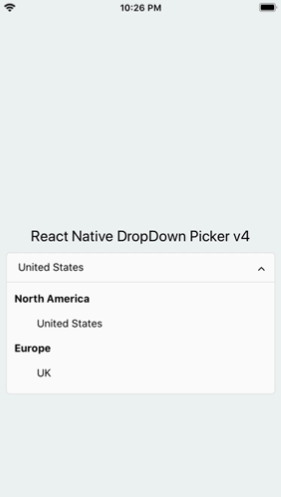
As of v4.x, You can simply categorize your items.
<DropDownPicker
    items={[
        {label: 'North America', value: 'na', untouchable: true}, // North America
        {label: 'United States', value: 'us', parent: 'na'},
        {label: 'Canada', value: 'canada', parent: 'na'},
        {label: 'Mexico', value: 'mexico', parent: 'na'},

        {label: 'Europe', value: 'eu', untouchable: true}, // Europe
        {label: 'UK', value: 'uk', parent: 'eu'},
        {label: 'Germany', value: 'germany', parent: 'eu'},
        {label: 'Russia', value: 'russia', parent: 'eu'},
    ]}

    ...
/>
The
parentproperty must be equal to thevalueproperty of the parent item.
Theuntouchableproperty makes the item untouchable.
Search for specific items.
searchable={true}
searchablePlaceholder="Search for an item"
searchablePlaceholderTextColor="gray"
seachableStyle={{}}
searchableError={() => <Text>Not Found</Text>}
onSearch={text => {
    // Example
    if (this._API.isFetching())
        this._API.abort();

    this._API = this.fetchFromServer(text, (items) => {
        // See controller: https://github.com/hossein-zare/react-native-dropdown-picker#controller
        this.controller.resetItems(items); // Maybe a new method will be introduced for a better UX!
    });
}}
You may want to select one of the items as default.
Use one of the following options:
Add selected: true to the object. (This method is not state-friendly!)
items={[
    {label: 'Item 1', value: 'item1'},
    {label: 'Item 2', value: 'item2', selected: true},
]}
The defaultValue property.
defaultValue = 'uk'; // Single
defaultValue = ['uk']; // Multiple
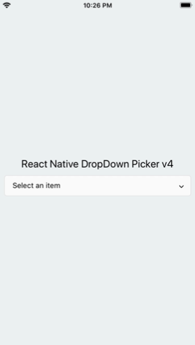
You may want to have a placeholder while the default value is null or an empty array.
Add the following properties to the component.
this.state = {
    data: null, // Single
    data: [] // Multiple
}

...
defaultValue={this.state.data}
placeholder="Select an item"
...
The controller property gives you full access to the DropDownPicker methods and properties.
constructor(props) {
    this.state = {
        value: null,
        items: []
    }

    this.controller;
}

<DropDownPicker
    items={this.state.items}
    controller={instance => this.controller = instance}
    onChangeList={(items, callback) => {
        this.setState({
            items // items: items
        }, callback);
    }}

    defaultValue={this.state.value}
    onChangeItem={item => this.setState({
        value: item.value
    })}
/>
const [value, setValue] = useState(null);
const [items, setItems] = useState([ {...}, ... ]);

const controller = useRef(null);

<DropDownPicker
    items={items}
    controller={instance => controller.current = instance}
    onChangeList={(items, callback) => {
        Promise.resolve(setItems(items))
            .then(() => callback());
    }}

    defaultValue={value}
    onChangeItem={item => setValue(item.value)}
/>
in Class components you can call methods using this.controller.METHOD_NAME() and controller.current.METHOD_NAME() in Functional components.
Reset the state.
You may want to reset the state of your picker.
this.controller.reset();
Reset items.
The second argument is your default value. (Optional)
this.controller.resetItems([{}, {}, ...]);

this.controller.resetItems([{}, {}, ...], 'uk'); // Single
this.controller.resetItems([{}, {}, ...], ['uk', ...]); // Multiple
Select an item manually.
You may want to select an item manually.
// Single
this.controller.selectItem('uk');

// Multiple
this.controller.selectItem(['uk', 'france']);
Add items manually.
There are two methods to help you add items manually.
this.controller.addItem({
  label: 'UK',
  value: 'uk',
  icon: () => {},
});
this.controller.addItems([
  {
    label: 'UK',
    value: 'uk',
    icon: () => {},
  },
]);
Remove items
this.controller.removeItem('uk', {
  changeDefaultValue: true, // Unselect if the removed item is the selected item
});
Check if the dropdown is open
this.controller.isOpen(); // boolean
Open, close or toggle.
this.controller.open();
this.controller.close();
this.controller.toggle();
There are 14 props to style the component.
The style property.
Use this to adjust the inner part of the picker.
style={{paddingVertical: 10}}
The dropDownStyle property.
Additional styles for the dropdown box.
dropDownStyle={{backgroundColor: '#fafafa'}}
The containerStyle property.
Use this to adjust the outer part of the picker such as margin, width, height, flex, ...
containerStyle={{width: 150, height: 70}}
The itemStyle property.
If you want the labels on the left and right side or to centerize them:
itemStyle={{justifyContent: 'flex-start|flex-end|center'}}
The labelStyle property.
This property gives full control over the label.
labelStyle={{
    fontSize: 14,
    textAlign: 'left',
    color: '#000'
}}
The selectedLabelStyle property.
Changes the style of the selected item label.
selectedLabelStyle={{
    color: '#39739d'
}}
The placeholderStyle property.
Style the placeholder text with this property.
placeholderStyle={{
    fontWeight: 'bold',
    textAlign: 'center'
}}
The activeItemStyle property.
This property allows you to style the active item.
activeItemStyle={{justifyContent: 'center'}}
The activeLabelStyle property.
This property allows you to style the active label.
activeLabelStyle={{color: 'red'}}
The arrowStyle property.
Adds your additional styles to the View element of the arrow.
arrowStyle={{marginRight: 10}}
The searchableStyle property.
Additional styles for the TextInput
searchableStyle={{backgroundColor: '#dfdfdf'}}
The searchablePlaceholderTextColor property.
Assigns a new color to the placeholder text.
searchablePlaceholderTextColor="silver"
The globalTextStyle property.
You can style <Text /> elements globally.
globalTextStyle={{
    fontFamily: "MyFontName",
    fontSize: 15
}}
The childrenContainerStyle property.
Style the children container View (See Category Support)
childrenContainerStyle={{
    paddingLeft: 30
}}
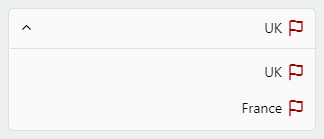
The selected item

style={{
    flexDirection: 'row-reverse',
}}
labelStyle={{
    textAlign: 'right',
}}
The dropdown items

itemStyle={{
    flexDirection: 'row-reverse',
    justifyContent: 'flex-start',
}}
this.state = {
    isVisibleA: false,
    isVisibleB: false,

    ...
}

changeVisibility(state) {
    this.setState({
        isVisibleA: false,
        isVisibleB: false,
        ...state
    });
}

// Picker A
<DropDownPicker
    isVisible={this.state.isVisibleA}
    onOpen={() => this.changeVisibility({
        isVisibleA: true
    })}
    onClose={() => this.setState({
        isVisibleA: false
    })}

    ...
/>

// Picker B
<DropDownPicker
    isVisible={this.state.isVisibleB}
    onOpen={() => this.changeVisibility({
        isVisibleB: true
    })}
    onClose={() => this.setState({
        isVisibleB: false
    })}

    ...
/>
Avoid using borderRadius and all the corners must be set separately.
style={{
    borderTopLeftRadius: 10, borderTopRightRadius: 10,
    borderBottomLeftRadius: 10, borderBottomRightRadius: 10
}}
dropDownStyle={{
    borderBottomLeftRadius: 20, borderBottomRightRadius: 20
}}
Using the containerStyle property to style the picker results in unexpected behaviors like untouchable items.
The
styleanddropDownStyleproperties must be used instead.
Use thecontainerStyleprop to adjust the outer part of the picker such asmargin,width,height,flex, ...
Nested Views
You have to add
zIndexto the nested views which contain the picker.
Note!zIndexlocks the picker on Android, The solution is to use thePlatform.OS
import { Platform } from 'react-native';

<View
    style={{
        ...(Platform.OS !== 'android' && {
            zIndex: 10
        })
    }}
>
    <DropDownPicker ... />
</View>
DropDownPicker wrapped with <View style={{backgroundColor: ..., border[...]: ..., elevation: ...}}>
These props will make your dropdown untouchable.
Remove all the backgroundColor, border[...], elevation, ... style properties from the parent element.
https://github.com/hossein-zare/react-native-dropdown-picker/issues/40#issuecomment-651744446
Multiple Pickers
The zIndexInverse prop must be greater than the first zIndex which is 5000
<DropDownPicker zIndex={5000} zIndexInverse={6000} />
<DropDownPicker zIndex={4000} zIndexInverse={6000} />
<DropDownPicker zIndex={3000} zIndexInverse={6000} />
Adding borders to the component separates elements or may overflow. To solve this issue add marginTop to the dropDownStyle and specify the value which fits your UI well.
dropDownStyle={{marginTop: 2}}
| Name | Description | Type | Default | Required |
|---|---|---|---|---|
items | The items for the component. | array | Yes | |
defaultValue | The value of the default item. (If multiple={true}, it takes an array of pre-selected values: ['uk']) | any | Yes | |
placeholder | Default text to be shown to the user when defaultValue={null} or defaultValue={[]} | string | 'Select an item' | No |
dropDownMaxHeight | Height of the dropdown box. | number | 150 | No |
style | Additional styles for the picker. | object | {} | No |
globalTextStyle | Global text style. | object | {} | No |
dropDownStyle | Additional styles for the dropdown box. | object | {} | No |
containerStyle | Additional styles for the container view. | object | {} | No |
itemStyle | Additional styles for the items. | object | {} | No |
labelStyle | Additional styles for the labels. | object | {} | No |
selectedLabelStyle | Additional styles for the selected label. | object | {} | No |
placeholderStyle | Additional styles for the placeholder text. | object | {} | No |
activeItemStyle | Additional styles for the active item. | object | {} | No |
activeLabelStyle | Additional styles for the active label. | object | {} | No |
arrowStyle | Additional styles for the arrow. | object | {} | No |
arrowColor | The color of arrow icons | string | #000 | No |
arrowSize | The size of the arrow. | number | 15 | No |
showArrow | An option to show/hide the arrow. | bool | true | No |
customArrowUp | Customize the arrow-up. | func | (size, color) => ... | No |
customArrowDown | Customize the arrow-down. | func | (size, color) => ... | No |
customTickIcon | Customize the tick icon for multiple item picker. | func | () => ... | No |
zIndex | This property specifies the stack order of the component. | number | 5000 | No |
zIndexInverse | Adds a different zIndex to the dropdown box when showing it above the picker. | number | 5000 | No |
disabled | Disables the component. | bool | false | No |
isVisible | Open or close the dropdown box. | bool | false | No |
autoScrollToDefaultValue | If true, automatically scroll to defaultValue/first defaultValue (multiple) during first render of dropdown | bool | false | No |
multiple | If set to true selecting multiple items is possible. | bool | false | No |
multipleText | a Text to inform the user how many items have been selected. | string | %d items have been selected | No |
min | Minimum number of items. | number | 0 | No |
max | Maximum number of items. | number | 10000000 | No |
searchable | Shows a TextInput to search for specific items. | bool | false | No |
searchablePlaceholder | Default text to be shown to the user. | string | Search for an item | No |
searchablePlaceholderTextColor | TextInput placeholder text color. | string | gray | No |
searchableStyle | Additional styles for the TextInput | object | {} | No |
searchableError | Shows a jsx element when nothing found. | func | () => <Text>Not Found</Text> | No |
onSearch | Fires when you type something in the TextInput. | func | (text) => {} | No |
selectedLabelLength | Specify length for the selected label. | number | 1000 | No |
labelLength | Specify length for the labels. | number | 1000 | No |
labelProps | Add props to the labels. | object | {} | No |
scrollViewProps | Add props to the ScrollView | object | {} | No |
searchTextInputProps | Add props to the search TextInput | object | {} | No |
offsetBottom | Extra space on the bottom of the screen which is not possible to show dropdown on (bottom bar) | number | 0 | No |
containerProps | Add props to the container view. | object | {} | No |
renderSeperator | Separate items. | func | undefined | No |
controller | Gives you access to the methods and properties. | func | (instance) => {} | No |
onOpen | Fires when you open the picker. | func | () => {} | No |
onClose | Fires when you close the picker. | func | () => {} | No |
onChangeItem | Callback which returns item and index. The item is the selected object or an array of the selected values. | func | (item, index) => {} | No |
onChangeItemMultiple | Callback which returns item. The item is an array of the selected objects. Only when multiple={true}. | func | (item, index) => {} | No |
onChangeList | Changes the list of items. | func | (items, callback) => {} | No |
noTopRadius | Removes the top radius when the picker is open. | boolean | true | No |
noBottomRadius | Removes the bottom radius when the picker is open. | boolean | true | No |
FAQs
A single / multiple, categorizable, customizable, localizable and searchable item picker (drop-down) component for react native which supports both Android & iOS.
The npm package react-native-dropdown-picker receives a total of 36,542 weekly downloads. As such, react-native-dropdown-picker popularity was classified as popular.
We found that react-native-dropdown-picker demonstrated a not healthy version release cadence and project activity because the last version was released a year ago. It has 2 open source maintainers collaborating on the project.
Did you know?

Socket for GitHub automatically highlights issues in each pull request and monitors the health of all your open source dependencies. Discover the contents of your packages and block harmful activity before you install or update your dependencies.

Security News
PyPI now supports digital attestations, enhancing security and trust by allowing package maintainers to verify the authenticity of Python packages.

Security News
GitHub removed 27 malicious pull requests attempting to inject harmful code across multiple open source repositories, in another round of low-effort attacks.

Security News
RubyGems.org has added a new "maintainer" role that allows for publishing new versions of gems. This new permission type is aimed at improving security for gem owners and the service overall.