react-native-drum-picker




A smooth Android-native iOS-style drum/wheel picker for React Native (Fabric / New Architecture).
Preview
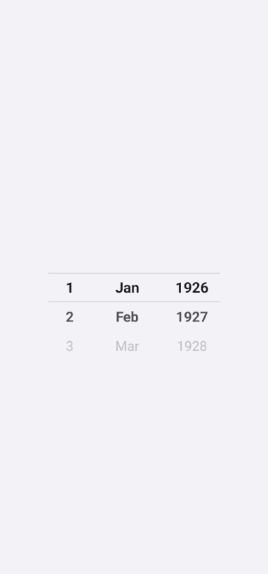
DateDrumPicker on Android (day · month · year):
Features
- Android-native implementation (Kotlin +
RecyclerView)
- iOS-style wheel / drum picker with smooth snapping
- Center selection indicator (optional)
- Transparent background by default
- Custom text colors and sizes
- TypeScript API
- Flexible
DateDrumPicker wrapper (day / month / year columns)
- Fabric View / New Architecture
Installation
yarn add react-native-drum-picker
npm install react-native-drum-picker
This package includes native Android code. Rebuild your app after installing:
cd android && ./gradlew clean && cd ..
npx react-native run-android
On Windows:
cd android
.\gradlew clean
cd ..
npx react-native run-android
Platform support
| Android | Supported |
| iOS | Not supported yet |
| Web | Not supported |
Requires React Native 0.76+ with the New Architecture enabled.
Compatibility
| React Native New Architecture | Required |
| Fabric | Required |
| Android | Supported |
| iOS | Not supported yet |
| Expo Go | Not supported (native Android library) |
| Expo SDK 54 + dev build / prebuild | Tested |
react-native-screens navigation | Tested (use 0.1.4+ for detach safety) |
Tested with
| Expo SDK | 54 |
| React Native | 0.81.5, 0.85.0 (example app) |
| New Architecture | enabled |
| Android | emulator / device |
Intended range: react-native >= 0.76 with New Architecture. The package is actively tested on RN 0.81.x / 0.85.x. Older 0.76–0.80 may work but are not CI-guaranteed.
This package is an Android Fabric View library. Use a development build or expo run:android after expo prebuild — not Expo Go.
React Native 0.81+ event dispatch
If Android Kotlin compile fails with No value passed for parameter 'uiManagerType', upgrade to 0.1.3+ (Fabric UIManagerType.FABRIC).
Basic usage
import { DrumPicker } from 'react-native-drum-picker';

export function Example() {
  return (
    <DrumPicker
      items={['Mon 7 Sep', 'Tue 8 Sep', 'Wed 9 Sep']}
      selectedIndex={1}
      itemHeight={44}
      visibleItemCount={5}
      onChange={(event) => {
        console.log(event.nativeEvent.index, event.nativeEvent.value);
      }}
      style={{ width: 150, height: 220 }}
    />
  );
}
Layout defaults (0.1.5+)
The JS wrapper applies minWidth: 64 and, unless you use flex or pass height / minHeight, height: itemHeight * visibleItemCount (default 220). Native Android also sets matching minimumWidth / minimumHeight.
For production layouts, still pass explicit dimensions:
style={{ width: 120, height: itemHeight * visibleItemCount }}
In __DEV__, a one-time warning is logged if neither height nor flex sizing is provided.
Examples
Time picker (hour · minute)
const hours = Array.from({ length: 24 }, (_, i) => String(i).padStart(2, '0'));
const minutes = Array.from({ length: 60 }, (_, i) => String(i).padStart(2, '0'));

<View style={{ flexDirection: 'row', alignItems: 'center' }}>
  <DrumPicker items={hours} style={{ width: 72, height: 220 }} />
  <DrumPicker items={minutes} style={{ width: 72, height: 220 }} />
</View>
Height / weight row (onboarding style)
<View style={{ flexDirection: 'row', alignItems: 'center' }}>
  <DrumPicker items={heightsCm} style={{ width: 90, height: 220 }} />
  <DrumPicker items={weightsKg} style={{ width: 96, height: 220 }} />
</View>
Controlled selectedIndex
const [index, setIndex] = useState(1);

<DrumPicker
  items={items}
  selectedIndex={index}
  onChange={(e) => setIndex(e.nativeEvent.index)}
  style={{ width: 120, height: 220 }}
/>
onChange and expensive side effects
Native emits onChange when the wheel snaps to idle and the centered index changes (duplicate indices are ignored). Use it for UI state. For AsyncStorage, APIs, or analytics, debounce in your app:
const save = useMemo(() => {
let t: ReturnType<typeof setTimeout> | undefined;
return (value: string) => {
if (t) clearTimeout(t);
t = setTimeout(() => {
}, 300);
};
}, []);
<DrumPicker onChange={(e) => save(e.nativeEvent.value)} ... />
See the example app (example/src/App.tsx) for basic, time, height/weight, date, controlled, and debounced demos.
DateDrumPicker
Higher-level date columns (TypeScript only). Renders wheels only — no built-in titles; add labels in your app if needed.
import { useState } from 'react';
import { DateDrumPicker } from 'react-native-drum-picker';

export function DateExample() {
  const [date, setDate] = useState({ day: 21, month: 5, year: 2026 });

  return (
    <DateDrumPicker
      mode="day-month-year"
      value={date}
      onChange={setDate}
    />
  );
}
<DateDrumPicker
  mode="month-year"
  monthFormat="long"
  minYear={2020}
  maxYear={2035}
  value={{ month: 5, year: 2026 }}
  onChange={(value) => console.log(value)}
/>
Controlled: pass value and update in onChange.
Uncontrolled: omit value; internal state updates and onChange still fires.
Day count follows month/year (e.g. February has 28/29 days).
API reference
DrumPicker
items | string[] | required | Wheel labels |
selectedIndex | number | 0 | Selected row index |
itemHeight | number | 44 | Row height (dp) |
visibleItemCount | number | 5 | Visible rows (odd recommended) |
textColor | string | #8E8E93 | Unselected text |
selectedTextColor | string | #1C1C1E | Selected text |
textSize | number | 20 | Unselected size (sp) |
selectedTextSize | number | 22 | Selected size (sp) |
backgroundColor | string | transparent | Root view background |
containerBackgroundColor | string | transparent | RecyclerView background |
itemBackgroundColor | string | transparent | Row background |
showSelectionIndicator | boolean | true | Center lines |
selectionIndicatorColor | string | #D1D1D6 | Line color |
selectionIndicatorHeight | number | 1 | Line thickness (dp) |
onChange | function | — | nativeEvent: { index, value } |
style | ViewStyle | — | Size and layout |
DateDrumPicker
mode | DateDrumPickerMode | day-month-year | Which columns to show |
value | { day?, month?, year? } | — | Controlled value |
onChange | function | — | { day, month, year } |
minYear | number | now − 100 | Year range start |
maxYear | number | now + 50 | Year range end |
monthFormat | 'short' | 'long' | 'number' | short | Month labels |
locale | string | en | Intl locale for month names |
itemHeight | number | 44 | Passed to each column |
visibleItemCount | number | 5 | Passed to each column |
textColor | string | — | Passed to each column |
selectedTextColor | string | — | Passed to each column |
textSize | number | — | Passed to each column |
selectedTextSize | number | — | Passed to each column |
showSelectionIndicator | boolean | — | Passed to each column |
selectionIndicatorColor | string | — | Passed to each column |
selectionIndicatorHeight | number | — | Passed to each column |
backgroundColor | string | transparent | Passed to each column |
itemBackgroundColor | string | transparent | Passed to each column |
containerBackgroundColor | string | transparent | Passed to each column |
style | ViewStyle | — | Row container |
columnStyle | ViewStyle | — | All columns |
columnStyles | object | — | Per column: day, month, year |
DateDrumPicker modes
Column order is left → right:
day | day |
month | month |
year | year |
day-month | day, month |
month-year | month, year |
day-month-year | day, month, year |
month-day-year | month, day, year |
year-month-day | year, month, day |
type DateDrumPickerMode =
  | 'day'
  | 'month'
  | 'year'
  | 'day-month'
  | 'month-year'
  | 'day-month-year'
  | 'month-day-year'
  | 'year-month-day';
Styling
Backgrounds are transparent by default. Only text and optional indicator lines are visible.
<DrumPicker
  items={['Small', 'Medium', 'Large']}
  selectedTextColor="#111827"
  textColor="#9CA3AF"
  selectionIndicatorColor="#D1D1D6"
  backgroundColor="transparent"
  style={{ width: 120, height: 220 }}
/>
Use an odd visibleItemCount (e.g. 5) for a symmetric wheel.
Troubleshooting
| Must rebuild after install | Native library — run a full Android rebuild |
| Metro shows old code | npx react-native start --reset-cache |
| Gradle / build errors | cd android && ./gradlew clean (Windows: .\gradlew clean) |
adb not found | Install Android SDK Platform-Tools; add to PATH |
| Empty or white picker | Enable New Architecture; upgrade to 0.1.5+ for layout defaults; or set style={{ width, height: itemHeight * visibleItemCount }} |
| Wrong initial row / off-center | Upgrade to 0.1.5+; avoid key remount hacks unless needed for other reasons |
| Props not applied | Rebuild app after native changes; run yarn build in the library before packing |
| iOS | Not supported — Android only |
| Expo Go | Use prebuild + dev build; this library is not in Expo Go |
RN 0.81 uiManagerType compile error | Upgrade to 0.1.3+ |
| Crash when leaving a screen | Upgrade to 0.1.4+ (safe onDetachedFromWindow with react-native-screens) |
| npm shows “no README” | Often a registry UI lag; run npm view react-native-drum-picker readme — if content appears, hard-refresh the package page |
Android build fails in Expo / React Native 0.81+
cd android
./gradlew clean
Windows:
cd android
.\gradlew clean
Then rebuild the native app (npx expo run:android or npx react-native run-android).
Crash when leaving a screen
If the app crashes when navigating away from a screen with DrumPicker (especially with react-native-screens transitions), upgrade to 0.1.4+, which avoids unsafe RecyclerView cleanup during onDetachedFromWindow.
New Architecture: This library is a Fabric view. Ensure New Architecture is enabled in your app (required for RN 0.76+).
Development
git clone https://github.com/scrollDynasty/react-native-drum-picker.git
cd react-native-drum-picker
yarn
yarn build
cd example
yarn android
From the repo root:
yarn lint
yarn build
yarn typecheck
See CONTRIBUTING.md.
License
MIT © Umar Matyokubov