react-native-masked-loader
Creating butter smooth content and skeleton loader in react native.
react-native-skeleton-loader is using react-native-masked-view and react-native-svg.
you can simply create your SVG elements with an arbitry color and pass it to the library;
Platforms Supported
:white_check_mark: iOS
:white_check_mark: Android
Getting Started
$ yarn add react-native-masked-loader react-native-masked-view react-native-svg
or
$ npm install --save react-native-masked-loader react-native-masked-view react-native-svg
for IOS
$ cd ios
  pod install
| Example 1 | Example 2 |
|---|
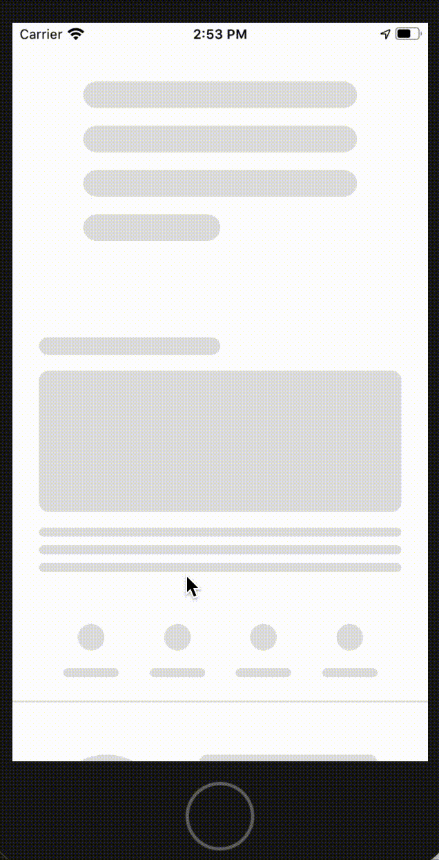 | 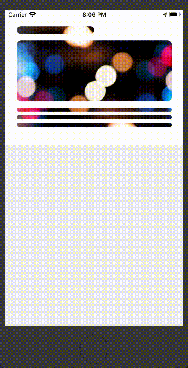 |
Props
| Type | Required | Description |
|---|
| MaskedElement | Yes | |
| duration | No | animation duration in millisecond the default is 1200 |
| delay | No | delay in millisecond for every round of animation default is zero |
| forColor | No | the animated gradient color default is #CBCBCB |
| forColorOpacity | No | its recommended to use this when you have backgroundImage, the default is 1 |
| backColor | No | the backgound of maked view the default is #E0E0E0 |
| backgroundImage | No | the backgoundImage => backgoundImage={uri:'imageUrl'} |
| dir | No | animation direction the default is "ltr", ltr/rtl/top/bottom |
Usage
import React from 'react';
import { View, StyleSheet } from 'react-native';
import Svg, { Rect } from 'react-native-svg';
import ContentLoader from 'react-native-masked-loader';

const styles = StyleSheet.create({
  container: {
    backgroundColor: '#fff',
    padding: '35px 24px 0 24px',
    height: 285,
  }
});

function getMaskedElement() {
  return (
    <Svg height={250} width="100%" fill={'black'}>
      <Rect x="0" y="0" rx="8" ry="8" width="50%" height="16" />
      <Rect x="0" y="30" rx="9" ry="9" width="100%" height="128" />
      <Rect x="0" y="172" rx="4" ry="4" width="100%" height="8" />
      <Rect x="0" y="188" rx="4" ry="4" width="100%" height="8" />
      <Rect x="0" y="204" rx="4" ry="4" width="100%" height="8" />
    </Svg>
  );
}

export default function BOSLoader() {
  const MaskedElement = getMaskedElement();
  return (
    <View style={styles.container}>
      <ContentLoader MaskedElement={MaskedElement} />
    </View>
  );
}
Advance Usage
import React from 'react';
import { View, StyleSheet, ScrollView } from 'react-native';
import Svg, { Rect, Circle } from 'react-native-svg';
import ContentLoader from 'react-native-masked-loader';

const styles = StyleSheet.create({
  container_1: {
    backgroundColor: '#fff',
    paddingHorizontal: 24,
    paddingVertical: 30,
    height: 285
  },
  container_2: {
    backgroundColor: '#fff',
    height: 145,
  },
  cardLoaderContainer: {
    width: '100%',
    flexDirection: 'row',
    paddingBottom: 20
  },
  cardCircleWrapper:{
    paddingTop: 20,
    paddingLeft: 33,
    width: 147
  },
  cardContextWrapper:{
    flex: 1,
    padding: 20,
    paddingLeft: 22,
    paddingBottom: 0
  }
});


function getMaskedElement_1() {
  return (
    <Svg height={250} width="100%" fill={'black'}>
      <Rect x="0" y="0" rx="8" ry="8" width="50%" height="16" />
      <Rect x="0" y="30" rx="9" ry="9" width="100%" height="128" />
      <Rect x="0" y="172" rx="4" ry="4" width="100%" height="8" />
      <Rect x="0" y="188" rx="4" ry="4" width="100%" height="8" />
      <Rect x="0" y="204" rx="4" ry="4" width="100%" height="8" />
    </Svg>
  );
}


function getMaskedElement_2() {

  return (
    <>
      <View style={styles.cardLoaderContainer}>
        <View style={styles.cardCircleWrapper}>
           <Svg height={105} width="100%" fill={'black'}>
              <Circle cx="52" cy="52" r="52" />
            </Svg>
        </View>
        <View style={styles.cardContextWrapper}>
          <Svg height={105} width="100%" fill={'black'}>
            <Rect x="0" y="0" rx="7" ry="7" width="100%" height="12" />
            <Rect x="0" y="29" rx="7" ry="7" width="100%" height="12" />
            <Rect x="0" y="53" rx="7" ry="7" width="100%" height="12" />
            <Rect x="0" y="77" rx="7" ry="7" width="50%" height="12" />
          </Svg>
        </View>
      </View>
    </>
  );
}

export default function LoaderComponent() {

  const MaskedElement_1 = getMaskedElement_1();
  const MaskedElement_2 = getMaskedElement_2();

  return (
    <ScrollView>

      {/* Basic Example with direction */}
      <View style={styles.container_1}>
        <ContentLoader MaskedElement={MaskedElement_1} dir={'rtl'} duration={2000} forColor="#cfcfcf" backColor="gray"/>
      </View>

      {/* diffrent svg mask item */}
      <View style={styles.container_2}>
        <ContentLoader MaskedElement={MaskedElement_2} />
      </View>

      {/* background image with forcolor opacity */}
      <View style={styles.container_1}>
        <ContentLoader
          MaskedElement={MaskedElement_1}
          forColorOpacity={0.8}
          backgroundImage={{uri:'https://i.pinimg.com/originals/11/f7/75/11f7754f6c4b3994c2656c09283d3c13.jpg'}}
        />
      </View>

    </ScrollView>
  );
}
LICENSE
MIT


