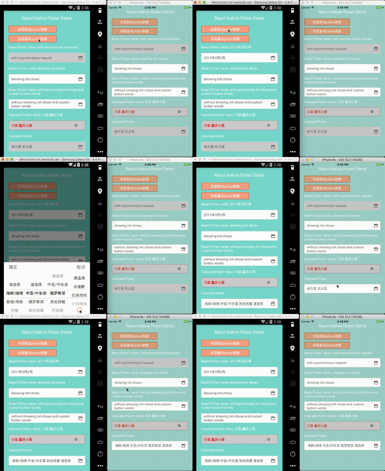
The React-Native-Picker
react native Picker component for both Android and iOS based on pure JavaScript.
Main
- For the iOS, using PickerIOS as the basic.
- This whole picker includes two types of pickers, one is the basic wheel picker which the wheels have no connection with each other, another is the cascade wheel picker which the whees have connection with each other.
How to install
npm install react-native-picker-xg --save
Example

Properties
- For the cascade wheel Picker:
- level: number, the number of the level of the wheels, and please make sure the number equals the length of the selectIndex's array if you have.[Mandatory]
- data: [object, for more details to see the data structure part], the content of the picker.[Mandatory]
- pickerNameStyle: CSS-layout, the style of the pickerName
- cancelBtnStyle: CSS-layout, the style of the cancel button
- confirmBtnStyle: CSS-layout, the confirm button's style
- iconStyle: CSS-layout, the right downdrop button's style
- iconName: string, the name of the icon
- iconSize: number, the size of the icon
- inputStyle: CSS-layout, the textInput's style
- navStyle: CSS-layout, the style of the nav of the picker
- textStyle: CSS-layout, the style of the inputText's inner text
- pickerName: string, the text of the picker's name
- inputValue: string, the initial text of the textInput
- enable: bool, to enable or disable the textInput
- confirmBtnText: string, the text of the confirm button
- cancelBtnText: string, the text of the cancel button
- visible: bool, init to show the wheels, when 'enable' is false, nomatter the value of 'visible', the wheels will not show. And there should not be more than 1 wheels with 'visible' is true in one page.
- id: string, the id of your data
- name: string, the label of your data
- parentId: string, the parentId of your data
- loading: array, the array of loading status
- For the basic wheel picker:
- data: [array, for more details to see the data structure part], the content of the picker.[Mandatory]
- pickerNameStyle: CSS-layout, the style of the pickerName
- cancelBtnStyle: CSS-layout, the style of the cancel button
- confirmBtnStyle: CSS-layout, the confirm button's style
- inputStyle: CSS-layout, the textInput's style
- navStyle: CSS-layout, the style of the nav of the picker
- textStyle: CSS-layout, the style of the inputText's inner text
- iconStyle: CSS-layout, the right downdrop button's style
- pickerName: string, the text of the picker's name
- inputValue: string, the initial text of the textInput
- enable: bool, to enable or disable the textInput
- confirmBtnText: string, the text of the confirm button
- cancelBtnText: string, the text of the cancel button
- selectIndex: [number] ,initial selected item
- visible: bool, init to show the wheels, when 'enable' is false, nomatter the value of 'visible', the wheels will not show. And there should not be more than 1 wheels with 'visible' is true in one page.
Method
Usage: you can see the example file to know how to use the component
We provide two ways for you to use this component.
The first one
npm install react-native-picker-xg --save
The second one
-
Step1--download the zip from the github
-
Step2--init an react-native project
-
Step3--copy the zip's content into your project
-
Step4--change the index.android.js's last line AppRegistry.registerComponent('widgets', () => TpickerEx);'s widgets into your project's name.
-
Step5--change the yourownip in line 19 in example/index.js to your own ip
-
Step6--npm install


