
Security News
Oracle Drags Its Feet in the JavaScript Trademark Dispute
Oracle seeks to dismiss fraud claims in the JavaScript trademark dispute, delaying the case and avoiding questions about its right to the name.
By Sarah Gooding - Feb 07, 2025
react-native-pop
Advanced tools
10 Material design popup components for react native.
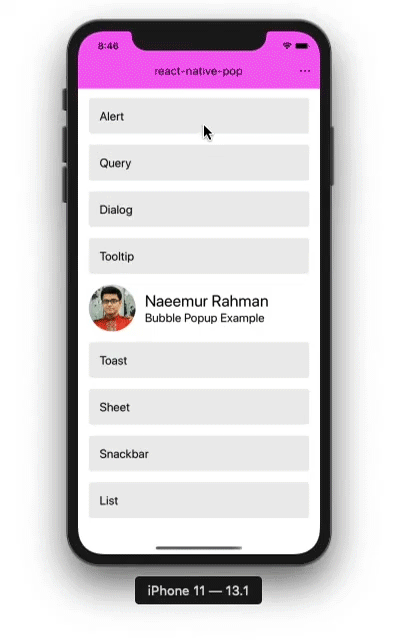
(This demo uses scale of 1.15 on this iPhone 11. Also uses my react-native-advanced-ripple and react-native-theme-system modules. Details are below.)
npm install react-native-pop
import { Component } from 'react'
import { View, ScrollView } from 'react-native'

import Popup from 'react-native-pop'

class App extends Component {
	showSomething() {
		// can be used like this too, without creating child popup components
		this.pop.append(Popup.makeAlert('Hello','world!'))
	}
	render() {
		return (
			<View>
				<View>
					<ScrollView>
						{ ... }
					</ScrollView>
				</View>
				<Popup
					ref={r=>{this.pop=r}}
					theme={theme}
					strech={1}
					offsetTop={24}
					style={{}}
					onDismiss={x=>{console.log('DISMISSED!')}}
				>
					<Popup.Query title="Hey!" message="Hello world!" />
				</Popup>
			</View>
		)
	}
}

export default App
Child popup components are stateless and uses react context to interact with parent <Popup/> component. All of the child popup components must be child of <Popup/> component to work.
A popup that alerts user with a message. Its props and default values are -
begin={} a {x,y,width,height} object that presents a rectangular area to start animation
items an array of items that represent a list item, this is overriden by children prop when provided
let items = [
	// [label, callback, disabled],
	['Item One', ()=>{}],
	['Item Two', ()=>{}, true],// disabled
	'---',// separator
	['Item Three', ()=>{}, false]
]
children component contents
style style properties
An individual item in a <Popup.Menu/>. Its props and default values are -
children component text contents
onPress press callback
disabled when true, component is disabled
A divider in a <Popup.Menu/>. Its props and default values are -
style style properties
A popup that presents a list of options one of which can be selected. Its props and default values are -
items an array of items that represent a list item, this is overriden by children prop when provided
let items = [
	// [label, callback, disabled],
	['Item One', ()=>{}],
	['Item Two', ()=>{}, true],// disabled
	'---',// separator
	['Item Three', ()=>{}, false]
]
children component contents
style style properties
An individual item in a <Popup.List/>. Its props and default values are -
children component text contents
onPress press callback
disabled when true, component is disabled
style style properties
A divider in a <Popup.List/>. Its props and default values are -
style style properties
A popup that alerts user with a message. Its props and default values are -
title popup component title
message message of the component
label label of the action
callback callback function for action
style style properties
A popup that presents user with a query and two actions. Its props and default values are -
title popup component title
message message of the component
primaryLabel label of the primary action
primaryAction callback function for primary action
secondaryLabel label of the primary action
secondaryAction callback function for secondary action
style style properties
A popup only contains a custom component for popup. Its props and default values are -
children component contents
style style properties
A popup that appears at the bottom with message and action. Its props and default values are -
message message of the component
secondLine second line of message of the component
label label of the component action button
action callback function for action button
timeOut=4000 time to wait before autohide. value 0 means autohide disabled
style style properties
A rectangular sheet that popup from bottom. Its props and default values are -
title popup component title
children component contents
style style properties
A popup that presents user with a short message and disappears. Its props and default values are -
children component text contents
gravity='b' position of the component. possible values b (bottom), t (top), c (center)
style style properties
A popup that starts from a round target, expands and morphs into a custom popup. Its props and default values are -
begin={} a {x,y,width,height} object that presents a rectangular area to start animation
end={} a {x,y,width,height} object that presents a rectangular area to end animation at
focus={} a {x,y,width,height} object that presents a rectangular area relative to child component to keep focus on until bubble expands
children component contents
style style properties
Shows a tiny tip for a tool or UI element. Its props and default values are -
begin={} a {x,y,width,height} object that presents a rectangular area to start animation
children component text contents
anchor='bc' position of the component. possible values bc (bottom-center), bl (bottom-left), br (bottom-right), tc (top-center), tl (top-left), tr (top-right), cl (center-left), cr (center-right)
gap=8 gap from begin rectangle towards anchor
style style properties
A button that calls a function and automatically dismisses the popup. Its props and default values are -
children component text contents
onPress press callback
style style properties
textStyle text label style properties
A parent component that contains all popup components that appears on the UI. All of the popup components must be child of this component to work. This can contain only one child popup component at a time. Popup props and default values are -
global: false when true, this instance of the component is used as global popup component. Global component has very useful implementation benifits, like creating popups by calling static methods of the class. There can only be one global popup in the app component tree. Should be used like -
const App = () => (
	<View>
		<NavigatorOrScreen style={{elevation:0}}/>
		<Popup global={true} />
	</View>
)
duration: 250 animation duration for appearing. this value is multiplied with strech prop when appearing and further 0.8 is multiplied with them when disappearing
offsetTop: 0 popup offset from top. one use case is when statusbar is hidden or translucent
onDismiss: () => {} a function that is called when popup disappears
backdropColor: null a string color value or null for no color
backdropDismiss: true to dismiss popup when backdrop is tapped
strech: 1 strech the popup appear duration by multiplying this value
autohide: 0 auto dismiss the popup after this ms time. value 0 disables autohide
hovering: false when true, popup appears without backdrop anchored to top and content behind is interactive
floating: false when true, popup appears without backdrop anchored to bottom and content behind is interactive
reverse: true when true, reverses the animation when popup disappears
elevate: true when true, uses elevation animation
scaling: true when true, uses animated scale transformation
fade: true when true, uses opacity animation
theme: null a theme object that is managed outside of popup with following structure (you might want to use react-native-theme-system for this) -
{
	colors: {
		primary: '#00ffff',// - primary color for your app, usually your brand color.
		accent: '#00cccc',// - secondary color for your app which complements the primary color.
		background: '#ffffff',// - background color for pages, such as lists.
		surface: '#ffffff',// - background color for elements containing content, such as cards.
		text: '#000000',// - text color for content.
		error: '#b00020',// - error.
		notification: "#f50057",// - notification.
		backdrop: 'rgba(0, 0, 0, 0.50)',// - color for backdrops of various components such as modals.
		disabled: 'rgba(0, 0, 0, 0.26)',// - color for disabled elements.
		placeholder: 'rgba(0, 0, 0, 0.54)',// - color for placeholder text, such as input placeholder.
		onBackground: '#000000',
		onSurface: '#000000',
	},
	dark: false,// (boolean): whether this is a dark theme or light theme.
	fonts: {
		light: "Roboto-Light, Roboto, \"Helvetica Neue\", Helvetica, Arial, sans-serif",
		medium: "Roboto-Medium, Roboto, \"Helvetica Neue\", Helvetica, Arial, sans-serif",
		regular: "Roboto, \"Helvetica Neue\", Helvetica, Arial, sans-serif",
		thin: "Roboto-Thin, Roboto, \"Helvetica Neue\", Helvetica, Arial, sans-serif",
	},
	roundness: 4,// (number): roundness of common elements, such as buttons.
}
global a reference to the global popup, if any
event an object with following event-wrapper functions { menu(), bubble(), tooltip() } for global popup
makeAlert(title,message,label,callback,style) creates a <Popup.Alert/> with provided options and returns it
makeTooltip(begin={},children,anchor='bc',gap=8,style) creates a <Popup.Tooltip/> with provided options and returns it
makeMenu(begin={},items,children,style) creates a <Popup.Menu/> with provided options and returns it
makeList(items,children,style) creates a <Popup.List/> with provided options and returns it
makeQuery(title,message,primaryLabel,primaryAction,secondaryLabe creates a <Popup.Query/> with provided options and returns it
makeDialog(children,style) creates a <Popup.Dialog/> with provided options and returns it
makeBubble(begin={},end={},focus={},children,style) creates a <Popup.Bubble/> with provided options and returns it
makeSnackbar(message,secondLine,label,action,timeOut=4000,style) creates a <Popup.Snackbar/> with provided options and returns it
makeToast(children,gravity='b',style) creates a <Popup.Toast/> with provided options and returns it
makeSheet(title,children,style) creates a <Popup.Sheet/> with provided options and returns it
showAlert(title,message,label,callback,style) creates a <Popup.Alert/> with provided options and appends to the global popup
showTooltip(begin={},children,anchor='bc',gap=8,style) creates a <Popup.Tooltip/> with provided options and appends to the global popup
showMenu(begin={},items,children,style) creates a <Popup.Menu/> with provided options and appends to the global popup
showList(items,children,style) creates a <Popup.List/> with provided options and appends to the global popup
showQuery(title,message,primaryLabel,primaryAction,secondaryLabe creates a <Popup.Query/> with provided options and appends to the global popup
showDialog(children,style) creates a <Popup.Dialog/> with provided options and appends to the global popup
showBubble(begin={},end={},focus={},children,style) creates a <Popup.Bubble/> with provided options and appends to the global popup
showSnackbar(message,secondLine,label,action,timeOut=4000,style) creates a <Popup.Snackbar/> with provided options and appends to the global popup
showToast(children,gravity='b',style) creates a <Popup.Toast/> with provided options and appends to the global popup
showSheet(title,children,style) creates a <Popup.Sheet/> with provided options and appends to the global popup
push(children, config) appends children to the global popup with temporary config that override props
config(opts) sets configurations for all popup instances. opts is an object with one or more of the following keys with values.
theme an object of theme for the all popup and children, this is overriden by theme prop set on a specific <Popup/>
scale a number that used for scaling the popup components using react-native-scaling
button an object for creating buttons used within the components. This has structure of { component, deriveProps, deriveTouchableStyles } used like this-
<component {...deriveProps(popup)}>
	<View style={deriveTouchableStyles(popup)}>{...}</View>
</component>
example: { component:TouchableOpacity, deriveProps:()=>({}), deriveTouchableStyles:()=>({}) }
example using react-native-advanced-ripple:
{
	component: Ripple,
	deriveProps: () => ({ highlight:true, containerStyle: { borderRadius:4, marginLeft:8, overflow:'hidden' }}),
	deriveTouchableStyles: () => ({marginLeft:0})
}
press an object for creating press items like in lists used within the components. This has structure of { component, deriveProps, deriveTouchableStyles } used like this-
<component {...deriveProps(popup)}>
	<View style={deriveTouchableStyles(popup)}>{...}</View>
</component>
example: { component:TouchableOpacity, deriveProps:()=>({}), deriveTouchableStyles:()=>({}) }
example using react-native-advanced-ripple:
{
	component: Ripple,
	deriveProps: () => ({ highlight:true, containerStyle: {overflow:'hidden'} }),
	deriveTouchableStyles: () => ({})
}
append(children, config) appends children to the popup with temporary config that override props
dismiss(callback) makes thepopup disappear and then calls the callback function
eventTooltip(cfg,children,anchor,gap) this returns a function, when it is called it creates a <Popup.Tooltip/> with provided options and appends to the <Popup/> and the begin prop is passed automatically. use like <SomeButton onPress={popup.eventTooltip(...)}/>
eventMenu(cfg,items,style) this returns a function, when it is called it creates a <Popup.Menu/> with provided options and appends to the <Popup/> and the begin prop is passed automatically. use like <SomeButton onPress={popup.eventMenu(...)}/>
eventBubble(cfg,end,focus,children,style) this returns a function, when it is called it creates a <Popup.Bubble/> with provided options and appends to the <Popup/> and the begin prop is passed automatically. use like <SomeButton onPress={popup.eventBubble(...)}/>
The MIT License (MIT)
Copyright (c) 2020 Md. Naeemur Rahman (https://naeemur.github.io)
Permission is hereby granted, free of charge, to any person obtaining a copy of this software and associated documentation files (the "Software"), to deal in the Software without restriction, including without limitation the rights to use, copy, modify, merge, publish, distribute, sublicense, and/or sell copies of the Software, and to permit persons to whom the Software is furnished to do so, subject to the following conditions:
The above copyright notice and this permission notice shall be included in all copies or substantial portions of the Software.
THE SOFTWARE IS PROVIDED "AS IS", WITHOUT WARRANTY OF ANY KIND, EXPRESS OR IMPLIED, INCLUDING BUT NOT LIMITED TO THE WARRANTIES OF MERCHANTABILITY, FITNESS FOR A PARTICULAR PURPOSE AND NONINFRINGEMENT. IN NO EVENT SHALL THE AUTHORS OR COPYRIGHT HOLDERS BE LIABLE FOR ANY CLAIM, DAMAGES OR OTHER LIABILITY, WHETHER IN AN ACTION OF CONTRACT, TORT OR OTHERWISE, ARISING FROM, OUT OF OR IN CONNECTION WITH THE SOFTWARE OR THE USE OR OTHER DEALINGS IN THE SOFTWARE.
FAQs
10 Material design popup components for react native
We found that react-native-pop demonstrated a not healthy version release cadence and project activity because the last version was released a year ago. It has 1 open source maintainer collaborating on the project.
Did you know?

Socket for GitHub automatically highlights issues in each pull request and monitors the health of all your open source dependencies. Discover the contents of your packages and block harmful activity before you install or update your dependencies.
Security News
Oracle seeks to dismiss fraud claims in the JavaScript trademark dispute, delaying the case and avoiding questions about its right to the name.

Security News
The Linux Foundation is warning open source developers that compliance with global sanctions is mandatory, highlighting legal risks and restrictions on contributions.

Security News
Maven Central now validates Sigstore signatures, making it easier for developers to verify the provenance of Java packages.