Research
Security News
Malicious npm Packages Inject SSH Backdoors via Typosquatted Libraries
Socket’s threat research team has detected six malicious npm packages typosquatting popular libraries to insert SSH backdoors.
react-native-range-chart
Advanced tools
A slider chart component for React Native, enabling interactive range selection with a visually appealing chart interface
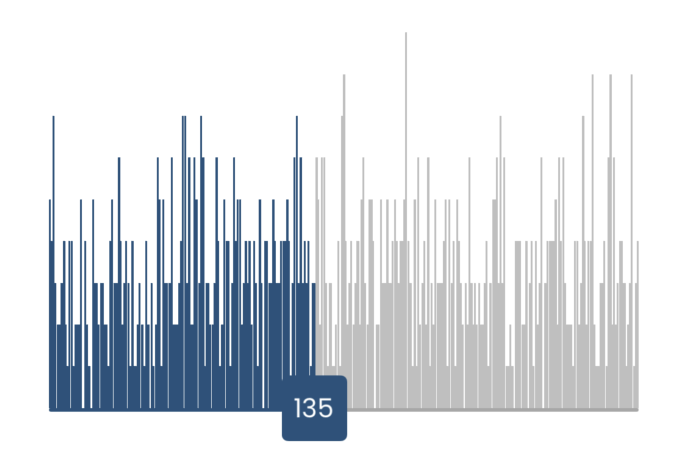
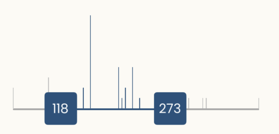
react-native-range-chart is a versatile and customizable range slider component for React Native, which includes a range slider with one or two handles and an integrated column chart. The column heights represent the frequency of occurrences, making it easy to visualize data distribution within a defined range.


To install the package, run:
npm i react-native-range-chart
Here’s a basic example of how to use the RangeChart component:
import RangeChart from 'react-native-range-chart';

const YourComponent = () => {
  const dataArray = [
    { value: 10, count: 2 },
    { value: 15, count: 5 },
    { value: 20, count: 3 },
    // More data points
  ];

  const handleRangeChange = (newRange) => {
    console.log('Selected Range:', newRange);
  };

  return (
    <RangeChart
      dataArray={dataArray}
      minRange={0}
      maxRange={30}
      maxHeight={200}
      containerWidth={350}
      compareWith="value"
      initialValues=[30,70]
      onRangeChange={handleRangeChange}
    />
  );
};
For a single-handle slider, set initialValues as e.g. [5]. For a double-handle slider, set initialValues as [4,7].
| Prop | Type | Description |
|---|---|---|
| dataArray | Array | Array of objects with data points, each containing a value to display on the chart and an occurrence count. |
| minRange | Number | Minimum value for the range slider. |
| maxRange | Number | Maximum value for the range slider. |
| maxHeight | Number | Maximum height for the column chart, adjusting based on occurrence frequency. |
| containerWidth | Number | Width of the chart container. |
| compareWith | String | Key in the data array to compare values with. |
| initialValues | Array | Initial values for the range slider; specify [5] for one handle, [5,10] for two handles. |
| onRangeChange | Function | Callback function that returns the selected range. |
| activeChartColor | String | Color used for active chart elements. default is #23527C |
| inactiveChartColor | String | Color used for inactive chart elements. default is #BFBFBF |
| sliderHandleBackgroundColor | String | Background color of the slider handle. default is #22527C |
| sliderHandleTextColor | String | Text color on the slider handle. default is white |
| activeBarColor | String | Color used for the active state of the bar. default is #22527C |
| inActiveBarColor | String | Color used for the inactive state of the bar. default is #A7A7A7 |
This project is licensed under the MIT License.
For more information, please reach out to the developer at usman.khalid444@gmail.com
FAQs
A slider chart component for React Native, enabling interactive range selection with a visually appealing chart interface
The npm package react-native-range-chart receives a total of 2 weekly downloads. As such, react-native-range-chart popularity was classified as not popular.
We found that react-native-range-chart demonstrated a healthy version release cadence and project activity because the last version was released less than a year ago. It has 0 open source maintainers collaborating on the project.
Did you know?

Socket for GitHub automatically highlights issues in each pull request and monitors the health of all your open source dependencies. Discover the contents of your packages and block harmful activity before you install or update your dependencies.

Research
Security News
Socket’s threat research team has detected six malicious npm packages typosquatting popular libraries to insert SSH backdoors.

Security News
MITRE's 2024 CWE Top 25 highlights critical software vulnerabilities like XSS, SQL Injection, and CSRF, reflecting shifts due to a refined ranking methodology.

Security News
In this segment of the Risky Business podcast, Feross Aboukhadijeh and Patrick Gray discuss the challenges of tracking malware discovered in open source softare.