
Security News
Maven Central Adds Sigstore Signature Validation
Maven Central now validates Sigstore signatures, making it easier for developers to verify the provenance of Java packages.
By Sarah Gooding - Feb 06, 2025
react-native-rtl-toggle
Advanced tools


https://www.npmjs.com/package/react-native-rtl-toggle
https://github.com/abbasmoosavi/react-native-rtl-toggle
| necessary | types | default | |
|---|---|---|---|
| switchOn | ✓ | boolean | false |
| onPress | ✓ | func | () => {} |
| containerStyle | styles | { width: 72, height: 36, borderRadius: 18 ... } | |
| circleStyle | styles | { width: 30, height: 30, borderRadius: 15 ... } | |
| backgroundColorOn | string | 'rgb(227,227,227)' | |
| backgroundColorOff | string | 'rgb(215,215,215)' | |
| circleColorOn | string | 'white' | |
| circleColorOff | string | 'rgb(102,134,205)' | |
| duration | number | 300 |
$ npm install react-native-rtl-toggle --save
import React, { Component } from 'react';
import {
Platform,
StyleSheet,
Text,
View
} from 'react-native';
import SwitchToggle from 'react-native-rtl-toggle';
export default class App extends Component<{}> {
constructor(props) {
super(props);
this.state = {
switchOn1: false,
switchOn2: false,
};
}
render() {
return (
<View style={styles.container}>
<SwitchToggle
switchOn={this.state.switchOn1}
onPress={this.onPress1}
/>
<SwitchToggle
containerStyle={{
marginTop: 16,
width: 108,
height: 48,
borderRadius: 25,
backgroundColor: '#ccc',
padding: 5,
}}
circleStyle={{
width: 38,
height: 38,
borderRadius: 19,
backgroundColor: 'white', // rgb(102,134,205)
}}
switchOn={this.state.switchOn2}
onPress={this.onPress2}
circleColorOff='white'
circleColorOn='red'
duration={500}
/>
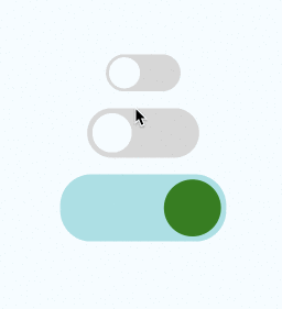
<SwitchToggle
containerStyle={{
marginTop: 16,
width: 160,
height: 65,
borderRadius: 30,
padding: 5,
}}
backgroundColorOn='#a0e1e5'
backgroundColorOff='#e5e1e0'
circleStyle={{
width: 55,
height: 55,
borderRadius: 27.5,
backgroundColor: 'blue', // rgb(102,134,205)
}}
switchOn={this.state.switchOn3}
onPress={this.onPress3}
circleColorOff='#ff11ff'
circleColorOn='green'
duration={500}
/>
</View>
);
}
onPress1 = () => {
this.setState({ switchOn1: !this.state.switchOn1 });
}
onPress2 = () => {
this.setState({ switchOn2: !this.state.switchOn2 });
}
onPress3 = () => {
this.setState({ switchOn3: !this.state.switchOn3 });
}
}
const styles = StyleSheet.create({
container: {
flex: 1,
justifyContent: 'center',
alignItems: 'center',
backgroundColor: '#F5FCFF',
},
});
FAQs
React native toggle for android and ios, RTL support
The npm package react-native-rtl-toggle receives a total of 0 weekly downloads. As such, react-native-rtl-toggle popularity was classified as not popular.
We found that react-native-rtl-toggle demonstrated a not healthy version release cadence and project activity because the last version was released a year ago. It has 1 open source maintainer collaborating on the project.
Did you know?

Socket for GitHub automatically highlights issues in each pull request and monitors the health of all your open source dependencies. Discover the contents of your packages and block harmful activity before you install or update your dependencies.
Security News
Maven Central now validates Sigstore signatures, making it easier for developers to verify the provenance of Java packages.

Security News
CISOs are racing to adopt AI for cybersecurity, but hurdles in budgets and governance may leave some falling behind in the fight against cyber threats.

Research
Security News
Socket researchers uncovered a backdoored typosquat of BoltDB in the Go ecosystem, exploiting Go Module Proxy caching to persist undetected for years.