Research
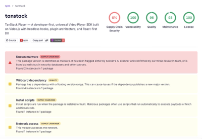
Malicious npm Package Brand-Squats TanStack to Exfiltrate Environment Variables
A brand-squatted TanStack npm package used postinstall scripts to steal .env files and exfiltrate developer secrets to an attacker-controlled endpoint.
react-native-sectioned-multi-select
Advanced tools
a multi (or single) select component with support for sub categories, search, chips.
A multi (or single) select component with support for sub categories, search, chips. It's intended for long-ish lists, as it opens in a Modal (I might make this optional in the future).
This is based on https://github.com/toystars/react-native-multiple-select. The problems I had were that I needed it to be in a modal, because of nested ScrollViews not working on Android, and I needed to display categories with sub-categories.


You can install this package with the following command:
npm i react-native-sectioned-multi-select or yarn add react-native-sectioned-multi-select
The library uses icon names from react-native-vector-icons/MaterialIcons, however, it no longer imports the react-native-vector-icons library.
You should install react-native-vector-icons yourself, then pass the icon to the IconRenderer prop.
import Icon from 'react-native-vector-icons/MaterialIcons`
...
<SectionedMultiSelect IconRenderer={Icon} />
Similarly, for Expo environments you can use:
import {MaterialIcons} from '@expo/vector-icons';
...
<SectionedMultiSelect IconRenderer={MaterialIcons} />
If you prefer to use your own icon images or icon font, the IconRenderer prop can be used to replace the icons used.
See an example here: https://github.com/renrizzolo/react-native-sectioned-multi-select/blob/9c5f71852aef7a7ac03e7761d5dd810cd2ccef5d/exampleapp/App.js#L322-L397 (note the switch, you can refer to this to know what to map icon names to e.g if you're just passing in a different RN Vector Icons font).
You can now pass your own icons object to map the properties to a different icon library or your own IconRenderer component.
For each of these keys, the IconRenderer will be called with the corresponding name and size props.
All properties are spread to the IconRenderer, so you can override style or other props your icon component might use.
Here is the default icons object, which uses Material Icons names.
icons: {
  search: {
    name: 'search', // search input
    size: 24
  },
  arrowUp: {
    name: 'keyboard-arrow-up', // dropdown toggle
    size: 22
  },
  arrowDown: {
    name: 'keyboard-arrow-down', // dropdown toggle
    size: 22
  },
  selectArrowDown: {
    name: 'keyboard-arrow-down', // select
    size: 24
  },
  close: {
    name: 'close', // chip close
    size: 16
  },
  check: {
    name: 'check', // selected item
    size: 16
  },
  cancel: {
    name: 'cancel', // cancel button
    size: 18
  }
}
items | array
uniqueKey | string
onSelectedItemsChange | function
IconRenderer | function or object
import React, { Component } from 'react';
import { View } from 'react-native';
import Icon from 'react-native-vector-icons/MaterialIcons'
import SectionedMultiSelect from 'react-native-sectioned-multi-select';

const items = [
  // this is the parent or 'item'
  {
    name: 'Fruits',
    id: 0,
    // these are the children or 'sub items'
    children: [
      {
        name: 'Apple',
        id: 10,
      },
      {
        name: 'Strawberry',
        id: 17,
      },
      {
        name: 'Pineapple',
        id: 13,
      },
      {
        name: 'Banana',
        id: 14,
      },
      {
        name: 'Watermelon',
        id: 15,
      },
      {
        name: 'Kiwi fruit',
        id: 16,
      },
    ],
  },
  {
    // next parent item
   ...
  },

];

export default class App extends Component {
  constructor() {
    super();
    this.state = {
      selectedItems: [],
    };
  }
  onSelectedItemsChange = (selectedItems) => {
    this.setState({ selectedItems });
  };

  render() {
    return (
      <View>
        <SectionedMultiSelect
          items={items}
          IconRenderer={Icon}
          uniqueKey="id"
          subKey="children"
          selectText="Choose some things..."
          showDropDowns={true}
          onSelectedItemsChange={this.onSelectedItemsChange}
          selectedItems={this.state.selectedItems}
        />
      </View>
    );
  }
}
You can do some programatic operations by setting up a ref to the component and accessing its internal methods:
// function component
import React, { useRef } from 'react'

const App = () => {
const ref = useRef(null)
  return (
    <SectionedMultiSelect
      ...
      ref={ref}
    />
  )
}

// class component
<SectionedMultiSelect
    ...
    ref={SectionedMultiSelect => this.SectionedMultiSelect = SectionedMultiSelect}
/>
Remove all items:
// function component
onPress={() => ref && ref.current && ref.current._removeAllItems()}
// class component
onPress={() => this.SectionedMultiSelect._removeAllItems()}
Toggle the modal:
// function component
onPress={() => ref && ref.current && ref.current._toggleSelector()}
// class component
onPress={() => this.SectionedMultiSelect._toggleSelector()}
See Recipes for more detailed usage examples / customizations.
Your items should have a uniqueKey(default: 'id') and a displayKey (default: 'name').
Any child items of that item should be in subKey, and they will have uniqueKey and displayKey properties. As you can see from the example above, my items all have a unique id property and the child items is an array within the subKey property.
Sub categories are optional, there's no need to have subKey items if you don't want to.
You can also pass in extra options to individual items:
disabled: true - the item will be disablediconKey is the name of the property that individual item icons will be derived from. E.g icon: {uri: ...}. See full example hereProps, there are lots.
| Prop | Default | type | Desc |
|---|---|---|---|
| items | array | the items | |
| uniqueKey | 'id' | string | the unique key for your items |
| subKey | 'sub' | string | the array of sub items within items |
| displayKey | 'name' | string | the key for the display name / title of the item |
| iconKey | string | the key for the display icon / bitmap of the item | |
| selectedItems | [] | array | the selected items |
| onSelectedItemsChange | function | function that runs when an item is toggled | |
| onSelectedItemObjectsChange | function | function that returns the selected items as their original objects instead of an array of ids | |
| onCancel | function | function that runs when the cancel button is pressed | |
| onConfirm | function | function that runs when the confirm button is pressed | |
| onToggleSelector | function | callback function that runs when the selector is toggled. receives a boolean for the open/close state of the modal |
| Prop | Default | type | Desc |
|---|---|---|---|
| loading | false | bool | set the loading state, shows loadingComponent if true |
| single | false | bool | allow only one selection |
| showDropDowns | true | bool | whether to allow dropdown toggles to show/hide the sub items (if false, sub items are always shown) |
| expandDropDowns | false | bool | when using showDropDowns, set to true to expand all the dropdowns on mount |
| animateDropDowns | true | bool | whether to animate toggling of dropdowns |
| showChips | true | bool | whether to show the chips of the selected items |
| hideSelect | false | bool | hide the select component |
| hideConfirm | false | bool | hide the confirm buttom |
| showCancelButton | false | bool | Show a cancel button next to the confirm button. Dismisses modal and removes all selected items. |
| alwaysShowSelectText | false | bool | Don't show number of items selected or the single selected item on the select label (unless single is true). |
| readOnlyHeadings | false | bool | whether the parent items can be pressed or not. If true and showDropdowns is true, pressing the parent item will toggle the dropdown |
| hideSearch | false | bool | hide the search bar entirely |
| selectChildren | false | bool | if true, selecting a parent item will automatically select its children |
| highlightChildren | false | bool | if true, selecting a parent item will automatically highlight its children (but the child ids won't be broadcast to the selectedItems state) |
| showRemoveAll | false | bool | Whether to show a Remove all chip at the beginning of the selected items chips |
| modalSupportedOrientations | ['landscape', 'portrait'] | array | The supportedOrientations of the Modal |
| modalAnimationType | 'fade' | string | The animation type of the Modal (fade or slide) |
| modalWithSafeAreaView | false | bool | If true uses a <SafeAreaView> component for the backdrop component. Useful for e.g iPhone X notch |
| modalWithTouchable | false | bool | If true wraps the backdrop component with <TouchableWithoutFeedback> . Closes modal on press (this._closeSelector(); fires onToggleSelector(false)). |
| parentChipsRemoveChildren | false | bool | If true, pressing a parent chip's remove button will remove all of its selected children. |
| Prop | Default | type | Desc |
|---|---|---|---|
| selectText | 'Select' | string | the text for the select component |
| confirmText | 'Confirm' | string | the text for the confirm button |
| selectedText | 'selected' | string OR function | the text that follows the number of items selected |
| renderSelectText | function | Function that allows you to set custom Select Text given access to component's props | |
| searchPlaceholderText | 'Search categories...' | string | the placeholder text for the search input |
| searchAdornment | function | receives search input text and is output on the right side of the search input | |
| removeAllText | 'Remove all' | string | Text for optional remove all button |
| filterItems | null | function | Use a custom filtering function for the search: receives searchText, items, props. Should return an array of item objects. |
| headerComponent | undefined | object | optional component to display above the search bar |
| footerComponent | undefined | object | optional component to display below the confirm button |
| stickyFooterComponent | undefined | object | optional component to display below the confirm button, but outside of the scroll view |
| noResultsComponent | Sorry, no results | object | the component to display when the search results are empty |
| loadingComponent | ActivityIndicator | object | the component to display when loading is set to true |
| noItemsComponent | No Items | object | Shown when the items array is empty / null |
| selectToggleIconComponent | Material keyboard-arrow-down | object | The icon to the right of the dropdown in its initial state ) |
| searchIconComponent | Material search | object | The search input icon (default Magnifying glass) |
| selectedIconComponent | Material check | object | The icon component to the left of the selected item (default Checkmark) |
| unselectedIconComponent | object | The icon component to the left of the unselected item | |
| dropDownToggleIconUpComponent | Material keyboard-arrow-up | object | The parent dropdown icon in closed state |
| dropDownToggleIconDownComponent | Material keyboard-arrow-down | object | The parent dropdown icon in opened state |
| cancelIconComponent | Material cancel | object | The cancel button's inner component |
| customChipsRenderer | function | Use a custom render function for custom chips: receives uniqueKey, subKey, displayKey, items, selectedItems, colors, styles. should return valid jsx | |
| chipRemoveIconComponent | Material close | object | The chip remove button's icon component |
| styles | {} | object | Styles object - see styles section |
| colors | {...} | object | colors object - see colors section |
| itemFontFamily | Avenir / normal - bold | object | font family for the parent items. Can be a regular style object |
| subItemFontFamily | Avenir / normal - 200 | object | font family for the sub items. Can be a regular style object |
| searchTextFontFamily | Avenir / normal - 200 | object | font family for the search input. Can be a regular style object |
| confirmFontFamily | Avenir / normal - bold | object | font family for the confirm button. |
| itemNumberOfLines | null | number | numberOfLines for item text |
| selectLabelNumberOfLines | 1 | number | numberOfLines for select label text |
| customLayoutAnimation | easeInEaseOut | object | define your own LayoutAnimation preset or custom animation |
| IconRenderer | function OR object | The icon component to use. Receives name, size (in some cases), and style props | |
| itemsFlatListProps | {} | object | extra props to add to / override the FlatList of parent items |
| subItemsFlatListProps | {} | object | extra props to add to / override the parent items' sub items FlatList |
You can pass a colors object to theme it how you like.
These are the available colors and their defaults:
| Name | Default | Description |
|---|---|---|
| primary | #3f51b5 | used for the dropdown toggle icon, the no results text and the background of the confirm button. |
| success | #4caf50 | used for the selected checkmark icon. |
| cancel | #1A1A1A | used for the cancel button background |
| text | #2e2e2e | Parent item text color |
| subText | #848787 | Sub item text color |
| selectToggleTextColor | #333 | Select button text color |
| searchPlaceholderTextColor | #999 | Search input placeholder text color |
| searchSelectionColor | rgba(0,0,0,0.2) | Search input text selection color |
| itemBackground | #fff | parent item background color |
| subItemBackground | #ffffff | sub item background color |
| chipColor | #848787 | chip color |
| disabled | #d7d7d7 | Selected icon color for sub items when highlight children is used |
You can pass a styles object to style it how you like.
These are the styles you can change:
container
modalWrapper
backdrop
listContainer
selectToggle
selectToggleText
item
selectedItem
subItem
itemText
selectedItemText
selectedSubItemText
selectedSubItem
subItemText
searchBar
center
separator
subSeparator
chipsWrapper
chipContainer
parentChipContainer
parentChipText
chipText
chipIcon
searchTextInput
scrollView
button
confirmText
cancelButton
itemIconStyle
View changelog.
FAQs
a multi (or single) select component with support for sub categories, search, chips.
The npm package react-native-sectioned-multi-select receives a total of 2,988 weekly downloads. As such, react-native-sectioned-multi-select popularity was classified as popular.
We found that react-native-sectioned-multi-select demonstrated a not healthy version release cadence and project activity because the last version was released a year ago. It has 1 open source maintainer collaborating on the project.
Did you know?

Socket for GitHub automatically highlights issues in each pull request and monitors the health of all your open source dependencies. Discover the contents of your packages and block harmful activity before you install or update your dependencies.

Research
A brand-squatted TanStack npm package used postinstall scripts to steal .env files and exfiltrate developer secrets to an attacker-controlled endpoint.

Research
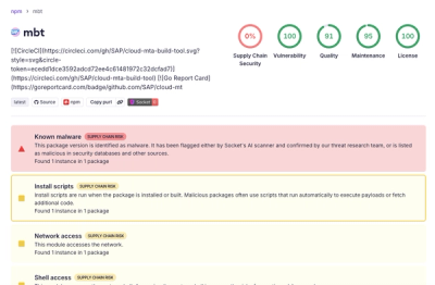
Compromised SAP CAP npm packages download and execute unverified binaries, creating urgent supply chain risk for affected developers and CI/CD environments.

Company News
Socket has acquired Secure Annex to expand extension security across browsers, IDEs, and AI tools.