
Security News
Supply Chain Attack Detected in Solana's web3.js Library
A supply chain attack has been detected in versions 1.95.6 and 1.95.7 of the popular @solana/web3.js library.
By Sarah Gooding - Dec 03, 2024
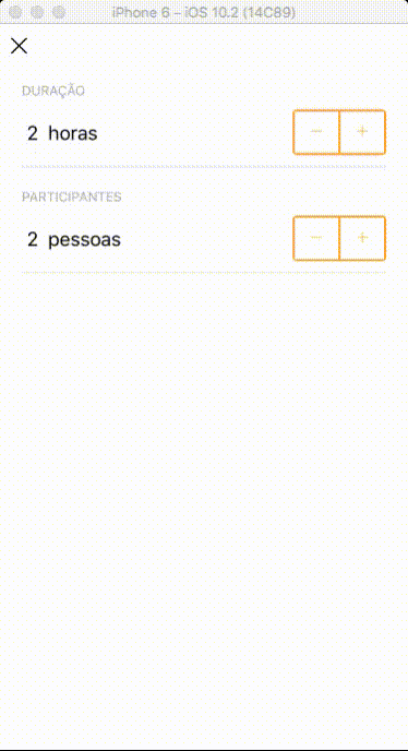
react-native-stepper
Advanced tools
A custome Stepper inspired in SimpleStepper by Brian Sinnicke


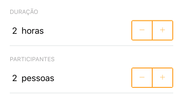
A super simple react-native stepper implementation. Check out the props below for customization.
This package was inspired in react-native-simple-stepper develop by Brian.
This is my first package with react-native and i need a stepper implementation that i could use any type of component as a stepper button.
npm i react-native-stepper --save
import Stepper from 'react-native-stepper'

//...

render() {
  return (

      //...

      <Stepper
        initValue={duration}
        minValue={0}
        stepValue={1}
        style={stepperStyle}
        decreaseComponent={(<Icon family="Ionicons" name="remove" style={stepperStyle.iconStyle} />)}
        increaseComponent={(<Icon family="Ionicons" name="add" style={stepperStyle.iconStyle} />)}
        valueChanged={(value) => this.onChangeDurationFilter(value)}
      />

      //...

  )
}

onChangeDurationFilter(value) {
  // ... update your app state here
}

//...
I do not provide any style or default component for decrease and increase buttons, you must provide both. To implement your style you must follow the schema below.
const stepperStyle = StyleSheet.create({
  containerStyle: {
    flexDirection: 'row'
  },
  decreaseButtonStyle: {
    padding: 0,
    borderWidth: 2,
    borderRightWidth: 1,
    borderColor: 'red',
    borderTopLeftRadius: 4,
    borderBottomLeftRadius: 4
  },
  increaseButtonStyle: {
    padding: 0,
    borderWidth: 2,
    borderLeftWidth: 1,
    borderColor: 'red',
    borderTopRightRadius: 4,
    borderBottomRightRadius: 4
  }
});
| Name | Type |Description | Default
| ------------ | ------------- | ------------ |------------ |------------ |
| initValue | Number | Initial value. | 0
| minValue | Number | The minimum value that stepper counter can achieve. | -
| maxValue | Number | The maximum value that stepper counter can achieve. | -
| maxValue | Number | The max value that stepper counter can achieve. | 1
| decreaseComponent | Component | Component that will be rendered as decrease button | <Text>-</Text>
| increaseComponent | Component | Component that will be rendered as increase button | <Text>-</Text>
| style | StyleSheet Object | Style that will be applied in your stepper component | -
| valueChanged | Function | Fires when the value changes and the value will be passed down for processing like display or calculations. | FALSE
| minMessage | String or Function | Message fired when stepper achieve the minimum value | null
| maxMessage | String or Function | Message fired when stepper achieve the maximum value | null
| ignoreMinValidation | Boolean | !!! | FALSE
| ignoreMaxValidation | Boolean | !!! | FALSE
FAQs
A custome Stepper inspired in SimpleStepper by Brian Sinnicke
The npm package react-native-stepper receives a total of 9 weekly downloads. As such, react-native-stepper popularity was classified as not popular.
We found that react-native-stepper demonstrated a not healthy version release cadence and project activity because the last version was released a year ago. It has 1 open source maintainer collaborating on the project.
Did you know?

Socket for GitHub automatically highlights issues in each pull request and monitors the health of all your open source dependencies. Discover the contents of your packages and block harmful activity before you install or update your dependencies.
Security News
A supply chain attack has been detected in versions 1.95.6 and 1.95.7 of the popular @solana/web3.js library.

Research
Security News
A malicious npm package targets Solana developers, rerouting funds in 2% of transactions to a hardcoded address.

Security News
Research
Socket researchers have discovered malicious npm packages targeting crypto developers, stealing credentials and wallet data using spyware delivered through typosquats of popular cryptographic libraries.