What is react-otp-input?
The react-otp-input package is a React component for handling one-time password (OTP) inputs. It provides a customizable and easy-to-use interface for users to input OTPs, which are commonly used for two-factor authentication (2FA) and other security measures.
What are react-otp-input's main functionalities?
Basic OTP Input
This feature allows you to create a basic OTP input with a specified number of input fields. The `numInputs` prop determines the number of OTP input fields, and the `separator` prop allows you to customize the separator between the input fields.
import React, { useState } from 'react';
import OTPInput from 'react-otp-input';
const OTPComponent = () => {
const [otp, setOtp] = useState('');
return (
<OTPInput
value={otp}
onChange={setOtp}
numInputs={6}
separator={<span>-</span>}
/>
);
};
export default OTPComponent;
Custom Styling
This feature allows you to apply custom styles to the OTP input fields. The `inputStyle` prop accepts a style object that can be used to customize the appearance of each input field.
import React, { useState } from 'react';
import OTPInput from 'react-otp-input';

const OTPComponent = () => {
  const [otp, setOtp] = useState('');

  return (
    <OTPInput
      value={otp}
      onChange={setOtp}
      numInputs={6}
      inputStyle={{
        width: '2rem',
        height: '2rem',
        margin: '0 0.5rem',
        fontSize: '1.5rem',
        borderRadius: '4px',
        border: '1px solid rgba(0,0,0,0.3)'
      }}
    />
  );
};

export default OTPComponent;
Handling OTP Completion
This feature demonstrates how to handle the completion of OTP input. The `handleChange` function checks if the OTP length matches the expected number of inputs and performs an action (e.g., logging the OTP) when the OTP is complete.
import React, { useState } from 'react';
import OTPInput from 'react-otp-input';

const OTPComponent = () => {
  const [otp, setOtp] = useState('');

  const handleChange = (otp) => {
    setOtp(otp);
    if (otp.length === 6) {
      console.log('OTP Complete:', otp);
    }
  };

  return (
    <OTPInput
      value={otp}
      onChange={handleChange}
      numInputs={6}
    />
  );
};

export default OTPComponent;
Other packages similar to react-otp-input
react-pin-input
The react-pin-input package provides a similar functionality to react-otp-input, allowing users to input PINs or OTPs. It offers customization options for the input fields and supports various input types. Compared to react-otp-input, react-pin-input has a simpler API but may lack some advanced customization features.
react-code-input
The react-code-input package is another alternative for handling OTP or PIN inputs in React applications. It provides a highly customizable input component with support for different input types and styles. Compared to react-otp-input, react-code-input offers more flexibility in terms of styling and input handling.
react-otp-input-box
The react-otp-input-box package is a lightweight OTP input component for React. It focuses on simplicity and ease of use, making it a good choice for basic OTP input needs. Compared to react-otp-input, react-otp-input-box is more minimalistic and may not offer as many customization options.
react-otp-input


A fully customizable, one-time password input component for the web built with React.
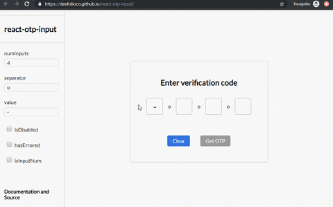
Live Demo
Installation

To install the latest stable version:
npm install --save react-otp-input
Still using v2?
No problem! You can find the documentation for v2 here
Basic usage:
import React, { useState } from 'react';
import OtpInput from 'react-otp-input';

export default function App() {
  const [otp, setOtp] = useState('');

  return (
    <OtpInput
      value={otp}
      onChange={setOtp}
      numInputs={4}
      renderSeparator={<span>-</span>}
      renderInput={(props) => <input {...props} />}
    />
  );
}
API
You can also pass a function that returns a component, where the function will get the index of the separator being rendered as an argument.
Name
| Type | Required | Default | Description |
|---|
| numInputs | number | true | 4 | Number of OTP inputs to be rendered. |
| renderInput | function | true | none | A function that returns the input that is supposed to be rendered for each of the input fields.
The function will get two arguments: inputProps and index. inputProps is an object that contains all the props that should be passed to the input being rendered (Overriding these props is not recommended because it might lead to some unexpected behaviour). index is the index of the input being rendered.
|
| onChange | function | true | console.log | Returns OTP code typed in inputs. |
| onPaste | function | false | none | Provide a custom onPaste event handler scoped to the OTP inputs container. Executes when content is pasted into any OTP field.
Example:
const handlePaste: React.ClipboardEventHandler = (event) => {
  const data = event.clipboardData.getData('text');
  console.log(data)
};
|
| value | string / number | true | '' | The value of the OTP passed into the component. |
| placeholder | string | false | none | Specify an expected value of each input. The length of this string should be equal to numInputs. |
| renderSeparator | component / function
| false | none | Provide a custom separator between inputs by passing a component. For instance, <span>-</span> would add - between each input. |
| containerStyle | style (object) / className (string) | false | none | Style applied or class passed to container of inputs. |
| inputStyle | style (object) / className (string) | false | none | Style applied or class passed to each input. |
| inputType | <input> type | false | text | The type of the input that will be passed to the input element being rendered. In v2 isInputNum used to set the input type as tel and prevented non numerical entries, so as to avoid the spin buttons added to the inputs with input type number. That behaviour is still supported if you pass tel to the inputType prop. |
| shouldAutoFocus | boolean | false | false | Auto focuses input on initial page load. |
| skipDefaultStyles | boolean | false | false | The component comes with default styles for legacy reasons. Pass true to skip those styles. This prop will be removed in the next major release. |
⚠️ Warning
Do not override the following props on the input component that you return from the renderInput prop. Doing so might lead to unexpected behaviour.
refvalueonChangeonFocusonBluronKeyDownonPasteonInputtypeinputMode
Migrating from v2
The v3 of react-otp-input is a complete rewrite of the library. Apart from making the API more customizable and flexible, this version is a complete rewrite of the library using TypeScript and React Hooks. Here are the breaking changes that you need to be aware of:
-
You now need to pass your own custom input component that will be rendered for each of the input fields via renderInput prop. This gives you the flexibility to customize the input fields as you desire. This also means that props like focusStyle, isDisabled, disabledStyle, hasErrored, errorStyle, isInputNum, isInputSecure, data-cy and data-testid are no longer supported. You can achieve the same functionality and more by passing the relevant props directly to the input component that you return from the renderInput prop.
-
The separator prop has now been renamed to renderSeparator. This prop now apart from accepting a component that will be rendered as a separator between inputs like it used to, now also accepts a function that returns a component. The function will get the index of the separator being rendered as an argument.
-
A new prop called inputType has been added to the component. This prop can be used to specify the type of the input that will be passed to the input element being rendered. The default value of this prop is number.
Migrating from v1
react-otp-input is now a controlled component to facilitate functionalities that weren't possible before from the application using it, such as clearing or pre-assigning values. For v1.0.0 and above, a value prop needs to be passed in the component for it to function as expected.
Development
To run the vite example:
cd example
npm run dev
Checklist


Contributing


Feel free to open issues and pull requests!
License

Contributors ✨
Thanks goes to these wonderful people (emoji key):
This project follows the all-contributors specification. Contributions of any kind welcome!


