
Product
Introducing Repository Access Permissions and Custom Roles
Socket now supports Custom Roles and Repository Access Permissions so organizations can control who can access specific repositories and actions.
By Joe Werle - Jun 19, 2026
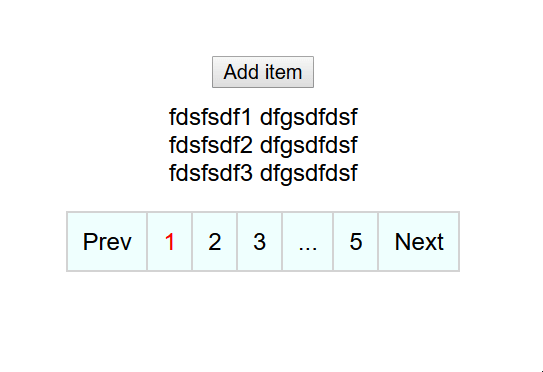
react-paginated-list
Advanced tools
A simple react component to render a paginated list ✨powered by styled-components 💅
A simple react component to render a paginated list ✨powered by styled-components 💅
npm install react-paginated-list
yarn install react-paginated-list
let users = [{'a': 123, 'b': 345}, {'c': 678, 'd': 891}];
return (
<PaginatedList
    list={users}
    itemsPerPage={3}
    renderList={(list) => (
      <>
        {list.map((item, id) => {
          return (
            <div key={id}>
              {item.a} {item.b}
            </div>
          );
        })}
      </>
    )}
  />);
To run the example project,
git clone https://github.com/rigelglen/react-paginated-list
npm run install-all
npm run dev
* indicates a required prop
| Prop | Description | Type | Default |
|---|---|---|---|
| list* | This is the list of items managed by the component. This list will be available in the renderList method to render your list | Array | - |
| renderList* | This is the function that renders each of your list items. | (list: Array) => JSX.Element | - |
| itemsPerPage | Number of items per page | number | 10 |
| onPageChange | Callback function that is called when the page is changed | (items: Array, currentPage: number) => void | - |
| isLoading | Sets whether the list is loading or not. | boolean | false |
| ControlItem | Styled Component for the pagination item | AnyStyledComponent | styled.li` |
| ControlContainer | Styled Component for the pagination controls | AnyStyledComponent | styled.div`` |
| PaginatedListContainer | Styled Component for the entire paginated list (contains the actual list and pagination controls) | AnyStyledComponent | styled.div`` |
| loadingItem | Component to be displayed when list is loading | JSX.Element | <p>Loading...</p> |
| breakText | Text to be shown for ellipsis | string | '...' |
| displayRange | The range of pages displayed | number | 3 |
| leftMargin | Number of extra pagination items to display on the left | number | 1 |
| rightMargin | Number of extra pagination items to display on the right | number | 1 |
| currentPage | Sets the initial page | number | 1 |
| controlClass | Class of the pagination box | string | 'pagination' |
| activeControlClass | Class of the active pagination item | string | 'active' |
| displayNumbers | Display pagination numbers | boolean | true |
| loopAround | Loop around after the end | boolean | false |
| breakClass | Class for the break item | string | 'pagination-break' |
| nextClass | Class of the next button | string | next |
| prevClass | Class of the prev button | string | prev |
| paginatedListContainerClass | Class of the entire paginated list (contains the actual list and pagination controls) | string | - |
| controlItemClass | Class of every pagination control item | string | pagination-item |
| showPrev | Show previous pagination control (does nothing if useMinimalControls is true) | boolean | true |
| showNext | Show next pagination control (does nothing if useMinimalControls is true) | boolean | true |
| nextText | Text inside next button | string | '〉' |
| prevText | Text inside prev button | string | '〈' |
| useMinimalControls | Hides next or previous button if there is no next or previous page respectively. | boolean | false |
Released under the MIT license. MIT: http://rem.mit-license.org, See LICENSE
FAQs
A simple react component to render a paginated list ✨powered by styled-components 💅
The npm package react-paginated-list receives a total of 99 weekly downloads. As such, react-paginated-list popularity was classified as not popular.
We found that react-paginated-list demonstrated a not healthy version release cadence and project activity because the last version was released a year ago. It has 1 open source maintainer collaborating on the project.
Did you know?

Socket for GitHub automatically highlights issues in each pull request and monitors the health of all your open source dependencies. Discover the contents of your packages and block harmful activity before you install or update your dependencies.
Product
Socket now supports Custom Roles and Repository Access Permissions so organizations can control who can access specific repositories and actions.

Product
Socket MCP now lets AI assistants review org alerts, investigate threats using the Socket threat feed, and inspect package files in addition to dependency scoring.

Product
Socket Firewall blocks malicious VS Code and Open VSX extensions before install, protecting developers from compromised editor marketplaces.