Research
Security News
Malicious npm Package Typosquats react-login-page to Deploy Keylogger
Socket researchers unpack a typosquatting package with malicious code that logs keystrokes and exfiltrates sensitive data to a remote server.
react-portal
Advanced tools
Package description
The react-portal package allows you to render components into a DOM node that exists outside the DOM hierarchy of the parent component. This is useful for creating modals, tooltips, and other UI elements that need to be rendered outside the main document flow.
Basic Portal Usage
This example demonstrates the basic usage of the react-portal package. It renders a div element outside the main DOM hierarchy, which can be useful for creating modals or tooltips.
import React from 'react';
import ReactDOM from 'react-dom';
import { Portal } from 'react-portal';
function App() {
return (
<div>
<h1>Main App</h1>
<Portal>
<div style={{ position: 'absolute', top: '50px', left: '50px', background: 'white', border: '1px solid black', padding: '10px' }}>
This is a portal content
</div>
</Portal>
</div>
);
}
export default App;Custom Portal Target
This example shows how to use a custom DOM node as the target for the portal. The content will be rendered inside the specified custom target element.
import React, { useRef } from 'react';
import ReactDOM from 'react-dom';
import { Portal } from 'react-portal';

function App() {
  const customTarget = useRef(null);

  return (
    <div>
      <h1>Main App</h1>
      <div ref={customTarget} id="custom-target" style={{ position: 'relative', height: '200px', border: '1px solid black' }}>
        Custom Target
      </div>
      <Portal node={customTarget.current}>
        <div style={{ position: 'absolute', top: '10px', left: '10px', background: 'white', border: '1px solid black', padding: '10px' }}>
          This is a portal content inside custom target
        </div>
      </Portal>
    </div>
  );
}

export default App;The react-dom package provides the createPortal function, which allows you to render children into a DOM node that exists outside the DOM hierarchy of the parent component. It is a part of the React core library and offers similar functionality to react-portal.
The react-reverse-portal package allows you to create portals that can be moved around in the DOM. It provides more advanced features compared to react-portal, such as the ability to move portals between different parts of the DOM dynamically.
The react-teleport package offers a simple API for rendering components outside the main DOM hierarchy. It is similar to react-portal but provides additional features like teleporting components to different parts of the DOM based on conditions.
Readme
Struggling with modals, lightboxes or loading bars in React? Look no further. This is the component that will help you.
Try http://miksu.cz/react-portal
Or git clone http://github.com/tajo/react-portal and open /examples/index.html
npm install react-portal --save
var React = require('react');
var Portal = require('react-portal');

var App = React.createClass({

  render: function() {
    var button1 = <button>Open portal with pseudo modal</button>;

    return (
      <Portal openByClickOn={button1} closeOnEsc={true} closeOnOutsideClick={true}>
        <PseudoModal>
          <h2>Pseudo Modal</h2>
          <p>This react component is appended to the document body.</p>
        </PseudoModal>
      </Portal>
    );
  }

});

var PseudoModal = React.createClass({

  render: function() {
    return (
      <div>
        {this.props.children}
        <p><button onClick={this.props.closePortal}>Close this</button></p>
      </div>
    );
  }

});

React.render(React.createElement(App), document.getElementById('react-body'));
The Portal expects one child (<Portal><Child ... /></Portal>) that will be ported.
If true, the portal is open. If false, the portal is closed. It's up to you to take care of the closing (aka taking care of the state).
The second way how to open the portal. This element will be rendered by the portal immediately
with onClick = open portal. How to close the portal then? It provides its child with
the callback this.props.closePortal. Or you can use built-in portal closing (see bellow).
Notice that you don't have to deal with the state (like when using the isOpened prop).
If true, the portal can be closed by the key ESC.
If true, the portal can be closed by the outside mouse click.
Please, create issues and pull requests.
git clone https://github.com/tajo/react-portal
cd react-portal
npm install
npm run dev
Inspired by the talk React.js Conf 2015 - Hype!, Ryan Florence
FAQs
Unknown package
We found that react-portal demonstrated a not healthy version release cadence and project activity because the last version was released a year ago. It has 1 open source maintainer collaborating on the project.
Did you know?

Socket for GitHub automatically highlights issues in each pull request and monitors the health of all your open source dependencies. Discover the contents of your packages and block harmful activity before you install or update your dependencies.

Research
Security News
Socket researchers unpack a typosquatting package with malicious code that logs keystrokes and exfiltrates sensitive data to a remote server.

Security News
The JavaScript community has launched the e18e initiative to improve ecosystem performance by cleaning up dependency trees, speeding up critical parts of the ecosystem, and documenting lighter alternatives to established tools.

Product
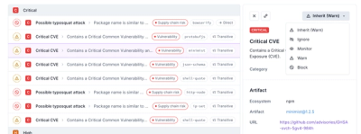
Socket now supports four distinct alert actions instead of the previous two, and alert triaging allows users to override the actions taken for all individual alerts.