Security News
GitHub Removes Malicious Pull Requests Targeting Open Source Repositories
GitHub removed 27 malicious pull requests attempting to inject harmful code across multiple open source repositories, in another round of low-effort attacks.
react-resizable-box
Advanced tools
Resizable component for React.

See demo: http://bokuweb.github.io/react-resizable-box/example/
npm i react-resizable-box
<Resizable
  customClass="item"
  width={320}
  height={200}
>
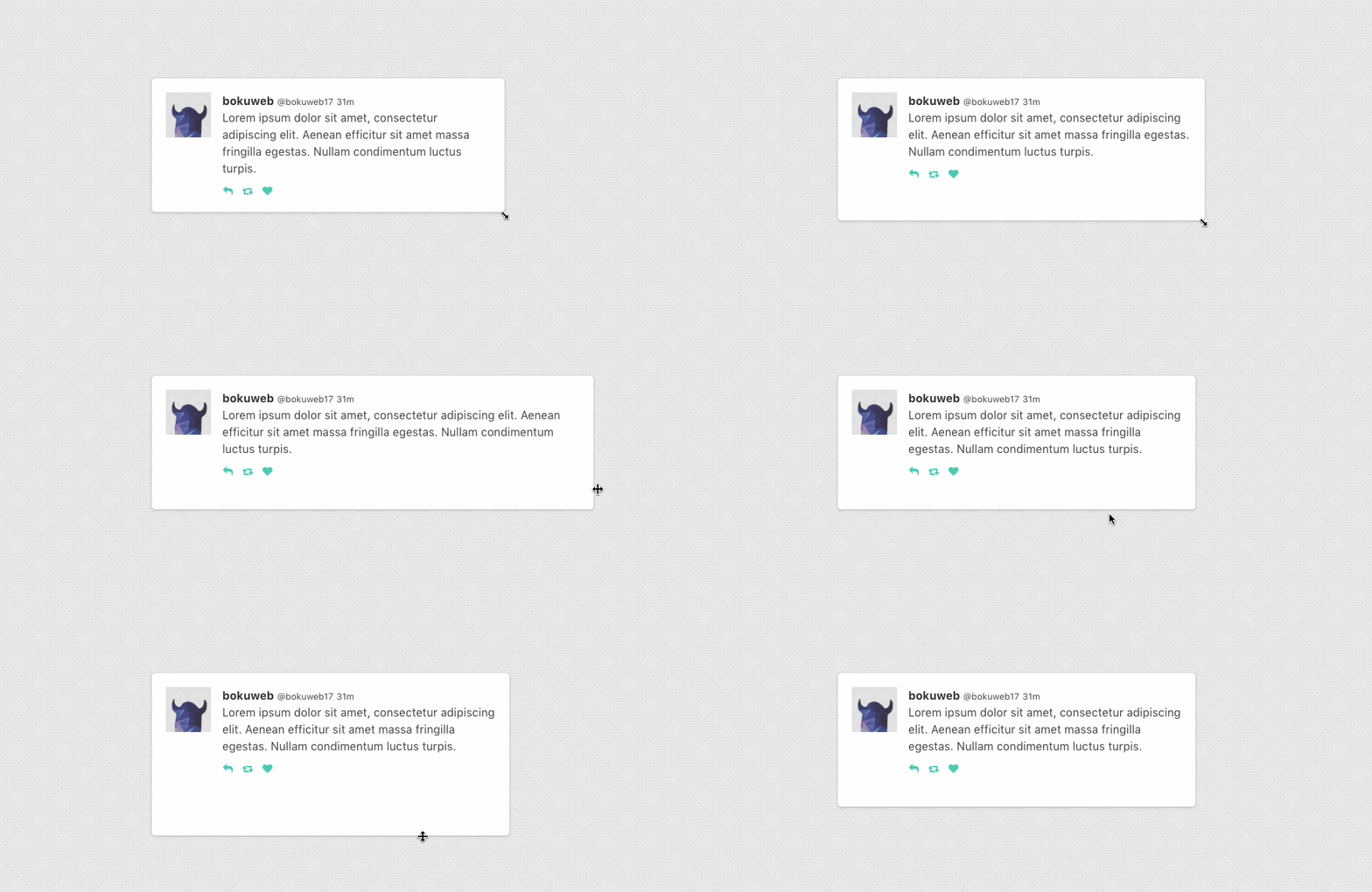
  Basic Sample
</Resizable>
<Resizable
  customClass="item"
  width={320}
  height={200}
  minWidth={160}
  minHeight={160}
  maxWidth={480}
  maxHeight={480}
>
  min size is 160px x 160px, max size is 480px x 480px.
</Resizable>
width: PropTypes.oneOfType([PropTypes.number, PropTypes.string])The width property is used to set the width of a resizable component.
For example, you can set 300, '300px', 50%.
If ommited, set 'auto'.
height: PropTypes.oneOfType([PropTypes.number, PropTypes.string])The height property is used to set the width of a resizable component.
For example, you can set 300, '300px', 50%.
If ommited, set 'auto'.
minWidth: PropTypes.numberThe minWidth property is used to set the minimum width of a resizable component.
minHeight: PropTypes.numberThe minHeight property is used to set the minimum height of a resizable component.
maxWidth: PropTypes.numberThe maxWidth property is used to set the maximum width of a resizable component.
maxHeight: PropTypes.numberThe maxheight property is used to set the maximum height of a resizable component.
customClass: PropTypes.stringThe customClass property is used to set the custom className of a resizable component.
customStyle: Proptypes.objectThe customStyle property is used to set the custom classStyle of a resizable component.
handleStyle: PropTypes.shape({ top: PropTypes.object, right: PropTypes.object, bottom: PropTypes.object, left: PropTypes.object, topRight: PropTypes.object, bottomRight: PropTypes.object, bottomLeft: PropTypes.object, topLeft: PropTypes.object })The handleStyle property is used to override the style of one or more resize handles.
Only the axis you specify will have its handle style replaced.
If you specify a value for right it will completely replace the styles for the right resize handle,
but other handle will still use the default styles.
isResizable: PropTypes.shape({ top: PropTypes.bool, right: PropTypes.bool, bottom: PropTypes.bool, left: PropTypes.bool, topRight: PropTypes.bool, bottomRight: PropTypes.bool, bottomLeft: PropTypes.bool, topLeft: PropTypes.bool })The isResizable property is used to set the resizable permission of a resizable component.
The permission of top, right, bottom, left, topRight, bottomRight, bottomLeft, topLeft direction resizing.
If omitted, all resizer are enabled.
If you want to permit only right direction resizing, set { top:false, right:true, bottom:false, left:false, topRight:false, bottomRight:false, bottomLeft:false, topLeft:false }.
onClick: PropTypes.funcCalls when resizable component clicked.
onTouchStart: PropTypes.funcCalls when resizable component touched.
onDoubleClick: PropTypes.funcCalls when resizable component double clicked.
onResizeStart: PropTypes.funcCalls when resizable component resize starts.
Calls back with (direction: string, event: object)
top, right, bottom, left, topRight, bottomRight, bottomLeft, and topLeft.mouse down eventonResize: PropTypes.funcCalls when resizable component resize.
Calls back with (direction: string, styleSize: object, clientSize: object, delta: object)
top, right, bottom, left, topRight, bottomRight, bottomLeft, and topLeft.{ width, height }
{ width, height }`
clientWidth and clientHeight.{ width, height }`
For example, when <Resizable width={100} height={200} style={{ padding: '20px'}} onResize={...} /> mounted and resize 'right' 20px, this callback is called with ('right', { width: 120, height: 200 }, { width: 160, height: 240 }, {width: 20, height: 0})
onResizeStop: PropTypes.funcCalls back with (direction: string, styleSize: object, clientSize: object, delta: object)
top, right, bottom, left, topRight, bottomRight, bottomLeft, and topLeft.{ width, height }
{ width, height }`
clientWidth and clientHeight.{ width, height }`
For example, when <Resizable width={100} height={200} style={{ padding: '20px'}} onResize={...} /> mounted and resize 'right' 20px, this callback is called with ('right', { width: 120, height: 200 }, { width: 160, height: 240 }, {width: 20, height: 0})
npm test
onResizeStart callback argument.'px' and '%' for width and height props.The MIT License (MIT)
Copyright (c) 2016 @Bokuweb
Permission is hereby granted, free of charge, to any person obtaining a copy of this software and associated documentation files (the "Software"), to deal in the Software without restriction, including without limitation the rights to use, copy, modify, merge, publish, distribute, sublicense, and/or sell copies of the Software, and to permit persons to whom the Software is furnished to do so, subject to the following conditions:
The above copyright notice and this permission notice shall be included in all copies or substantial portions of the Software.
THE SOFTWARE IS PROVIDED "AS IS", WITHOUT WARRANTY OF ANY KIND, EXPRESS OR IMPLIED, INCLUDING BUT NOT LIMITED TO THE WARRANTIES OF MERCHANTABILITY, FITNESS FOR A PARTICULAR PURPOSE AND NONINFRINGEMENT. IN NO EVENT SHALL THE AUTHORS OR COPYRIGHT HOLDERS BE LIABLE FOR ANY CLAIM, DAMAGES OR OTHER LIABILITY, WHETHER IN AN ACTION OF CONTRACT, TORT OR OTHERWISE, ARISING FROM, OUT OF OR IN CONNECTION WITH THE SOFTWARE OR THE USE OR OTHER DEALINGS IN THE SOFTWARE.
v1.1.0
FAQs
Unknown package
The npm package react-resizable-box receives a total of 553 weekly downloads. As such, react-resizable-box popularity was classified as not popular.
We found that react-resizable-box demonstrated a not healthy version release cadence and project activity because the last version was released a year ago. It has 1 open source maintainer collaborating on the project.
Did you know?

Socket for GitHub automatically highlights issues in each pull request and monitors the health of all your open source dependencies. Discover the contents of your packages and block harmful activity before you install or update your dependencies.

Security News
GitHub removed 27 malicious pull requests attempting to inject harmful code across multiple open source repositories, in another round of low-effort attacks.

Security News
RubyGems.org has added a new "maintainer" role that allows for publishing new versions of gems. This new permission type is aimed at improving security for gem owners and the service overall.

Security News
Node.js will be enforcing stricter semver-major PR policies a month before major releases to enhance stability and ensure reliable release candidates.