Security News
Node.js EOL Versions CVE Dubbed the "Worst CVE of the Year" by Security Experts
Critics call the Node.js EOL CVE a misuse of the system, sparking debate over CVE standards and the growing noise in vulnerability databases.
react-simple-charts
Advanced tools
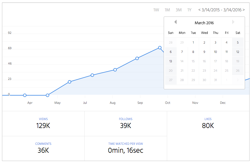
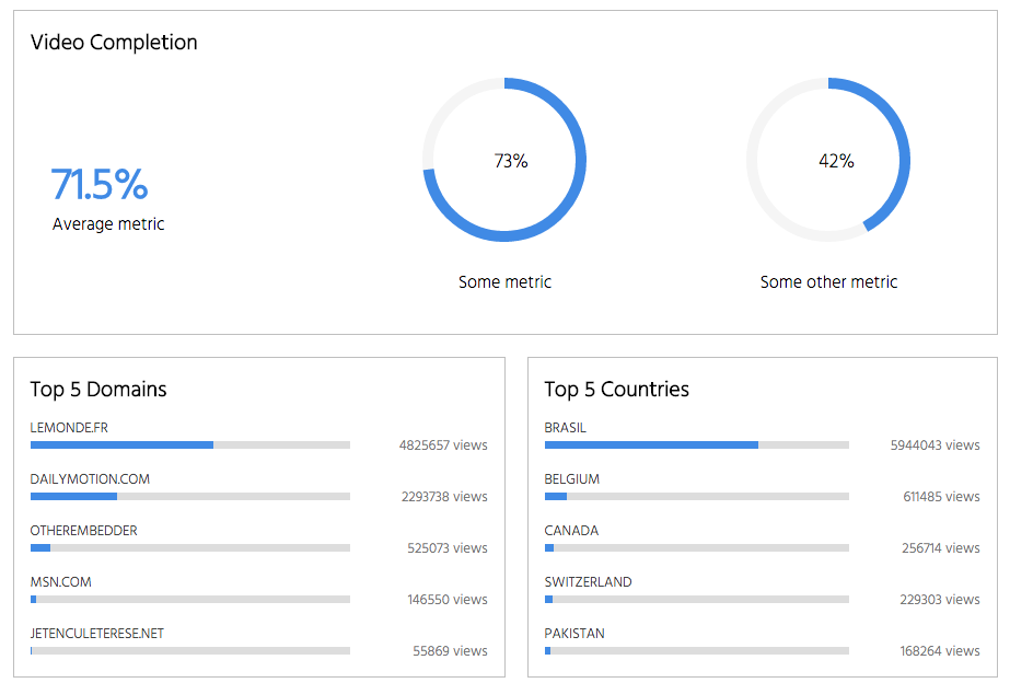
A collection of React Components usefull for creating dashboards or other type of number formatting. Currently there are 3 components: Area, BarMetric, and CirclePie.


npm install --save react-simple-charts
import {Area, CirclePie, BarMetric} from 'react-simple-charts'
A pure React/SVG charting library.
Data input is specified as follow: [{time: Unix MS timestamp, value: yValue, label: Text shown for this value}]
{
    width: 640,
    height: 320,
    border: 'none',
    strokeWidth: 2,
    useDynamicYMin: false,
    strokeColor: '#408AE5',
    pointsRadius: 5,
    tipsWidth: 240,
    tipsHeight: 22,
    tipsPadding: 10,
    tipStrokeWidth: 1,
    tipStrokeColor: '#BBBBBB',
    tipsFill: 'white',
    gridColor: 'rgba(230,230,230,.5)',
    labelFontSize: 12,
    labelTextShadow: '1px 1px #fff',
    labelColor: '#555',
    fillColor: 'rgba(191, 216, 246, 0.3)',
    maxOverflow: 20,
    yLabelsOutside: false,
    yLabelsPosition: 'left',
    yPadding: 10,
    data: [],
}
import Area from 'react-area-chart'

let data = [
    {time:1422766800000, value: 0, label: "active users"},
    {time:1422853200000, value: 10, label: "active users"},
    {time:1422939600000, value: 5, label: "active users"}
];
<Area width={900} height={300} data={data}/>
A micro bar metric component.
{
    metricName: 'points',
    value: 0,
    percent: 100,
    label: 'N/A'
}
import BarMetric from 'react-bar-metric'

<BarMetric label="Share of IE" percent={5} metricName="Nearing Zero"/>
A micro component for rendering a percentage value as an SVG circle.
{
    width: 150,
    height: 150,
    border: 'none',
    strokeWidth: 10,
    labelColor: '#111111',
    labelFontSize: '18px',
    strokeColor: '#408AE5',
    railColor: '#f5f5f5',
    fillColor: 'none',
    percent: 70,
    padding: 0,
}
import CirclePie from 'react-circle-pie'

<CirclePie percent={5}/>
The following libraries are peer dependencies and are expected to be included in your own package:
Made with love at Dailymotion in NYC. Designed by Leury Hidalgo and created by Samuel Delesque.
FAQs
Simple react charts in plain svg. Also part of Salad-UI.
The npm package react-simple-charts receives a total of 16 weekly downloads. As such, react-simple-charts popularity was classified as not popular.
We found that react-simple-charts demonstrated a not healthy version release cadence and project activity because the last version was released a year ago. It has 1 open source maintainer collaborating on the project.
Did you know?

Socket for GitHub automatically highlights issues in each pull request and monitors the health of all your open source dependencies. Discover the contents of your packages and block harmful activity before you install or update your dependencies.

Security News
Critics call the Node.js EOL CVE a misuse of the system, sparking debate over CVE standards and the growing noise in vulnerability databases.

Security News
cURL and Go security teams are publicly rejecting CVSS as flawed for assessing vulnerabilities and are calling for more accurate, context-aware approaches.

Security News
Bun 1.2 enhances its JavaScript runtime with 90% Node.js compatibility, built-in S3 and Postgres support, HTML Imports, and faster, cloud-first performance.