
Product
Socket for Jira Is Now Available
Socket for Jira lets teams turn alerts into Jira tickets with manual creation, automated ticketing rules, and two-way sync.
By Jeppe Hasseriis - Apr 20, 2026
react-sliding-pane
Advanced tools
Pane that slides out of the window side. Like panes from Google Tag Manager.
Features:
See changelog.
Thanks BrowserStack for support!
I've found sliding pane very helpful in situations when normal modal window (or just popup) is not enough: long list with pagination, multi-step form or nested popups.
Install module and peer dependencies:
npm i --save react react-dom react-sliding-pane
import React, { Component, useState } from "react";
import { render } from "react-dom";
import SlidingPane from "react-sliding-pane";
import "react-sliding-pane/dist/react-sliding-pane.css";
const App = () => {
const [state, setState] = useState({
isPaneOpen: false,
isPaneOpenLeft: false,
});
return (
<div>
<button onClick={() => setState({ isPaneOpen: true })}>
Click me to open right pane!
</button>
<div style={{ marginTop: "32px" }}>
<button onClick={() => setState({ isPaneOpenLeft: true })}>
Click me to open left pane with 20% width!
</button>
</div>
<SlidingPane
className="some-custom-class"
overlayClassName="some-custom-overlay-class"
isOpen={state.isPaneOpen}
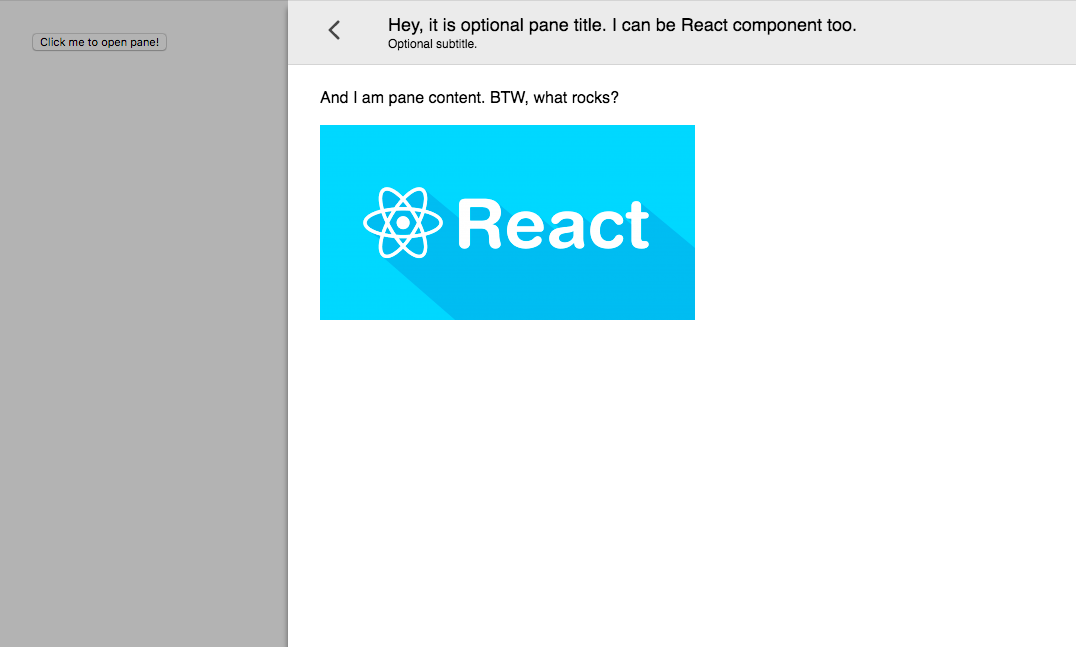
title="Hey, it is optional pane title. I can be React component too."
subtitle="Optional subtitle."
onRequestClose={() => {
// triggered on "<" on left top click or on outside click
setState({ isPaneOpen: false });
}}
>
<div>And I am pane content. BTW, what rocks?</div>
<br />
<img src="img.png" />
</SlidingPane>
<SlidingPane
closeIcon={<div>Some div containing custom close icon.</div>}
isOpen={state.isPaneOpenLeft}
title="Hey, it is optional pane title. I can be React component too."
from="left"
width="200px"
onRequestClose={() => setState({ isPaneOpenLeft: false })}
>
<div>And I am pane content on left.</div>
</SlidingPane>
</div>
);
};
render(<App />, document.getElementById("app"));
| Prop | Required | Default | Description |
|---|---|---|---|
| isOpen | ✅ | Is pane open | |
| title | Title in header | ||
| subtitle | Subtitle in header | ||
| from | "right" | Direction from pane will appear | |
| children | Content of pane | ||
| className | CSS class name. See react-modal | ||
| overlayClassName | CSS class name of overlay. See react-modal | ||
| width | CSS string for width pane. | ||
| closeIcon | Custom close icon | ||
| shouldCloseOnEsc | Enable pane close on ESC | ||
| hideHeader | Hide pane header | ||
| onRequestClose | ✅ | Called on close icon press | |
| onAfterOpen | Called after open |
npm run docs
open docs/example.html
npm
FAQs
Full height sliding pane
The npm package react-sliding-pane receives a total of 17,396 weekly downloads. As such, react-sliding-pane popularity was classified as popular.
We found that react-sliding-pane demonstrated a not healthy version release cadence and project activity because the last version was released a year ago. It has 1 open source maintainer collaborating on the project.
Did you know?

Socket for GitHub automatically highlights issues in each pull request and monitors the health of all your open source dependencies. Discover the contents of your packages and block harmful activity before you install or update your dependencies.
Product
Socket for Jira lets teams turn alerts into Jira tickets with manual creation, automated ticketing rules, and two-way sync.

Company News
Socket won two 2026 Reppy Awards from RepVue, ranking in the top 5% of all sales orgs. AE Alexandra Lister shares what it's like to grow a sales career here.

Security News
NIST will stop enriching most CVEs under a new risk-based model, narrowing the NVD's scope as vulnerability submissions continue to surge.