
Product
Introducing License Enforcement in Socket
Ensure open-source compliance with Socket’s License Enforcement Beta. Set up your License Policy and secure your software!
By Philipp Burckhardt - Oct 17, 2024
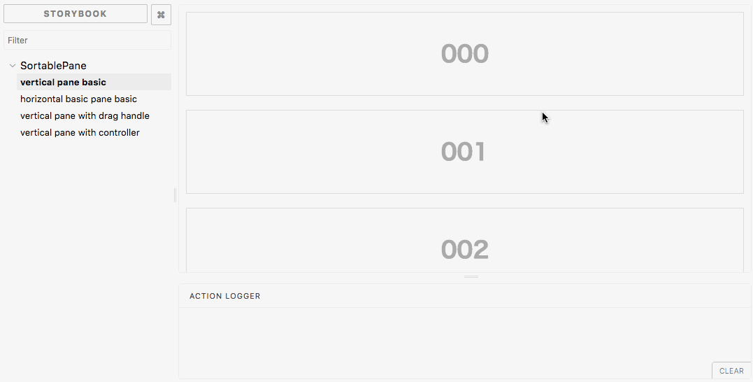
react-sortable-pane
Advanced tools
Sortable and resizable pane component for react.


npm i react-sortable-pane
or
yarn add react-sortable-pane
If you need not to control SortablePane state, please use defaultSize and defaultOrder.
import * as React from 'react';
import { SortablePane, Pane } from 'react-sortable-pane';

export default function SimpleUncontrolledExample() {
  const panes = [0, 1, 2].map(key => (
    <Pane key={key} defaultSize={{ width: '100%', height: 120 }}>
      00{key}
    </Pane>
  ));
  return (
    <div>
      <SortablePane direction="vertical" margin={20} defaultOrder={['0', '1', '2']}>
        {panes}
      </SortablePane>
    </div>
  );
}
If you need to control SortablePanestate by yourself, please use size and order.
import * as React from 'react';
import { SortablePane, Pane } from 'react-sortable-pane';

type State = {
  order: string[];
  panes: { [key: string]: { height: number } };
};

export default class SimpleControlledFullExample extends React.Component<{}, State> {
  state = {
    order: ['2', '1', '0'],
    panes: { '0': { height: 100 }, '1': { height: 200 }, '2': { height: 300 } },
  };

  render() {
    const panes = [0, 1, 2].map(key => (
      <Pane key={key} size={{ width: '100%', height: this.state.panes[key].height }}>
        00{key}
      </Pane>
    ));
    return (
      <div>
        <SortablePane
          direction="vertical"
          margin={20}
          order={this.state.order}
          onOrderChange={order => {
            this.setState({ order });
          }}
          onResizeStop={(e, key, dir, ref, d) => {
            this.setState({
              panes: { ...this.state.panes, [key]: { height: this.state.panes[key].height + d.height } },
            });
          }}
        >
          {panes}
        </SortablePane>
      </div>
    );
  }
}
| Props | Required | Type | Default | Description |
|---|---|---|---|---|
className | string | undefined | Specify className of component. | |
style | React.CssProperties | {} | Original style of component. | |
direction | 'horizontal' | 'vertical' | horizontal | The direction is used to set the direction of a component. | |
order | string[] | undefined | The order is used to control Pane order. If you need not to control Pane state, you can omit this property. (See also, controlled) | |
defaultOrder | string[] | undefined | The defaultOrder is used to set default Pane order. If you need to control Pane state, please use order property. (See also, uncontrolled) | |
margin | number | 0 | The margin is used to set the margin between Pane component. | |
isSortable | boolean | true | The isSortable is used to control whether panes can be dragged or not. | |
disableEffect | boolean | false | The disableEffect is used to disable floating effect. | |
dragHandleClassName | string | undefined | The dragHandleClassName is a class name of an element which should handle drag events for panes. | |
onOrderChange | (order: string[]) => void | undefined | It is called when Pane component order changed. The argument order is array of react element's key. | |
onResizeStart | (e: React.MouseEvent | React.TouchEvent, key: string, dir: PaneResizeDirection) => void | undefined | It is called when Pane component resize start. | |
onResize | (e: MouseEvent | TouchEvent, key: string, dir: PaneResizeDirection, elementRef: HTMLElement, delta: PaneSize) => void | undefined | It is called when Pane component resize. | |
onResizeStop | (e: MouseEvent | TouchEvent, key: string, dir: PaneResizeDirection, elementRef: HTMLElement, delta: PaneSize) => void | undefined | It is called when Pane component resize stop. | |
onDragStart | (e: React.MouseEvent | React.TouchEvent, key: string, elementRef: HTMLElement) => void | undefined | It is called when Pane component dragging starts. | |
onDragStop | (e: MouseEvent | TouchEvent, key: PaneKey, elementRef: HTMLElement, order: string[]) => void | undefined | It is called when Pane component dragging stop. |
| Props | Required | Type | Default | Description |
|---|---|---|---|---|
className | string | undefined | Specify className of component. | |
style | React.CssProperties | {} | Original style of component. | |
defaultSize | { width?: (number | string), height?: (number | string) } | auto | Specifies the width and height that the dragged item should start at. For example, you can set 300, '300px', 50%. | |
size | { width?: (number | string), height?: (number | string) } | auto | The size property is used to set the size of the component. For example, you can set 300, '300px', '50%'. | |
minWidth | number | string | 10px | The minWidth is used to set the minimum width of a Pane component. | |
minHeight | number | string | 10px | The minHeight is used to set the minimum height of a Pane component. | |
maxWidth | number | string | undefined | The maxWidth is used to set the maximum width of a Pane component. | |
maxHeight | number | string | undefined | The maxHeight is used to set the maximum height of a Pane component. | |
grid | [number, number] | [1, 1] | The maxHeight is used to set the maximum height of a Pane component. | |
resizable | { x: boolean, y: boolean, xy: boolean } | { x: true, y: true, xy: true } | The resizable is used to set the resizable permission of a component. |
flowtype definition.TypeScript instead of flowtype.defaultSize, defaultOrder, order, size props to control(or uncontrol) SortablePane state.order property.re-resizable instead of react-resizable-box)grid props.grid props. (#93)onResizeStart and onResizeStop not fired.prop-types package.user-select: none when resizeing or moving.isSortable props. (#34 thanks @lanVS)publised.
The MIT License (MIT)
Copyright (c) 2018 @bokuweb
Permission is hereby granted, free of charge, to any person obtaining a copy of this software and associated documentation files (the "Software"), to deal in the Software without restriction, including without limitation the rights to use, copy, modify, merge, publish, distribute, sublicense, and/or sell copies of the Software, and to permit persons to whom the Software is furnished to do so, subject to the following conditions:
The above copyright notice and this permission notice shall be included in all copies or substantial portions of the Software.
THE SOFTWARE IS PROVIDED "AS IS", WITHOUT WARRANTY OF ANY KIND, EXPRESS OR IMPLIED, INCLUDING BUT NOT LIMITED TO THE WARRANTIES OF MERCHANTABILITY, FITNESS FOR A PARTICULAR PURPOSE AND NONINFRINGEMENT. IN NO EVENT SHALL THE AUTHORS OR COPYRIGHT HOLDERS BE LIABLE FOR ANY CLAIM, DAMAGES OR OTHER LIABILITY, WHETHER IN AN ACTION OF CONTRACT, TORT OR OTHERWISE, ARISING FROM, OUT OF OR IN CONNECTION WITH THE SOFTWARE OR THE USE OR OTHER DEALINGS IN THE SOFTWARE.
FAQs
Unknown package
The npm package react-sortable-pane receives a total of 206 weekly downloads. As such, react-sortable-pane popularity was classified as not popular.
We found that react-sortable-pane demonstrated a not healthy version release cadence and project activity because the last version was released a year ago. It has 1 open source maintainer collaborating on the project.
Did you know?

Socket for GitHub automatically highlights issues in each pull request and monitors the health of all your open source dependencies. Discover the contents of your packages and block harmful activity before you install or update your dependencies.
Product
Ensure open-source compliance with Socket’s License Enforcement Beta. Set up your License Policy and secure your software!

Product
We're launching a new set of license analysis and compliance features for analyzing, managing, and complying with licenses across a range of supported languages and ecosystems.

Product
We're excited to introduce Socket Optimize, a powerful CLI command to secure open source dependencies with tested, optimized package overrides.