Security News
PyPI Introduces Digital Attestations to Strengthen Python Package Security
PyPI now supports digital attestations, enhancing security and trust by allowing package maintainers to verify the authenticity of Python packages.
react-stepzilla
Advanced tools
A react multi-step, wizard component for managing data collection via forms and sub components
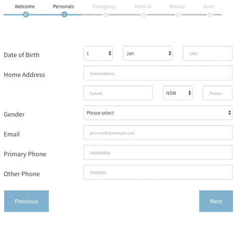
is a multi-step, wizard component for sequential data collection. It basically lets you throw a bunch of react components at it (data forms, text / html components etc) and it will take the user through those components in steps. If it's a data-entry form it can tigger validation and only proceed if the data is valid.

:+1: :sparkles: :camel: :tada: :rocket: :metal: :octocat:
Full example usage code is available in the src/examples directory. Have a look at a live working version here
npm install --save react-stepzilla
var StepZilla = require('react-stepzilla')
name indicates the title of the UI step and component is what loads.const steps =
[
{name: 'Step 1', component: <Step1 />},
{name: 'Step 2', component: <Step2 />},
{name: 'Step 3', component: <Step3 />},
{name: 'Step 4', component: <Step4 />},
{name: 'Step 5', component: <Step5 />}
]
    <div className='step-progress'>
        <StepZilla steps={steps}/>
    </div>
// hide or show Next and Previous Buttons at the bottom
showNavigation: true | false

// disable or enable the steps UI navigation on top
showSteps: true | false

// disable or enable onClick step jumping from the UI navigation on top
stepsNavigation: true | false

// show or hide the previous button in the last step (maybe the last step is a thank you message and you don't want them to go back)
prevBtnOnLastStep: true | false

// dev control to disable validation rules called in step components **
dontValidate: true | false

// by default if you hit the Enter key on any element it validates the form and moves to next step if validation passes. Use this to prevent this behaviour
preventEnterSubmission: true | false

// specify what step to start from in the case you need to skip steps (send in a 0 based index for the item in the steps array. e.g. 2 will load <Step3 /> initially)
startAtStep: [stepIndex]

// specify what the Next button text should be in the step before the last (This is usually the last "Actionable" step. You can use this option to change the Next button to say Save - if you save the form data collected in previous steps)
nextTextOnFinalActionStep: "Save"
example options usage:
<div className='step-progress'>
    <StepZilla steps={steps} stepsNavigation={false} prevBtnOnLastStep={false} startAtStep=2 />
</div>
** if one of your components is a form that requires validation before moving to the next component, then that component needs to implement a isValidated() public method which validates the form and returns true/false if the data is valid. For an e.g. on this have a look at the src/examples/Step2 component.
** validation can also be Async and therefore Promise based. This is useful if you do server side validation or you want to save data to a server and only proceed if it was a success. For an e.g. on this have a look at the src/examples/Step3 component.
also if you want some default style, copy the source from src/css/main.css code into your project (the above look in the picture also requires bootstrap)
jumpToStep as a prop into all your react step componentsthis.props.jumpToStep(2) will jump to your 3rd step (it uses a zero based index)src/examples/Step3 for an actual usage examplenpm installnpm run build to transpile the jsx into distnpm run build-example builds and packs the example app into the 'docs' folder so it can be accessed via ghpagesA full example is found in the src/examples directory.
npm installnpm run examplehttp://localhost:8080/webpack-dev-server/src/examples/index.html in your browsernpm run test command run testsnpm run test:watch command run test in watch modenpm run test:coverage command to generate full coverage report (shown in terminal and as lcov report in coverage directory)Current coverage sitting at v4.0.0:
Statements   : 50.35% ( 72/143 ), 6 ignored
Branches     : 43.8% ( 53/121 ), 20 ignored
Functions    : 72.97% ( 27/37 ), 11 ignored
Lines        : 28.87% ( 28/97 )
FAQs
A react multi-step, wizard component for managing data collection via forms and sub components
The npm package react-stepzilla receives a total of 4,549 weekly downloads. As such, react-stepzilla popularity was classified as popular.
We found that react-stepzilla demonstrated a not healthy version release cadence and project activity because the last version was released a year ago. It has 2 open source maintainers collaborating on the project.
Did you know?

Socket for GitHub automatically highlights issues in each pull request and monitors the health of all your open source dependencies. Discover the contents of your packages and block harmful activity before you install or update your dependencies.

Security News
PyPI now supports digital attestations, enhancing security and trust by allowing package maintainers to verify the authenticity of Python packages.

Security News
GitHub removed 27 malicious pull requests attempting to inject harmful code across multiple open source repositories, in another round of low-effort attacks.

Security News
RubyGems.org has added a new "maintainer" role that allows for publishing new versions of gems. This new permission type is aimed at improving security for gem owners and the service overall.