Security News
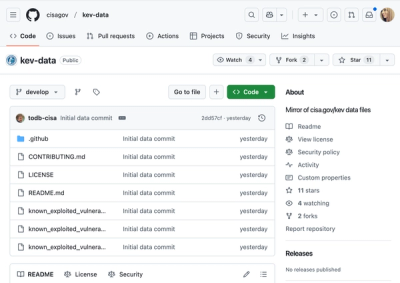
CISA Brings KEV Data to GitHub
CISA's KEV data is now on GitHub, offering easier access, API integration, commit history tracking, and automated updates for security teams and researchers.
react-svg-pan-zoom
Advanced tools
react-svg-pan-zoom is a React component that adds pan and zoom features to the SVG images. It helps to display big SVG images in a small space.
available at http://chrvadala.github.io/react-svg-pan-zoom/
This component can work in four different modes depending on the selected tool:
npm install --save react-svg-pan-zoom
yarn add react-svg-pan-zoom
<script src="https://unpkg.com/prop-types@15/prop-types.js"></script>
<script src="https://unpkg.com/react-svg-pan-zoom@3"></script>
<ReactSVGPanZoom>.<UncontrolledReactSVGPanZoom>.setPointOnViewerCenter, reset methods and className, style propsauto, improves default toolbarpreventPanOutside and scaleFactor propsminiatureBackground, miniatureHeight, Minor improvements & fixdisableDoubleClickZoomWithToolAutoscaleFactorOnWheel, Upgrades depsscaleFactorMax, scaleFactorMin props (#71), Upgrades depsonPan and onZoom callbacks, Upgrade deps, Fixes boundaries featuretoolbarProps.SVGAlignX and toolbarProps.SVGAlignY props. Adds alignment configuration in fitToViewer(SVGAlignX = "left", SVGAlignY = "top") method (#120). Upgrades deps.<UncontrolledReactSVGPanZoom /> component and makes <ReactSVGPanZoom> a stateless component (except for some optimizations); Moves props related to miniature and toolbar, respectively into the miniatureProp and toolbarProp props. Migration guide is available here.fitToViewer method #167, adds activeToolColor property #168, upgrades depsFAQs
A React component that adds pan and zoom features to SVG
The npm package react-svg-pan-zoom receives a total of 61,506 weekly downloads. As such, react-svg-pan-zoom popularity was classified as popular.
We found that react-svg-pan-zoom demonstrated a healthy version release cadence and project activity because the last version was released less than a year ago. It has 0 open source maintainers collaborating on the project.
Did you know?

Socket for GitHub automatically highlights issues in each pull request and monitors the health of all your open source dependencies. Discover the contents of your packages and block harmful activity before you install or update your dependencies.

Security News
CISA's KEV data is now on GitHub, offering easier access, API integration, commit history tracking, and automated updates for security teams and researchers.

Security News
Opengrep forks Semgrep to preserve open source SAST in response to controversial licensing changes.

Security News
Critics call the Node.js EOL CVE a misuse of the system, sparking debate over CVE standards and the growing noise in vulnerability databases.