Security News
PyPI’s New Archival Feature Closes a Major Security Gap
PyPI now allows maintainers to archive projects, improving security and helping users make informed decisions about their dependencies.
react-time-picker-input
Advanced tools
Simple and light time picker for React app. No moment.js needed
npm install react-time-picker-input
yarn add react-time-picker-input
import TimePicker from 'react-time-picker-input'
import "react-time-picker-input/dist/components/TimeInput.css"
Here's an example of basic usage:
import React, { useState } from 'react';
import TimePicker from 'react-time-picker-input';
function TimePickerTest() {
const [value, setValue] = useState('10:00');
return (
<div>
<TimePicker
onChange={(newValue)=>setValue(value)}
value={value}
/>
</div>
);
}
| PropName | Type | default | description |
|---|---|---|---|
| onChange | function | (date)=>{} | It fires every time that time is valid (minute hour exists) and returns date parameter which is date in string 24 hour format |
| onChangeEveryFormat | function | (date)=>{} | Similar to onChange but it can be used when allowDelete is true to get every value no matter if it is valid |
| value | String | "- -" | Defines default value of TimePicker. Required format ("HH:mm") ex("22:04") -> always 24Hour format |
| hour12Format | boolean | false | make it true to make input 12HourFormat support see on demo example |
| allowDelete | boolean | false | make it true if you want to allow user to delete fields (hour and minutes) using Backspace |
| disabled | boolean | false | make it true if you want to block user editting (no change on input can happen and cursor is turned to disabled) |
| eachInputDropdown | boolean | false | make it true if you want to activate drodpown for each input (default is automatically not manually managed) |
| manuallyDisplayDropdown | boolean | false | make it true if use eachInputDropdown prop to turn each dropdown to manually controlled mode |
| fullTimeDropdown | boolean | false | make it true if you want to activate full dropdown time see demo |
.react-time-input-picker {
  // css code here
}
.react-time-input-picker #react-time-input-picker__hourInput {
  // css code here
}
.react-time-input-picker input#react-time-input-picker__minuteInput {
  // css code here
}
.react-time-input-picker input#react-time-input-picker__amPm {
  // css code here
}
.react-time-input-picker input:focus {
  // css code here
}
or
.react-time-input-picker input(//inputSelector):focus
{
  // css code here
}
.input-time-mobile {
  // css here
}
Made By Eagle Zone
FAQs
Simple react imte picker input
The npm package react-time-picker-input receives a total of 345 weekly downloads. As such, react-time-picker-input popularity was classified as not popular.
We found that react-time-picker-input demonstrated a not healthy version release cadence and project activity because the last version was released a year ago. It has 1 open source maintainer collaborating on the project.
Did you know?

Socket for GitHub automatically highlights issues in each pull request and monitors the health of all your open source dependencies. Discover the contents of your packages and block harmful activity before you install or update your dependencies.

Security News
PyPI now allows maintainers to archive projects, improving security and helping users make informed decisions about their dependencies.

Research
Security News
Malicious npm package postcss-optimizer delivers BeaverTail malware, targeting developer systems; similarities to past campaigns suggest a North Korean connection.

Security News
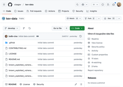
CISA's KEV data is now on GitHub, offering easier access, API integration, commit history tracking, and automated updates for security teams and researchers.