Huge News!Announcing our $40M Series B led by Abstract Ventures.Learn More →
react-tooltip-controller
Advanced tools
react-tooltip-controller - npm Package Compare versions
Comparing version 1.0.4 to 1.0.5
| { | ||
| "name": "react-tooltip-controller", | ||
| "version": "1.0.4", | ||
| "version": "1.0.5", | ||
| "description": "A feature-rich React component for controlling tooltips / pop-up menus", | ||
@@ -5,0 +5,0 @@ "author": "dbilgili", |
280
README.md
@@ -1,31 +0,285 @@ | ||
| # react-tooltip-controller | ||
| # React-Tooltip-Controller | ||
| > A feature-rich React component for controlling tooltips / pop-up menus | ||
| This is a feature-rich React component for controlling tooltips. Not only for tooltips, but you can use it for various interaction requirements. | ||
| [](https://www.npmjs.com/package/react-tooltip-controller) [](https://standardjs.com) | ||
| It seamlessly integrates into your markup without breaking it. | ||
| ## Install | ||
| Visit the [examples page](https://dbilgili.github.io/React-Tooltip-Controller/) to discover the functionalities. | ||
| ```bash | ||
| npm install --save react-tooltip-controller | ||
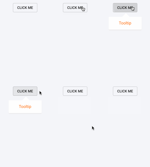
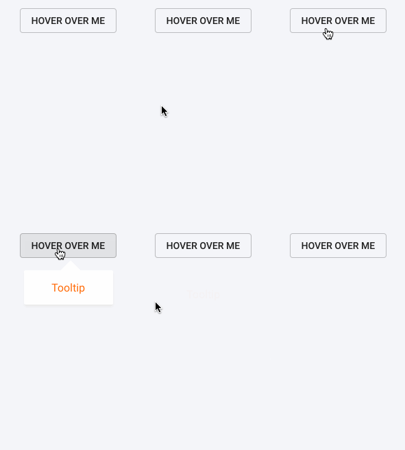
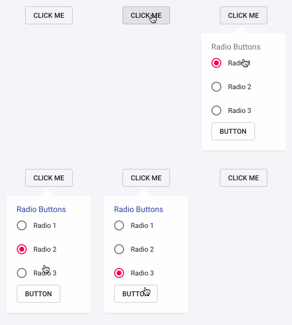
| | Basic Tooltip | Animated Tooltip | Advanced Tooltip | | ||
| |---|---|---| | ||
| |  |  |  | | ||
| #### Highlights | ||
| - Supports `click`, `hover`, `hover-hold` and `hover-interact` detections. | ||
| - Each tooltip can be animated individually. | ||
| - Set whether the tooltip closes when clicked on it. | ||
| - Close the tooltip manually by assigning a variable. | ||
| - Retrieve the state of the tooltip (whether open or not). | ||
| - Set a timeout to automatically close the tooltip. | ||
| - Position the tooltip relative to the triggering element. | ||
| - Automatically center the tooltip along the X axis for dynamically sized elements. | ||
| ## Installing | ||
| `npm install react-tooltip-controller` | ||
| After installing the module, import the following components: | ||
| ```javascript | ||
| import {ToolTipController, Select} from 'react-tooltip-controller' | ||
| ``` | ||
| ## Usage | ||
| ## Basic Usage | ||
| ```jsx | ||
| ```html | ||
| <ToolTipController | ||
| detect="click" | ||
| offsetY="center" | ||
| offsetY={20}> | ||
| // Selects the element controlling the tooltip | ||
| <Select> | ||
| <button>Click me</button> | ||
| </Select> | ||
| // Custom tooltip component | ||
| <TooltipComponent/> | ||
| </ToolTipController> | ||
| ``` | ||
| Anything, but `<Select>` component, wrapped by `<ToolTipController>` is portalled to the bottom of the `<body>` tag in the DOM. | ||
| You can either wrap a component or JSX Markup with `<ToolTipController>`. | ||
| By wrapping the `<button>` with `<Select>` component, `<TooltipComponent/>` is attached to `<button>` and set to be triggered by a `click` event. | ||
| By default, the tooltip wrapped is positioned relative to the left-bottom of the selected element. | ||
| ## Properties Table | ||
| | Props | Description | Possible Values | Default | Data Type | | ||
| |------------|----------------------------------------------------------------------------------------------------------------------------------------------------------------------------|----------------------------------------|---------|-----------------| | ||
| | id | Assigns an ID number to the tooltip container class to be able to distinguish between multiple tooltips. Required for CSS animations on tooltip | E.g. `"1"`, `"2"` | null | String | | ||
| | detect | Determines how to trigger the tooltip. Note that `timeOut` prop should be defined in order to use the `"hover-interact”` option | `"click"`,<br/>`"hover"`,<br/>`"hover-hold"`,<br/>`"hover-interact”` | `"click"` | String | | ||
| | closeOnClick | Determines whether the tooltip closes when clicked on it | `true`, `false` | `true` | Boolean | | ||
| | triggerClose | A Boolean value of `true` closes the tooltip manually | Boolean variable |- | Boolean | | ||
| | returnState | Returns the state of the tooltip - If it’s open or not | Function | - | Function | ||
| | timeOut | Determines if the tooltip closes automatically after a certain amount of time in milliseconds | positive integers | null | Integer | | ||
| | offsetX | Determines the offset along the X axis relative to left bottom of the element | positive/negative integers | 0 | Integer | | ||
| | offsetY | Determines the offset along the Y axis relative to left bottom of the element. If set to `"center"`, automatically aligns to middle of the triggering element | positive/negative integers or `"center"` | 0 | Integer, String | | ||
| | animation | Determines the name of the animation class | - | null | String | | ||
| | duration | Determines the duration of the animation in units of milliseconds(ms) or seconds(s) | E.g. `"500ms"` or `"0.5s"` | null | String | | ||
| | timing | Determines the timing function of the animation. You can use standard CSS timing functions such as `"linear"`, `"ease"` or can define a specific Cubic Bezier curve | E.g. `"linear"` or `"ease"` | null | String | | ||
| | properties | Determines the properties to be animated. Can be a string or an array of strings | E.g. `"all"` or `["opacity", "transform"]` | [ ] | String, Array | | ||
| _Note: Hover events act as a click event on touch devices._ | ||
| ## Examples | ||
| ### Minimal Example | ||
| ```javascript | ||
| import React, { Component } from 'react' | ||
| import {ToolTipController, Select} from 'react-tooltip-controller' | ||
| import MyComponent from 'react-tooltip-controller' | ||
| const ToolTip = () => | ||
| <div className="toolTip"> | ||
| Tooltip | ||
| </div> | ||
| class Example extends Component { | ||
| render () { | ||
| render() { | ||
| return ( | ||
| <MyComponent /> | ||
| <div className="App"> | ||
| <ToolTipController | ||
| detect="hover"> | ||
| <Select> | ||
| <button>Hello There</button> | ||
| </Select> | ||
| <ToolTip/> | ||
| </ToolTipController> | ||
| </div> | ||
| ) | ||
| } | ||
| } | ||
| export default Example | ||
| ``` | ||
| ## License | ||
| ### Animation Example | ||
| MIT © [dbilgili](https://github.com/dbilgili) | ||
| __Stylus File__ | ||
| ```css | ||
| .react-tooltip-1 | ||
| opacity: 0 | ||
| transform: translateY(10px) | ||
| &.fadeIn | ||
| opacity: 1 | ||
| transform: translateY(0) | ||
| ``` | ||
| __JSX file__ | ||
| ```javascript | ||
| import React, { Component } from 'react' | ||
| import {ToolTipController, Select} from 'react-tooltip-controller' | ||
| import './styles/animation.css' | ||
| const ToolTip = () => | ||
| <div className="toolTip"> | ||
| Tooltip | ||
| </div> | ||
| class Example extends Component { | ||
| render() { | ||
| return ( | ||
| <div className="App"> | ||
| <ToolTipController | ||
| id="1" | ||
| detect="hover" | ||
| animation="fadeIn" | ||
| duration=".3s" | ||
| timing="ease" | ||
| properties={["opacity", "transform"]}> | ||
| <Select> | ||
| <button>Hello There</button> | ||
| </Select> | ||
| <ToolTip/> | ||
| </ToolTipController> | ||
| </div> | ||
| ) | ||
| } | ||
| } | ||
| export default Example | ||
| ``` | ||
| Note that `react-tooltip` is a built-in class name and since the `id` prop is set to `"1"`, it is referred with the specific class name of `react-tooltip-1`. | ||
| Always set the `id` prop for the animated tooltips in order to prevent any class name conflicts. | ||
| __Side note:__ _If you don't set the `properties` prop, all the properties for the tooltip animates. This results in position animations when the browser is resized._ | ||
| ### Use of `triggerClose` prop | ||
| ```javascript | ||
| import React, { Component } from 'react' | ||
| import {ToolTipController, Select} from 'react-tooltip-controller' | ||
| const ToolTip = (props) => | ||
| <div className="toolTip"> | ||
| Tooltip | ||
| <button onClick={null}></button> | ||
| <button onClick={props.closeTriggerFunction}></button> | ||
| </div> | ||
| class Example extends Component { | ||
| state = { | ||
| trigger: false | ||
| } | ||
| close = () => { | ||
| this.setState({trigger: true}) | ||
| } | ||
| render() { | ||
| return ( | ||
| <div className="App"> | ||
| <ToolTipController | ||
| detect="click" | ||
| closeOnClick={false} | ||
| triggerClose={this.state.trigger}> | ||
| <Select> | ||
| <button>Hello There</button> | ||
| </Select> | ||
| <ToolTip closeTriggerFunction={this.close}/> | ||
| </ToolTipController> | ||
| </div> | ||
| ) | ||
| } | ||
| } | ||
| export default Example | ||
| ``` | ||
| By using the `triggerClose` prop, the tooltip can be closed manually. To do so, variable passed to `triggerClose` prop should be set to `true`. | ||
| This example demonstrates how to close the tooltip by setting the state of the triggering variable to `true`. To prevent the other click events on the tooltip from closing it, `closeOnClick` is set to `false`. Note that clicking outside of the tooltip closes it independent of the `triggerClose` prop. | ||
| ### Use of `returnState` prop | ||
| ```javascript | ||
| import React, { Component } from 'react' | ||
| import {ToolTipController, Select} from 'react-tooltip-controller' | ||
| const ToolTip = (props) => | ||
| <div className="toolTip"> | ||
| Tooltip | ||
| </div> | ||
| class Example extends Component { | ||
| state = { | ||
| tooltipState: false | ||
| } | ||
| getTooltipState = (data) => { | ||
| this.setState({tooltipState: data}) | ||
| } | ||
| render() { | ||
| return ( | ||
| <div className="App"> | ||
| <ToolTipController | ||
| select="btn" | ||
| detect="hover" | ||
| returnState={this.getTooltipState}> | ||
| <Select> | ||
| <button>Hello There</button> | ||
| </Select> | ||
| <ToolTip/> | ||
| </ToolTipController> | ||
| </div> | ||
| ) | ||
| } | ||
| } | ||
| export default Example | ||
| ``` | ||
| You can pass a function as a prop through `returnState` in order to get the state of the tooltip, whether it's open or not. | ||
| ### License | ||
| MIT License |
New alerts
License Policy Violation
LicenseThis package is not allowed per your license policy. Review the package's license to ensure compliance.
Found 1 instance in 1 package
Fixed alerts
License Policy Violation
LicenseThis package is not allowed per your license policy. Review the package's license to ensure compliance.
Found 1 instance in 1 package
Improved metrics
- Total package byte prevSize
- increased by4.54%
215703
- Number of lines in readme file
- increased by793.75%
286
No dependency changes