react-tourlight
Guides for people. Tools for builders.
A React runtime, visual Studio, and portable documents for your team and agents. MIT.




Watch the launch video ·
Support Tourlight
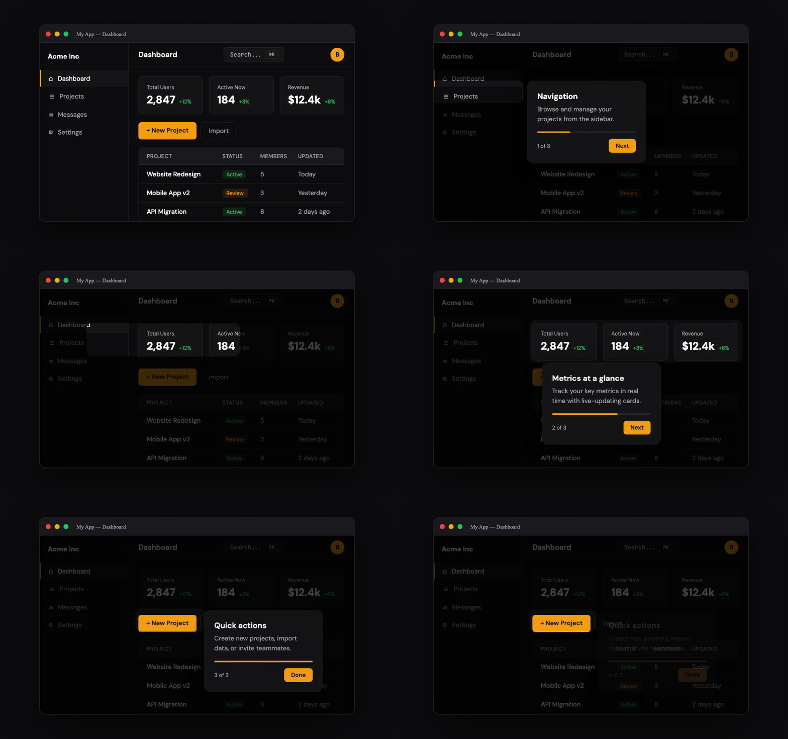
Build a guide together
Product people edit the words and journey in Studio. Developers own the
integration, routes, and application behavior. Agents work with the same
validated JSON document. Everything stays in your application and your files.
- Visual Studio: an optional authoring component with live target picking,
preview, browser drafts, and JSON import/export.
- Portable documents: stable IDs, plain text, and named app capabilities.
Validate, review in Git, and compile into the regular React runtime.
- Agent tools: a skill, JSON Schema, local CLI, and a separate stdio MCP
server. Generate target smoke checks, then verify real application journeys.
- React runtime: themed or headless, interactive steps, multi-page guides,
highlights, beacons, and explicit control over when guidance appears.
Version requirement: Studio, portable documents, guidance components, and the
CLI require react-tourlight 0.5.0 or later. See the
changelog for release details.
Run the demo from source
pnpm install
pnpm build
pnpm --filter react-tourlight-docs dev
Open the local URL printed by Next.js and visit /studio. It demonstrates a
sample application; embed Studio in your own app to pick its real elements.
No Tourlight account or backend is required. See the Studio guide.
Install
npm install react-tourlight@^0.5.0 @floating-ui/react-dom
@floating-ui/react-dom is a required peer dependency — it powers tooltip
positioning (flip, shift, overflow handling). It's a peer dep rather than a
bundled dependency so you control the version and it isn't duplicated if
something else in your app already depends on it.
yarn add react-tourlight@^0.5.0 @floating-ui/react-dom
pnpm add react-tourlight@^0.5.0 @floating-ui/react-dom
Next.js App Router: as of v0.2.0 the package ships its own "use client"
directive, so SpotlightProvider, SpotlightTour, and friends can be
imported directly into a Server Component (like app/layout.tsx) without
wrapping them in your own client component first — Next.js honors the
boundary declared inside react-tourlight itself.
Quickstart
import { SpotlightProvider, SpotlightTour, useSpotlight } from 'react-tourlight'
import 'react-tourlight/styles.css'

function App() {
  return (
    <SpotlightProvider>
      <SpotlightTour
        id="onboarding"
        steps={[
          {
            target: '#search-input',
            title: 'Search',
            content: 'Find anything instantly with our search.',
            placement: 'bottom',
          },
          {
            target: '[data-tour="sidebar"]',
            title: 'Navigation',
            content: 'Browse your projects and teams here.',
            placement: 'right',
          },
        ]}
      />
      <Dashboard />
    </SpotlightProvider>
  )
}

function Dashboard() {
  const { start } = useSpotlight()
  return (
    <main>
      <input id="search-input" aria-label="Search projects" />
      <nav data-tour="sidebar" aria-label="Workspace">Projects · Team</nav>
      <button onClick={() => start('onboarding')}>Start Tour</button>
    </main>
  )
}
Why react-tourlight
| Beautiful by default | Modern, polished tooltips with smooth CSS clip-path spotlight transitions. Light, dark, and custom themes out of the box. |
| Accessible | Focus management, keyboard navigation, ARIA roles, and screen reader announcements. Verify accessibility in your own integration. |
| Separate entry points | Import the player, headless engine, document tools, or Studio where you need them. The editor is not included by a player-only import. |
| Headless when you want it | react-tourlight/core gives you the state machine, element resolution, clip-path, and a11y utilities with no CSS and no Floating UI. |
| Multi-page & interactive | Route-aware tours that survive navigation and reloads. Interactive steps with real event pass-through and advanceOn. |
| MIT License | Free for commercial use. No GPL restrictions, no paid tiers. |
Features
- CSS clip-path spotlight — an overlay cutout that works with light and dark themes
- Floating UI positioning — smart flip, shift, and overflow handling
- Full keyboard navigation — Arrow keys, Escape, Tab focus trap that opens with focus on the primary (Next/Done) button
- Async element waiting —
MutationObserver-based, handles lazy-loaded content, with a configurable timeout (SpotlightStep.timeout / SpotlightProviderProps.waitForElementTimeout) and a dimmed loading overlay while a target is still resolving
- Light / Dark / Custom themes — auto-detect OS preference (and stay in sync when it changes live), or bring your own theme, including working hover states on buttons and the close button
- Responsive positioning — tooltip flip, shift, and overflow handling; test your content at the viewports you support
- React 19 compatible — built for modern React, no deprecated APIs
- Next.js / RSC ready — ships its own
"use client" directive, no manual wrapper required
- i18n support — customize all button labels and step text
- Multi-page / route-aware tours — a tour can pause on one route, navigate to another (SPA or full page reload), and resume automatically via pluggable persistence (
localStorage / custom / memory). Router-agnostic — plug in next/navigation, React Router, or location.assign (see below)
- Single-element highlights — one-off "What's new" callouts without a full tour
- Beacons / hotspots —
<SpotlightBeacon> renders a pulsing dot on any element that starts a tour or a highlight when clicked, so users can opt in instead of being interrupted
- Flexible targets — steps accept a CSS selector, a React ref, or a resolver function (
() => element). Cross-document and shadow-root integrations require their own coordinate, event, and accessibility checks; a resolver alone does not establish complete support.
- Analytics-ready callbacks —
onStart, onStepChange(stepIndex, step), onComplete, onSkip at both tour and provider level
- Start anywhere —
start('tour', { stepIndex: 2 }) for deep links and "resume" buttons; portalContainer and autoScroll props for apps with custom scroll or stacking contexts
- Custom tooltips — full render prop API for complete control, with unique per-instance ARIA ids (
useId) so multiple tooltips never collide and no aria-labelledby/aria-describedby reference is left dangling
- True interactive targets —
interactive: true makes the spotlight hole genuinely transparent to all pointer/keyboard/focus events (typing, hovering, dragging, scrolling) — real event pass-through, not synthesized clicks. Add advanceOn to auto-advance when the user clicks the real button/link
- Headless core — the entire unstyled engine (state machine, element resolution, clip-path, focus/a11y, and a
useTour hook) is available from react-tourlight/core with no CSS and no Floating UI, for fully custom tour UIs (see below)
Multi-page tours
A tour can span multiple routes and survive both SPA navigation and full page
reloads. Enable persistence and give the provider a navigate callback wired
to your router, then tag steps with the route they live on:
'use client'

import { useRouter } from 'next/navigation'
import { SpotlightProvider, SpotlightTour } from 'react-tourlight'
import 'react-tourlight/styles.css'

function Providers({ children }: { children: React.ReactNode }) {
  const router = useRouter()
  return (
    <SpotlightProvider
      persist          // localStorage by default; pass a custom storage object if you like
      navigate={(path) => router.push(path)}
    >
      <SpotlightTour
        id="onboarding"
        steps={[
          { target: '#dashboard-header', title: 'Dashboard', content: 'Your home base.', route: '/dashboard' },
          // Advancing to this step navigates to /settings, then waits for the target there:
          { target: '#profile-section', title: 'Profile', content: 'Update your details.', route: '/settings' },
        ]}
      />
      {children}
    </SpotlightProvider>
  )
}
How it works:
route — when advancing to a step whose route doesn't match
window.location.pathname, the provider calls navigate(route) and then
waits (via the built-in MutationObserver) for the target on the new page.persist — true uses localStorage; pass a SpotlightStorage object
(e.g. createMemoryStorage() or window.sessionStorage) for other backends.
Tour state is saved on every change.resume (default true) — on mount, a persisted, still-active tour is
automatically resumed at the exact step it left off, so a full page
reload picks the tour right back up. Stale snapshots (older than
persistMaxAge, or from a tour whose step count changed) are ignored.- Router-agnostic — route matching compares against
window.location.pathname (exact, :param, or trailing *). Override it
with isRouteActive={(route, pathname) => ...} for anything custom. Works
with Next.js, React Router, TanStack Router, or location.assign.
Interactive steps
Set interactive: true and the spotlight hole becomes a genuine gap in the
overlay — real clicks, typing, hovering, dragging, and scrolling all reach the
highlighted element (no synthesized events). Add advanceOn to advance the
tour when the user actually interacts with the target:
<SpotlightTour
id="create-flow"
steps={[
{
target: '#new-project-btn',
title: 'Create a project',
content: 'Click the button to continue.',
interactive: true,
advanceOn: { event: 'click' },
},
{
target: '#project-name',
title: 'Name it',
content: 'Type a name, then press Enter.',
interactive: true,
advanceOn: { event: 'keydown', selector: 'input' },
},
]}
/>
advanceOn composes with route steps — clicking a real link that navigates
advances the tour, and the next step resumes on the destination page.
Headless core (react-tourlight/core)
Most consumers only need SpotlightProvider, SpotlightTour, and
useSpotlight. If you want to render your own overlay and tooltip, import
the unstyled engine from react-tourlight/core — it ships no CSS, no default
tooltip, and no Floating UI in its graph:
import { useTour, type SpotlightStep } from 'react-tourlight/core'
function CustomTour({ steps }: { steps: SpotlightStep[] }) {
const tour = useTour({ steps })
if (!tour.isActive || !tour.rect) {
return <button onClick={tour.start}>Start</button>
}
return (
<>
{/* Your own overlay — clipPath is generated for you */}
<div
style={{
position: 'fixed',
inset: 0,
background: 'rgba(0,0,0,0.5)',
clipPath: tour.clipPath,
pointerEvents: 'none',
}}
/>
{/* Your own tooltip, positioned however you like */}
<div style={{ position: 'fixed', top: tour.rect.y + tour.rect.height + 8, left: tour.rect.x }}>
<h3>{tour.step?.title}</h3>
<div>{tour.step?.content}</div>
<button onClick={tour.previous}>Back</button>
<button onClick={tour.next}>
{tour.currentIndex + 1 === tour.totalSteps ? 'Done' : 'Next'}
</button>
</div>
</>
)
}
useTour drives the state machine, resolves and measures each step's target
(async waiting, scrolling, and route-aware navigate included), and hands you
clipPath, rect, targetElement, and the current step. The lower-level
building blocks are also exported for even more control:
import {
createTourStateMachine,
waitForElement,
resolveTarget,
getTargetRect,
measureElement,
generateClipPath,
isRouteActive,
createMemoryStorage,
createFocusTrap,
setInert,
} from 'react-tourlight/core'
These are the same primitives SpotlightProvider uses internally. (For
convenience, the engine primitives and useTour are also re-exported from the
main react-tourlight entry, but importing from /core keeps Floating UI and
the default styles out of your bundle.)
Beacons
Let users opt into a tour instead of interrupting them. A beacon is a pulsing
dot anchored to any element; clicking it starts a tour (or shows a highlight):
import { SpotlightBeacon } from 'react-tourlight'
<SpotlightBeacon target="#export-button" tour="export-tour" />
<SpotlightBeacon
target="#export-button"
position="top-left"
highlight={{ title: 'New: CSV export', content: 'Download your data any time.' }}
/>
Beacons hide automatically while a tour is running, follow the target across
scroll and resize, and respect prefers-reduced-motion.
Documents, Studio, and agents
Keep a guide as data and compile it for the player:
import { compileTourDocument, parseTourDocument } from 'react-tourlight/document'
import guideJson from './welcome.tour.json'
const guide = parseTourDocument(guideJson)
const steps = compileTourDocument(guide)
<SpotlightTour id={guide.id} steps={steps} />
Mount the editor only in your app's authoring experience:
import { TourStudio } from 'react-tourlight/studio'
import 'react-tourlight/studio.css'
import 'react-tourlight/styles.css'

<TourStudio defaultValue={guide} storageKey="welcome-draft">
  <YourApp />
</TourStudio>
Studio contains its own preview provider. It works with the integrated app's
DOM; it cannot inspect unrelated websites merely by entering their URLs.
Browser drafts remain local. Export a document to hand work to another person,
then integrate it using your own release process.
After installing the package in your project:
npx --no-install tourlight validate welcome.tour.json
npx --no-install tourlight inspect welcome.tour.json
npx --no-install tourlight test welcome.tour.json --base-url http://localhost:3000
The last command prints Playwright target smoke-check source. It does not run
a browser or prove that the user's task completed. Configure your application's
actual authentication, setup, interactions, and outcome assertions.
The agent skill guides coding agents through this
workflow and is included at node_modules/react-tourlight/skills/tourlight/SKILL.md.
The separate react-tourlight-mcp package accepts guide
documents and returns schemas, validation, summaries, and generated test source.
It does not read app files or publish guides. See the agent guide
and testing guide.
Documentation
Visit react-tourlight.vercel.app for the full docs — API reference, interactive examples, theming guide, accessibility details, and recipes for Next.js, Remix, and shadcn/ui.
Contributing
We welcome contributions! See CONTRIBUTING.md for development setup, project structure, and PR workflow.
Support Tourlight
Help keep Tourlight free. Voluntary support funds maintenance, documentation,
and new features. The player, Studio, and agent tools remain free under MIT;
sponsorship includes no exclusive features or dedicated support.
Stripe processes contributions through our existing GPT Hotline account.
That name and logo appear at checkout alongside your Tourlight contribution.
Bug reports, documentation, code contributions, and sharing the project help too.
License
MIT