react-tridi
React Tridi is a light-weight react component for 360-degree product viewer


Inspired by the Tridi javascript library for 360-degree 3D product visualizations based on series of images. Special thanks to Łukasz Wójcik
Install
npm install --save react-tridi
Usage
Simple
Here is the simplest case of using React Tridi. You just need to specify an images' location, its format, and total of the images.
Sample code:
import React from 'react';
import Tridi from 'react-tridi';
import 'react-tridi/dist/index.css';

const Example = () => (
    <div style={{ width: '500px' }}>
        <Tridi location="./images" format="jpg" count="36" />
    </div>
);
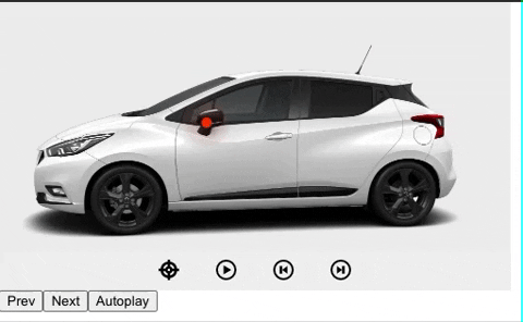
With Pins
In this mode, you can load some pin points on top of the product images. There is an onClick event on each pin with the pin's information returned, so you can show the product information on that event if needed.
The pins data structure looks like this:
const pins = [
  { "id": "kcyvybbrjkr8lz7w1j", "frameId": 0, "x": "0.664000", "y": "0.570922", "recordingSessionId": "klbp4jr3r7vyy5nnmkg" },
  { "id": "kcyvybrdbqwmi3z1ig", "frameId": 1, "x": "0.340000", "y": "0.500000", "recordingSessionId": "klbp4jr3r7vyy5nnmkg" },
]
You can record pins' coordinates via the recoding mode of the React Tridi with the following steps:
- Enable the prop
showControlBar to show functionality buttons.
- Click the target icon to start recoding the coordinates.
- Click on the image view area to create a pin. Double click the pin to remove it. You can click the Next & Prev button to move to other frames, and create other pins on them.
- On each start and stop recording event, an array of pins' information like above will be returned.
You can also render a custom pin point if needed by using the renderPin prop.
Sample code:
import React from 'react';
import Tridi from 'react-tridi';
import 'react-tridi/dist/index.css';

const Example = () => (
    <div style={{ width: '500px' }}>
      <Tridi
        location="./images"
        format="jpg"
        count="36"
        autoplaySpeed={70}
        onRecordStart={recordStartHandler}
        onRecordStop={recordStopHandler}
        onPinClick={pinClickHandler}
        renderPin={(pin) => (<span>A</span>)}
        inverse
        showControlBar
      />
    </div>
);
With Customized Control Buttons
If you do not like the default control buttons, React Tridi gives you a ref accessing to all the button actions.
Sample code:
import React, { useState, useRef } from 'react';
import Tridi from 'react-tridi';
import 'react-tridi/dist/index.css';

const Example = () => {
    const [isAutoPlayRunning, setIsAutoPlayRunning] = useState(false);
  const tridiRef = useRef(null);

  return (
    <div style={{ width: '500px' }}>
      <Tridi
        ref={tridiRef}
        location="./images"
        format="jpg"
        count="36"
      />
      <button onClick={() => tridiRef.current.prev()}>Prev</button>
      <button onClick={() => tridiRef.current.next()}>Next</button>
      <button onClick={() => tridiRef.current.toggleAutoplay(!isAutoPlayRunning)}>
        {isAutoPlayRunning ? 'Pause' : 'Autoplay'}
      </button>
    </div>
  );
};
Props
| className | string | undefined | no | Add class name for the component |
| style | object | undefined | no | Add style for the component |
| images | arrays | "numbered" | no | Source of images to be used by Tridi |
| pins | arrays | undefined | no | Pin coordinates to show on the product |
| format | string | undefined | yes* | Image extension (e.g. "jpg"). Required if images = "numbered" |
| location | string | undefined | yes* | Path to images folder. Required if images = "numbered" |
| count | number | undefined | yes* | Number of images in the series. Required if images = "numbered" |
| draggable | boolean | true | no | Enable/disable mouse drag event |
| hintOnStartUp | boolean | false | no | Enable/disable hint on start up |
| hintText | string | undefined | no | Enable/disable hint text |
| autoplay | boolean | false | no | Enable/disable autoplay |
| autoplaySpeed | number | 50 | no | Adjust autoplay speed |
| stopAutoplayOnClick | boolean | false | no | Stop autoplay if user clicks on container |
| stopAutoplayOnMouseEnter | boolean | false | no | Stop autoplay if user hovers over container |
| resumeAutoplayOnMouseLeave | boolean | false | no | Resume autoplay if user moves mouse cursor away from container |
| touch | boolean | true | no | Enable/disable touch support |
| mousewheel | boolean | false | no | Enable/disable mousewheel support |
| inverse | boolean | false | no | Swap image rotation direction. Affects mouse drag, mousewheel and touch |
| dragInterval | number | 1 | no | Adjust rotation speed for mouse drag events |
| touchDragInterval | number | 2 | no | Adjust rotation speed for touch events |
| mouseleaveDetect | boolean | false | no | If true, active drag event will stop whenever mouse cursor leaves Tridi container |
| showControlBar | boolean | false | no | show a control bar with record, play, pause, next, prev functions |
| showStatusBar | boolean | false | no | show a status bar on recording |
| hideRecord | boolean | false | no | hide record button in the control bar |
| zoom | number | 1 | no | default zoom value |
| minZoom | number | 1 | no | minimum zoom value |
| maxZoom | number | 3 | no | maximum zoom value |
| renderPin | func | undefined | no | render a customized pin point |
| setPins | func | undefined | no | function to set pin's state |
| renderHint | func | undefined | no | render a customized hint message |
Prop Events
| onHintHide | null | Hint is hidden |
| onAutoplayStart | null | Autoplay is started |
| onAutoplayStop | null | Autoplay is stopped |
| onNextMove | null | Next image is loaded (obeying inverse option) |
| onPrevMove | null | Previous image is loaded (obeying inverse option) |
| onNextFrame | null | Next image is loaded following the order in the image source (indifferent to inverse option) |
| onPrevFrame | null | Previous image is loaded according to the order in the image source (indifferent to inverse option) |
| onDragStart | null | Image rotation sequence (dragging) starts |
| onDragEnd | null | Image rotation sequence (dragging) ends |
| onFrameChange | number | Next image is loaded, sending out the current image index |
| onRecordStart | null | get current sessionId on start recording |
| onRecordStop | null | get current sessionId on stop recording |
| onPinClick | null | get a pin info on click in normal mode |
| onZoom | null | get the current zoom scale value |
| onLoadChange | load_success, percentage | load_success: get whether all images have been loaded, percentage: current load percentage |
Ref Functions
| prev() | null | trigger prev move |
| next() | null | trigger next move |
| toggleAutoPlay(true/false) | boolean | toogle autoplay |
| toggleRecording(true/false) | boolean | toggle recording pins' coordinates |
| toggleMoving(true/false) | boolean | toogle moving photo while zooming |
License
MIT © nevestuan


