React loading button
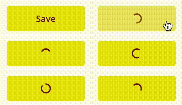
A simple, lightweight and customizable React button that supports a loading state. When isLoading is set to true, the button will show a loading state. The component supports three different loading animations.
For full documentation, check out our doc page
Other free projects and APIs
For more cool and free open source projects and APIs, check out our website
Default button

Bouncing ball

Spinner

Basic usage
Default button styling is black background and white text
<LoadingButton
text="Save"
onClick={() => console.log("CLICK")}
isLoading={isLoading}
loadingModoe="PROGRESS"
/>
Bounce animation
Bounce animation, and some custom coloring
<LoadingButton
  text="Save"
  onClick={() => console.log("CLICK")}
  isLoading={isLoading}
  loadingMode="BOUNCE"
  animationColor="white"
  buttonStyle={{
    backgroundColor: "#0069c4",
    color: "white",
  }}
/>
Spinner animation
Spinner animation, and some custom coloring
<LoadingButton
  text="Save"
  onClick={() => console.log("CLICK")}
  isLoading={isLoading}
  loadingMode="SPINNER"
  animationColor="white"
  buttonStyle={{
    backgroundColor: "#0069c4",
    color: "white",
  }}
/>
Full docs
For full documentation and more examples, check our docs at Algobook
Feedback
Is something missing? Not working? Or any feature requests? Just email us, we love to improve our software. Email can be found here.

