rfs - npm Package Compare versions
Comparing version 8.0.1 to 8.0.2
| { | ||
| "name": "rfs", | ||
| "version": "8.0.1", | ||
| "version": "8.0.2", | ||
| "main": "postcss.js", | ||
| "description": "Powerful & easy-to-use responsive font sizing engine.", | ||
| "author": "Martijn Cuppens <martijn.cuppens@gmail.com>", | ||
| "license": "MIT", | ||
| "repository": { | ||
| "type": "git", | ||
| "url": "git+https://github.com/twbs/rfs.git" | ||
| }, | ||
| "bugs": { | ||
| "url": "https://github.com/twbs/rfs/issues" | ||
| }, | ||
| "homepage": "https://github.com/twbs/rfs#readme", | ||
| "files": [ | ||
@@ -13,17 +23,2 @@ "less.less", | ||
| ], | ||
| "scripts": { | ||
| "test": "mocha", | ||
| "generate-test-results": "node-sass test/sass/ -o test/result/", | ||
| "gulp-examples": "cd examples/less/gulp && gulp build && cd ../../postcss/gulp && gulp build && cd ../../sass/gulp && gulp build && cd ../../stylus/gulp && gulp build && cd ../../../..", | ||
| "node-examples": "node examples/less/node/index.js && node examples/postcss/node/index.js && node examples/sass/node/index.js && node examples/stylus/node/index.js" | ||
| }, | ||
| "husky": { | ||
| "hooks": { | ||
| "pre-commit": "npm test" | ||
| } | ||
| }, | ||
| "repository": { | ||
| "type": "git", | ||
| "url": "git+https://github.com/twbs/rfs.git" | ||
| }, | ||
| "keywords": [ | ||
@@ -40,12 +35,22 @@ "rfs", | ||
| ], | ||
| "author": "Martijn Cuppens <martijn.cuppens@gmail.com>", | ||
| "license": "MIT", | ||
| "bugs": { | ||
| "url": "https://github.com/twbs/rfs/issues" | ||
| "engines": { | ||
| "node": ">=6" | ||
| }, | ||
| "homepage": "https://github.com/twbs/rfs#readme", | ||
| "scripts": { | ||
| "mocha": "mocha", | ||
| "stylelint": "stylelint \"**/*.less\" \"**/*.scss\" \"**/*.sass\" --cache --cache-location node_modules/.cache/stylelint", | ||
| "xo": "xo", | ||
| "lint": "npm-run-all --parallel xo stylelint", | ||
| "test": "npm run lint && npm run mocha", | ||
| "generate-test-results": "node-sass test/sass/ -o test/expected/", | ||
| "gulp-examples": "cd examples/less/gulp && gulp build && cd ../../postcss/gulp && gulp build && cd ../../scss/gulp && gulp build && cd ../../stylus/gulp && gulp build && cd ../../../..", | ||
| "node-examples": "node examples/less/node/index.js && node examples/postcss/node/index.js && node examples/scss/node/index.js && node examples/stylus/node/index.js" | ||
| }, | ||
| "husky": { | ||
| "hooks": { | ||
| "pre-commit": "npm test" | ||
| } | ||
| }, | ||
| "dependencies": {}, | ||
| "devDependencies": { | ||
| "babel-cli": "^6.26.0", | ||
| "babel-preset-env": "^1.7.0", | ||
| "browserify": "^16.2.3", | ||
| "gulp": "^4.0.0", | ||
@@ -58,13 +63,33 @@ "gulp-less": "^4.0.1", | ||
| "less": "^3.9.0", | ||
| "mocha": "^5.2.0", | ||
| "mocha": "^6.0.2", | ||
| "node-sass": "^4.11.0", | ||
| "npm-run-all": "^4.1.5", | ||
| "postcss": "^7.0.14", | ||
| "postcss-nested": "^4.1.1", | ||
| "postcss-prettify": "^0.3.4", | ||
| "prettier": "^1.16.4", | ||
| "stylelint": "^9.10.1", | ||
| "stylelint-scss": "^3.5.3", | ||
| "stylelint-config-standard": "^18.2.0", | ||
| "stylus": "^0.54.5", | ||
| "uglify-js": "^3.4.9" | ||
| "xo": "^0.24.0" | ||
| }, | ||
| "xo": { | ||
| "rules": { | ||
| "ava/no-import-test-files": "off", | ||
| "indent": [ | ||
| "error", | ||
| 2, | ||
| { | ||
| "MemberExpression": "off", | ||
| "SwitchCase": 1 | ||
| } | ||
| ], | ||
| "prefer-destructuring": [ | ||
| "error", | ||
| { | ||
| "object": true, | ||
| "array": false | ||
| } | ||
| ], | ||
| "unicorn/prefer-exponentiation-operator": "off" | ||
| } | ||
| } | ||
| } |
131
postcss.js
@@ -1,6 +0,8 @@ | ||
| // PostCSS RFS plugin | ||
| // | ||
| // Automated font-resizing | ||
| // | ||
| // See https://github.com/twbs/rfs | ||
| /*! | ||
| * PostCSS RFS plugin | ||
| * | ||
| * Automated font-resizing | ||
| * | ||
| * Licensed under MIT (https://github.com/twbs/rfs/blob/master/LICENSE) | ||
| */ | ||
@@ -11,3 +13,3 @@ 'use strict'; | ||
| module.exports = postcss.plugin('postcss-rfs', function (opts) { | ||
| module.exports = postcss.plugin('postcss-rfs', opts => { | ||
| const BREAKPOINT_ERROR = 'breakpoint option is invalid, it must be set in `px`, `rem` or `em`.'; | ||
@@ -18,2 +20,3 @@ const BREAKPOINT_UNIT_ERROR = 'breakpointUnit option is invalid, it must be `px`, `rem` or `em`.'; | ||
| const ENABLE_RESPONSIVE_FONT_SIZE_SELECTOR = '.enable-responsive-font-size'; | ||
| const defaultOptions = { | ||
@@ -33,2 +36,3 @@ baseFontSize: 20, | ||
| }; | ||
| opts = Object.assign(defaultOptions, opts); | ||
@@ -39,7 +43,5 @@ | ||
| opts.baseFontSize = parseFloat(opts.baseFontSize); | ||
| } | ||
| else if (opts.baseFontSize.endsWith('rem')) { | ||
| } else if (opts.baseFontSize.endsWith('rem')) { | ||
| opts.baseFontSize = parseFloat(opts.baseFontSize) / opts.remValue; | ||
| } | ||
| else { | ||
| } else { | ||
| console.error(BASE_FONT_SIZE_ERROR); | ||
@@ -52,7 +54,5 @@ } | ||
| opts.breakpoint = parseFloat(opts.breakpoint); | ||
| } | ||
| else if (opts.breakpoint.endsWith('em')) { | ||
| } else if (opts.breakpoint.endsWith('em')) { | ||
| opts.breakpoint = parseFloat(opts.breakpoint) * opts.remValue; | ||
| } | ||
| else { | ||
| } else { | ||
| console.error(BREAKPOINT_ERROR); | ||
@@ -62,6 +62,4 @@ } | ||
| return function (css) { | ||
| css.walkRules(function (rule) { | ||
| return css => { | ||
| css.walkRules(rule => { | ||
| if (rule.selector.includes(DISABLE_RESPONSIVE_FONT_SIZE_SELECTOR)) { | ||
@@ -71,5 +69,5 @@ return; | ||
| rule.walkDecls(function (decl) { | ||
| rule.walkDecls(decl => { | ||
| // Skip if property is not in propList | ||
| if (opts.propList.indexOf(decl.prop) === -1) { | ||
| if (!opts.propList.includes(decl.prop)) { | ||
| return; | ||
@@ -90,3 +88,3 @@ } | ||
| // Multiply by remValue if value is in rem | ||
| if (decl.value.indexOf('rem') > -1) { | ||
| if (decl.value.includes('rem')) { | ||
| value *= opts.remValue; | ||
@@ -97,8 +95,6 @@ } | ||
| if (opts.fontSizeUnit === 'px') { | ||
| decl.value = toFixed(value, opts.unitPrecision) + 'px'; | ||
| } | ||
| else if (opts.fontSizeUnit === 'rem') { | ||
| decl.value = toFixed(value / opts.remValue, opts.unitPrecision) + 'rem'; | ||
| } | ||
| else { | ||
| decl.value = `${toFixed(value, opts.unitPrecision)}px`; | ||
| } else if (opts.fontSizeUnit === 'rem') { | ||
| decl.value = `${toFixed(value / opts.remValue, opts.unitPrecision)}rem`; | ||
| } else { | ||
| console.error('fontSizeUnit option is not valid, it must be `px` or `rem`.'); | ||
@@ -113,3 +109,3 @@ } | ||
| // Calculate font-size and font-size difference | ||
| let baseFontSize = opts.baseFontSize + (value - opts.baseFontSize) / opts.factor; | ||
| let baseFontSize = opts.baseFontSize + ((value - opts.baseFontSize) / opts.factor); | ||
| const fontSizeDiff = value - baseFontSize; | ||
@@ -124,6 +120,6 @@ | ||
| value = 'calc(' + toFixed(baseFontSize, opts.unitPrecision) + opts.fontSizeUnit + ' + ' + toFixed((fontSizeDiff * 100 / opts.breakpoint), opts.unitPrecision) + viewportUnit + ')'; | ||
| value = `calc(${toFixed(baseFontSize, opts.unitPrecision)}${opts.fontSizeUnit} + ${toFixed(fontSizeDiff * 100 / opts.breakpoint, opts.unitPrecision)}${viewportUnit})`; | ||
| const mediaQuery = postcss.atRule(renderMediaQuery(opts)); | ||
| let rule_selector = rule.selector; | ||
| let ruleSelector = rule.selector; | ||
@@ -133,21 +129,25 @@ // Prefix with .enable-responsive-font-size class if needed | ||
| const selectors = rule.selector.split(','); | ||
| let ruleSelector = ''; | ||
| let tempRuleSelector = ''; | ||
| for (let selector of selectors) { | ||
| ruleSelector += ENABLE_RESPONSIVE_FONT_SIZE_SELECTOR + ' ' + selector + ',\n'; | ||
| ruleSelector += selector + ENABLE_RESPONSIVE_FONT_SIZE_SELECTOR + ',\n'; | ||
| for (const selector of selectors) { | ||
| tempRuleSelector += `${ENABLE_RESPONSIVE_FONT_SIZE_SELECTOR} ${selector},\n`; | ||
| tempRuleSelector += `${selector + ENABLE_RESPONSIVE_FONT_SIZE_SELECTOR},\n`; | ||
| } | ||
| rule_selector = ruleSelector.slice(0, -2); | ||
| ruleSelector = tempRuleSelector.slice(0, -2); | ||
| } | ||
| const mediaQueryRule = postcss.rule({ | ||
| selector: rule_selector, | ||
| selector: ruleSelector, | ||
| source: rule.source | ||
| }); | ||
| mediaQueryRule.append(decl.clone({value: value})); | ||
| mediaQueryRule.append(decl.clone({value})); | ||
| // Safari iframe resize bug: https://github.com/twbs/rfs/issues/14 | ||
| if (opts.safariIframeResizeBugFix) { | ||
| mediaQueryRule.append(postcss.decl({ prop: 'min-width', value: '0vw' })); | ||
| mediaQueryRule.append(postcss.decl({ | ||
| prop: 'min-width', | ||
| value: '0vw' | ||
| })); | ||
| } | ||
@@ -163,10 +163,11 @@ | ||
| for (let selector of selectors) { | ||
| ruleSelector += selector + ',\n'; | ||
| ruleSelector += DISABLE_RESPONSIVE_FONT_SIZE_SELECTOR + ' ' + selector + ',\n'; | ||
| ruleSelector += selector + DISABLE_RESPONSIVE_FONT_SIZE_SELECTOR + ',\n'; | ||
| for (const selector of selectors) { | ||
| ruleSelector += `${selector},\n`; | ||
| ruleSelector += `${DISABLE_RESPONSIVE_FONT_SIZE_SELECTOR} ${selector},\n`; | ||
| ruleSelector += `${selector + DISABLE_RESPONSIVE_FONT_SIZE_SELECTOR},\n`; | ||
| } | ||
| ruleSelector = ruleSelector.slice(0, - 2); | ||
| const dc_rule = postcss.rule({ | ||
| ruleSelector = ruleSelector.slice(0, -2); | ||
| const dcRule = postcss.rule({ | ||
| selector: ruleSelector, | ||
@@ -176,12 +177,16 @@ source: rule.source | ||
| dc_rule.append(decl.clone()); | ||
| rule.parent.insertAfter(rule, dc_rule); | ||
| decl.prev() || decl.next() ? decl.remove() : decl.parent.remove(); | ||
| dcRule.append(decl.clone()); | ||
| rule.parent.insertAfter(rule, dcRule); | ||
| if (decl.prev() || decl.next()) { | ||
| decl.remove(); | ||
| } else { | ||
| decl.parent.remove(); | ||
| } | ||
| } | ||
| }); | ||
| }); | ||
| }; | ||
| function renderMediaQuery (opts) { | ||
| function renderMediaQuery(opts) { | ||
| const mediaQuery = { | ||
@@ -193,20 +198,21 @@ name: 'media' | ||
| case 'em': | ||
| case 'rem': | ||
| case 'rem': { | ||
| const breakpoint = opts.breakpoint / opts.remValue; | ||
| if (opts.twoDimensional) { | ||
| mediaQuery.params = '(max-width: ' + breakpoint + opts.breakpointUnit + '), (max-height: ' + breakpoint + opts.breakpointUnit + ')'; | ||
| mediaQuery.params = `(max-width: ${breakpoint}${opts.breakpointUnit}), (max-height: ${breakpoint}${opts.breakpointUnit})`; | ||
| } else { | ||
| mediaQuery.params = `(max-width: ${breakpoint}${opts.breakpointUnit})`; | ||
| } | ||
| else { | ||
| mediaQuery.params = '(max-width: ' + breakpoint + opts.breakpointUnit + ')'; | ||
| } | ||
| break; | ||
| } | ||
| case 'px': | ||
| if (opts.twoDimensional) { | ||
| mediaQuery.params = '(max-width: ' + opts.breakpoint + 'px), (max-height: ' + opts.breakpoint + 'px)'; | ||
| mediaQuery.params = `(max-width: ${opts.breakpoint}px), (max-height: ${opts.breakpoint}px)`; | ||
| } else { | ||
| mediaQuery.params = `(max-width: ${opts.breakpoint}px)`; | ||
| } | ||
| else { | ||
| mediaQuery.params = '(max-width: ' + opts.breakpoint + 'px)'; | ||
| } | ||
| break; | ||
@@ -222,7 +228,8 @@ | ||
| function toFixed (number, precision) { | ||
| const multiplier = Math.pow(10, precision + 1), | ||
| wholeNumber = Math.floor(number * multiplier); | ||
| function toFixed(number, precision) { | ||
| const multiplier = Math.pow(10, precision + 1); | ||
| const wholeNumber = Math.floor(number * multiplier); | ||
| return Math.round(wholeNumber / 10) * 10 / multiplier; | ||
| } | ||
| }); |
@@ -33,3 +33,3 @@ <p align="center"> | ||
|  | ||
|  | ||
@@ -83,3 +83,7 @@ | ||
| .title { | ||
| @include font-size(4rem); // OR @include responsive-font-size(64px); OR @include rfs(64); | ||
| @include font-size(4rem); | ||
| // or | ||
| @include responsive-font-size(64px); | ||
| // or | ||
| @include rfs(64); | ||
| } | ||
@@ -96,3 +100,7 @@ ``` | ||
| .title | ||
| +font-size(4rem) // OR +responsive-font-size(64px) OR +rfs(64) | ||
| +font-size(4rem) | ||
| // or | ||
| +responsive-font-size(64px) | ||
| // or | ||
| +rfs(64) | ||
| ``` | ||
@@ -107,3 +115,5 @@ | ||
| .title { | ||
| responsive-font-size: 4rem; // OR rfs: 64; | ||
| responsive-font-size: 4rem; | ||
| // or | ||
| rfs: 64; | ||
| } | ||
@@ -123,3 +133,7 @@ | ||
| .title { | ||
| .font-size(4rem); // OR .responsive-font-size(64px); OR .rfs(64); | ||
| .font-size(4rem); | ||
| // or | ||
| .responsive-font-size(64px); | ||
| // or | ||
| .rfs(64); | ||
| } | ||
@@ -137,3 +151,7 @@ ``` | ||
| .title | ||
| font-size(4rem) // OR responsive-font-size(64px) OR rfs(64) | ||
| font-size(4rem) | ||
| // or | ||
| responsive-font-size(64px) | ||
| // or | ||
| rfs(64) | ||
| ``` | ||
@@ -157,16 +175,36 @@ | ||
| If you're using Webpack, you can simplify the `@import` using the `~` prefix: | ||
| ```text | ||
| @import "~rfs/less"; | ||
| @import "~rfs/sass"; | ||
| ```scss | ||
| @import "~rfs/scss"; | ||
| @import "~rfs/stylus"; | ||
| ``` | ||
| ```sass | ||
| @import "~rfs/sass" | ||
| ``` | ||
| ```less | ||
| @import "~rfs/less"; | ||
| ``` | ||
| ```stylus | ||
| @import "~rfs/stylus" | ||
| ``` | ||
| ## Visualisation | ||
| If you wonder how the font sizes are rescaled, wonder no more and stare at this graph which might clarify things a bit. The font sizes used on the graph are in `px`, but in reality RFS renders them in `rem` by default: | ||
| If you wonder how the font sizes are rescaled, wonder no more and stare at this graph which might clarify things a bit: | ||
|  | ||
|  | ||
| Each color represents another font size being rescaled. For example: | ||
| ```scss | ||
| .title { | ||
| @include font-size(40px); | ||
| } | ||
| ``` | ||
| This is the green line. A font size of `40px` stays `40px` in viewports with a size larger than `1200px`. Below `1200px`, the font size is rescaled and at viewport of `360px`, the font size is about `27px`. Note that every font size is generated in a combination of `rem` and `vw` units, but they are mapped to `px` in the graph to make it easier to understand. | ||
| ## Configuration | ||
@@ -232,2 +270,13 @@ | ||
| ### Rem value <sub><sup>(number)</sup></sub> | ||
| - SCSS, Sass & Stylus: `$rfs-rem-value` | ||
| - Less: `@rfs-rem-value` | ||
| - PostCSS: `remValue` | ||
| The value of `1rem` in `px`. The value of `1rem` is typically `16px` but if the font size is changed for `html` the value of `1rem` changes. This variable can be used to change the default value but be careful with it because changing it could lead to unexpected behaviour, for example if additional CSS is loaded which expects `1rem` to be `16px`. | ||
| *Default value: `16`* | ||
| ### Two dimensional <sub><sup>(boolean)</sup></sub> | ||
@@ -307,3 +356,3 @@ | ||
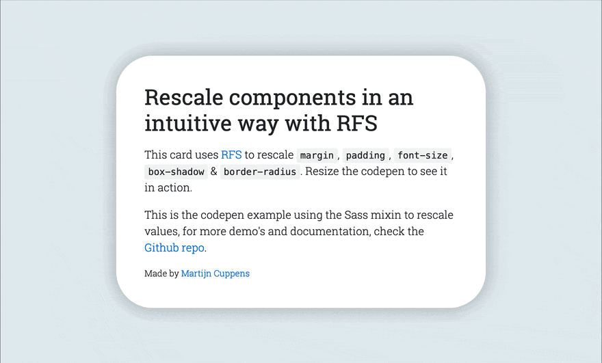
| - [Simple Codepen Demo](https://codepen.io/MartijnCuppens/pen/ZBjdMy) | ||
| - [RFS in bootstrap demo](https://martijncuppens.github.io/rfs) | ||
| - [RFS in Bootstrap demo](https://project-rfs.github.io/) | ||
@@ -328,3 +377,3 @@ | ||
| [license-url]: https://github.com/twbs/rfs/blob/master/LICENSE | ||
| [build-image]: https://img.shields.io/travis/twbs/rfs.svg | ||
| [build-image]: https://img.shields.io/travis/twbs/rfs/master.svg | ||
| [build-url]: https://travis-ci.org/twbs/rfs |
Sorry, the diff of this file is not supported yet
Sorry, the diff of this file is not supported yet
Sorry, the diff of this file is not supported yet
Sorry, the diff of this file is not supported yet
New alerts
Major refactor
Supply chain riskPackage has recently undergone a major refactor. It may be unstable or indicate significant internal changes. Use caution when updating to versions that include significant changes.
Found 1 instance in 1 package
Improved metrics
- Total package byte prevSize
- increased by2.21%
38772
- Dev dependency count
- decreased by-20%
16
- Lines of code
- increased by1.15%
176
- Number of lines in readme file
- increased by15.26%
370
Worsened metrics
- Number of medium supply chain risk alerts
- increased byInfinity%
1