Research
/Security News
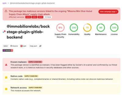
Miasma Mini Shai-Hulud Hits ImmobiliareLabs npm Packages
Miasma Mini Shai-Hulud hits @immobiliarelabs Backstage plugins, targeting GitLab and LDAP auth packages on npm.
By Socket Research Team - Jun 26, 2026
A fast, lightweight RGB curve editor component for React - like Lightroom/Premiere Pro color grading
Professional color grading curves like Adobe Lightroom, Premiere Pro, and Photoshop


|
🎛️ Professional Grade
|
🎨 Beautiful UI
|
|
⚡ Fast & Lightweight
|
🔧 Developer Friendly
|
Choose your preferred package manager:
# npm
npm install rgb-curve
# yarn
yarn add rgb-curve
# pnpm
pnpm add rgb-curve
# bun
bun add rgb-curve
Get up and running in seconds:
import { RGBCurve } from 'rgb-curve';

function App() {
  return (
    <RGBCurve
      onChange={({ points, lut, activeChannel }) => {
        console.log('Control points:', points);
        console.log('LUT:', lut);
        console.log('Active channel:', activeChannel);
      }}
    />
  );
}
| Action | Description |
|---|---|
| Click on curve | Add a new control point |
| Drag a point | Adjust the curve shape |
| Double-click a point | Remove the control point |
| Click tabs | Switch between Master/R/G/B channels |
| Prop | Type | Default | Description |
|---|---|---|---|
width | number | 300 | Width of the curve editor in pixels |
height | number | 300 | Height of the curve editor in pixels |
defaultPoints | Partial<ChannelPoints> | — | Initial control points for each channel |
points | Partial<ChannelPoints> | — | Controlled points (makes component controlled) |
defaultChannel | Channel | 'master' | Initial active channel |
activeChannel | Channel | — | Controlled active channel |
onChange | (data: CurveChangeData) => void | — | Callback when curve changes |
onChannelChange | (channel: Channel) => void | — | Callback when channel changes |
styles | RGBCurveStyles | — | Custom styles (see Styling section) |
showTabs | boolean | true | Show/hide channel tabs |
showHistogram | boolean | false | Show/hide histogram overlay |
histogramData | Uint8Array | — | Histogram data (256 values) |
disabled | boolean | false | Disable all interactions |
className | string | — | CSS class for container |
interpolation | 'monotone' | 'catmullRom' | 'monotone' | Curve interpolation algorithm |
The onChange callback receives an object with:
interface CurveChangeData {
  // Control points for all channels
  points: {
    master: CurvePoint[];
    red: CurvePoint[];
    green: CurvePoint[];
    blue: CurvePoint[];
  };

  // Look-Up Table (256 values per channel) for pixel processing
  lut: {
    master: Uint8Array;
    red: Uint8Array;
    green: Uint8Array;
    blue: Uint8Array;
  };

  // Currently active channel
  activeChannel: 'master' | 'red' | 'green' | 'blue';
}

interface CurvePoint {
  x: number; // Input value: 0-255
  y: number; // Output value: 0-255
}
Access component methods using React refs:
import { useRef } from 'react';
import { RGBCurve, RGBCurveRef } from 'rgb-curve';

function App() {
  const curveRef = useRef<RGBCurveRef>(null);

  return (
    <>
      <RGBCurve ref={curveRef} />

      <button onClick={() => curveRef.current?.reset()}>
        Reset All Channels
      </button>

      <button onClick={() => curveRef.current?.resetChannel('red')}>
        Reset Red Channel
      </button>

      <button onClick={() => {
        const lut = curveRef.current?.getLUT();
        console.log('Current LUT:', lut);
      }}>
        Get LUT Data
      </button>
    </>
  );
}
| Method | Description |
|---|---|
reset() | Reset all channels to default (diagonal line) |
resetChannel(channel) | Reset a specific channel |
getLUT() | Get current LUT data for all channels |
getPoints() | Get current control points for all channels |
setPoints(points) | Set control points programmatically |
The component comes with a beautiful dark theme by default. You can customize every aspect using the styles prop.
<RGBCurve
  styles={{
    // Container wrapper
    container: {
      background: '#1a1a1a',
      borderRadius: 12,
      padding: 16,
    },

    // Canvas wrapper
    canvasWrapper: {
      borderRadius: 8,
      overflow: 'hidden',
      background: '#0d0d0d',
    },

    // Grid lines
    grid: {
      color: '#2a2a2a',
      lineWidth: 1,
      subdivisions: 4,
      showDiagonal: true,
      diagonalColor: '#333333',
    },

    // Curve lines (per channel)
    curve: {
      master: {
        color: '#e0e0e0',
        width: 2,
        shadowColor: 'rgba(255, 255, 255, 0.3)',
        shadowBlur: 4,
      },
      red: {
        color: '#ff6b6b',
        width: 2,
        shadowColor: 'rgba(255, 107, 107, 0.4)',
        shadowBlur: 4,
      },
      green: {
        color: '#51cf66',
        width: 2,
        shadowColor: 'rgba(81, 207, 102, 0.4)',
        shadowBlur: 4,
      },
      blue: {
        color: '#339af0',
        width: 2,
        shadowColor: 'rgba(51, 154, 240, 0.4)',
        shadowBlur: 4,
      },
    },

    // Control points
    controlPoint: {
      radius: 6,
      fill: '#ffffff',
      stroke: '#000000',
      strokeWidth: 2,
      activeFill: '#ffd43b',
      activeStroke: '#000000',
      hoverScale: 1.2,
    },

    // Channel tabs
    tabs: {
      background: '#252525',
      borderRadius: 8,
      gap: 4,
      tab: {
        padding: '8px 16px',
        borderRadius: 6,
        fontSize: 13,
        fontWeight: 500,
        color: '#808080',
        background: 'transparent',
        hoverBackground: '#333333',
        activeColor: '#ffffff',
        activeBackground: '#404040',
      },
    },

    // Histogram (if enabled)
    histogram: {
      show: true,
      opacity: 0.3,
      fillColor: '#666666',
    },
  }}
/>
container: CSSProperties
Standard React CSS properties for the outer container.
styles={{
  container: {
    background: 'linear-gradient(135deg, #1a1a2e, #16213e)',
    borderRadius: 16,
    padding: 20,
    boxShadow: '0 10px 40px rgba(0,0,0,0.5)',
  }
}}
canvasWrapper: CSSProperties
Standard React CSS properties for the canvas container.
styles={{
  canvasWrapper: {
    borderRadius: 12,
    border: '1px solid #333',
    overflow: 'hidden',
  }
}}
interface GridStyle {
  color?: string;        // Grid line color
  lineWidth?: number;    // Grid line width
  subdivisions?: number; // Number of grid divisions (default: 4)
  showDiagonal?: boolean; // Show diagonal baseline
  diagonalColor?: string; // Diagonal line color
}
styles={{
  grid: {
    color: '#333333',
    lineWidth: 1,
    subdivisions: 4,
    showDiagonal: true,
    diagonalColor: '#444444',
  }
}}
interface CurveLineStyle {
  color?: string;       // Curve line color
  width?: number;       // Curve line width
  shadowColor?: string; // Glow effect color
  shadowBlur?: number;  // Glow blur radius
}
styles={{
  curve: {
    master: { color: '#ffffff', width: 2 },
    red: { color: '#ff0000', width: 2, shadowColor: 'rgba(255,0,0,0.5)', shadowBlur: 8 },
    green: { color: '#00ff00', width: 2 },
    blue: { color: '#0088ff', width: 3 },
  }
}}
interface ControlPointStyle {
  radius?: number;       // Point radius
  fill?: string;         // Point fill color
  stroke?: string;       // Point border color
  strokeWidth?: number;  // Point border width
  activeFill?: string;   // Fill when dragging
  activeStroke?: string; // Border when dragging
  hoverScale?: number;   // Scale on hover (1.2 = 120%)
}
styles={{
  controlPoint: {
    radius: 8,
    fill: '#ffffff',
    stroke: '#000000',
    strokeWidth: 2,
    activeFill: '#ffcc00',
    activeStroke: '#000000',
    hoverScale: 1.3,
  }
}}
interface TabsStyle {
  background?: string;    // Tabs container background
  borderRadius?: number;  // Tabs container border radius
  gap?: number;           // Gap between tabs
  tab?: {
    padding?: string;
    borderRadius?: number;
    fontSize?: number;
    fontWeight?: number | string;
    color?: string;           // Inactive tab text color
    background?: string;      // Inactive tab background
    hoverBackground?: string; // Hover background
    activeColor?: string;     // Active tab text color
    activeBackground?: string; // Active tab background
  };
}
styles={{
  tabs: {
    background: '#1a1a1a',
    borderRadius: 10,
    gap: 8,
    tab: {
      padding: '10px 20px',
      borderRadius: 8,
      fontSize: 14,
      fontWeight: 600,
      color: '#666666',
      background: 'transparent',
      hoverBackground: '#2a2a2a',
      activeColor: '#ffffff',
      activeBackground: '#3a3a3a',
    },
  }
}}
interface HistogramStyle {
  show?: boolean;     // Show/hide histogram
  opacity?: number;   // Histogram opacity (0-1)
  fillColor?: string; // Histogram bar color
}
<RGBCurve
  showHistogram={true}
  histogramData={myHistogramData} // Uint8Array of 256 values
  styles={{
    histogram: {
      opacity: 0.4,
      fillColor: '#888888',
    }
  }}
/>
<RGBCurve
  styles={{
    container: {
      background: '#f5f5f5',
      borderRadius: 12,
      padding: 16,
    },
    canvasWrapper: {
      background: '#ffffff',
      borderRadius: 8,
      border: '1px solid #e0e0e0',
    },
    grid: {
      color: '#e0e0e0',
      diagonalColor: '#d0d0d0',
    },
    curve: {
      master: { color: '#333333', width: 2 },
      red: { color: '#e53935', width: 2 },
      green: { color: '#43a047', width: 2 },
      blue: { color: '#1e88e5', width: 2 },
    },
    controlPoint: {
      fill: '#ffffff',
      stroke: '#333333',
      activeFill: '#ffca28',
    },
    tabs: {
      background: '#e0e0e0',
      tab: {
        color: '#666666',
        activeColor: '#000000',
        activeBackground: '#ffffff',
        hoverBackground: '#eeeeee',
      },
    },
  }}
/>
<RGBCurve
  styles={{
    container: {
      background: '#0a0a0a',
      borderRadius: 16,
      padding: 20,
      border: '1px solid #333',
    },
    canvasWrapper: {
      background: '#000000',
      borderRadius: 12,
    },
    grid: {
      color: '#1a1a1a',
      diagonalColor: '#2a2a2a',
    },
    curve: {
      master: {
        color: '#00ffff',
        width: 2,
        shadowColor: '#00ffff',
        shadowBlur: 10
      },
      red: {
        color: '#ff0066',
        width: 2,
        shadowColor: '#ff0066',
        shadowBlur: 10
      },
      green: {
        color: '#00ff66',
        width: 2,
        shadowColor: '#00ff66',
        shadowBlur: 10
      },
      blue: {
        color: '#0066ff',
        width: 2,
        shadowColor: '#0066ff',
        shadowBlur: 10
      },
    },
    controlPoint: {
      radius: 5,
      fill: '#ffffff',
      stroke: '#00ffff',
      strokeWidth: 2,
      activeFill: '#ff00ff',
      hoverScale: 1.4,
    },
    tabs: {
      background: '#111111',
      tab: {
        color: '#666666',
        activeColor: '#00ffff',
        activeBackground: '#1a1a1a',
        hoverBackground: '#1a1a1a',
      },
    },
  }}
/>
<RGBCurve
  styles={{
    container: {
      background: 'transparent',
      padding: 0,
    },
    canvasWrapper: {
      background: '#1a1a1a',
      borderRadius: 4,
    },
    grid: {
      color: '#252525',
      showDiagonal: false,
      subdivisions: 2,
    },
    curve: {
      master: { color: '#888', width: 1.5, shadowBlur: 0 },
      red: { color: '#f66', width: 1.5, shadowBlur: 0 },
      green: { color: '#6f6', width: 1.5, shadowBlur: 0 },
      blue: { color: '#66f', width: 1.5, shadowBlur: 0 },
    },
    controlPoint: {
      radius: 4,
      fill: '#fff',
      stroke: 'transparent',
      strokeWidth: 0,
      hoverScale: 1.5,
    },
    tabs: {
      background: 'transparent',
      gap: 8,
      tab: {
        padding: '6px 12px',
        background: 'transparent',
        hoverBackground: '#252525',
        activeBackground: '#333',
      },
    },
  }}
/>
The LUT (Look-Up Table) returned by onChange enables fast, real-time pixel processing:
import { RGBCurve, applyLUT, LUTData } from 'rgb-curve';

function ImageEditor() {
  const canvasRef = useRef<HTMLCanvasElement>(null);
  const originalImageData = useRef<ImageData | null>(null);

  const handleCurveChange = ({ lut }: { lut: LUTData }) => {
    const canvas = canvasRef.current;
    if (!canvas || !originalImageData.current) return;

    const ctx = canvas.getContext('2d');
    if (!ctx) return;

    // Clone original data
    const imageData = new ImageData(
      new Uint8ClampedArray(originalImageData.current.data),
      originalImageData.current.width,
      originalImageData.current.height
    );

    // Apply LUT to each pixel
    const data = imageData.data;
    for (let i = 0; i < data.length; i += 4) {
      const [r, g, b] = applyLUT(data[i], data[i + 1], data[i + 2], lut);
      data[i] = r;
      data[i + 1] = g;
      data[i + 2] = b;
    }

    ctx.putImageData(imageData, 0, 0);
  };

  return (
    <div>
      <RGBCurve onChange={handleCurveChange} />
      <canvas ref={canvasRef} />
    </div>
  );
}
The package exports several utilities for advanced use cases:
import {
  // Components
  RGBCurve,
  CurveCanvas,
  ChannelTabs,

  // Hooks
  useCurvePoints,
  useCanvasInteraction,

  // Utilities
  generateLUT,
  generateChannelLUT,
  applyLUT,
  getDefaultPoints,
  getDefaultChannelPoints,
  monotoneCubicInterpolation,
  catmullRomInterpolation,
  sortPoints,
  clamp,

  // Constants
  CHANNELS,
  CHANNEL_INFO,
  CHANNEL_COLORS,
  DEFAULT_STYLES,
  DEFAULT_WIDTH,
  DEFAULT_HEIGHT,

  // Types
  type CurvePoint,
  type Channel,
  type ChannelPoints,
  type LUTData,
  type CurveChangeData,
  type RGBCurveProps,
  type RGBCurveRef,
  type RGBCurveStyles,
} from 'rgb-curve';
Full TypeScript support is included. Import types as needed:
import type {
  CurvePoint,
  Channel,
  ChannelPoints,
  LUTData,
  CurveChangeData,
  RGBCurveProps,
  RGBCurveRef,
  RGBCurveStyles,
  CurveLineStyle,
  ControlPointStyle,
  GridStyle,
  TabsStyle,
  HistogramStyle,
} from 'rgb-curve';
| Browser | Version |
|---|---|
| Chrome | Latest ✅ |
| Firefox | Latest ✅ |
| Safari | Latest ✅ |
| Edge | Latest ✅ |
Requirements: Browsers with Canvas 2D support.
Contributions are welcome! Here's how you can help:
# Clone the repository
git clone https://github.com/LittleBoy9/rgb-curve.git

# Install dependencies
npm install

# Start development server
npm run dev

# Build the library
npm run build:lib
MIT © Sounak Das
If you find this project helpful, consider giving it a ⭐️ on GitHub!
FAQs
A fast, lightweight RGB curve editor component for React - like Lightroom/Premiere Pro color grading
We found that rgb-curve demonstrated a healthy version release cadence and project activity because the last version was released less than a year ago. It has 1 open source maintainer collaborating on the project.
Did you know?

Socket for GitHub automatically highlights issues in each pull request and monitors the health of all your open source dependencies. Discover the contents of your packages and block harmful activity before you install or update your dependencies.
Research
/Security News
Miasma Mini Shai-Hulud hits @immobiliarelabs Backstage plugins, targeting GitLab and LDAP auth packages on npm.

Security News
Rolldown paused Rust React Compiler integration after a 5MB binary size increase raised concerns about shipping React-specific code to all Vite users.

Security News
/Research
Mini Shai-Hulud expands into the Go ecosystem after hitting LeoPlatform npm packages and targeting GitHub Actions workflows.