Security News
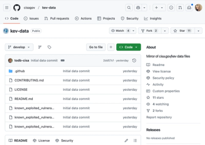
CISA Brings KEV Data to GitHub
CISA's KEV data is now on GitHub, offering easier access, API integration, commit history tracking, and automated updates for security teams and researchers.
seek-asia-style-guide
Advanced tools
Living style guide containing the building blocks and design principles for SEEK web applications
Living style guide for SEEK ASIA, powered by React, webpack, CSS Modules and Less.
If you're creating a new project from scratch, consider using sku, our officially supported front-end development toolkit. It's specially designed to get your project up and running as quickly as possible, while simplifying the process of keeping your development environment up to date.
The easiest way to explore the components offered by the style guide is browsing the demo site - use the hamburger menu to access the goodies.
You can also run the demo site locally by checking out this repo and running npm start
If you want to add SEEK Asia Style Guide to your app, install it with npm or yarn:
$ npm install --save seek-asia-style-guide
If you want to dev on the style guide itself or run the demo page, clone this repository and npm install then npm start to start the demo page locally. See CONTRIBUTING.md for a complete guide.
Consumers can stay up to date by following our release notes, which are published automatically whenever a new release is published to npm.
skusku needs to be told you're using seek-asia-style-guide to pass the components through babel. In your sku.config.js file, add seek-asia-style-guide to the compilePackages array:
module.exports = {
  compilePackages: ['seek-asia-style-guide']
};
Wrap your app with the StyleGuideProvider component to use any of the style guide components. For example:
import React, { Component } from 'react';
import { StyleGuideProvider } from 'seek-asia-style-guide/react';

export default class App extends Component {
  render() {
    const title = '...';
    const meta = [
      { name: 'description', content: '...' }
    ];
    const link = [
      { rel: 'canonical', href: 'https://www.seekasia.com/' }
    ];

    return (
      <StyleGuideProvider title={title} meta={meta} link={link}>
        ...
      </StyleGuideProvider>
    );
  }
};
StyleGuideProvider's props are used to set the page head properties using Helmet.
As much as possible, you should aim to minimise the amount of custom CSS you need to write. This is achieved by leveraging our suite of high level components, which are demonstrated on our style guide documentation site.
Please use the branded headers under JobStreet and JobsDB for candidate-facing sites. They consume the same underlying header component but you may find it useful to avoid importing the assets of the second brand in a particular build if your users will only see one of them at runtime.
If you're building a variant branded experience, you should consume the underlying <Header /> component in /react. Note it has a fairly extensive API, see the JobStreet and JobsDB components for examples of how to pass props in to the <Header /> component.
For more advanced pages, if you need to drop down into Less, the style guide provides a set of mixins and variables to make it easier to stay on brand.
In any style sheet that depends on the style guide, first import the Less theme by reference.
@import (reference) "~seek-asia-style-guide/theme";
The style guide exposes one responsive breakpoint:
@responsive-breakpoint: 740px;
Content should otherwise be responsive within its container. The set of included components follow this model internally if you'd like to get a sense of what this looks like in practice.
To ensure correct relative elements stacking order, z-index variables are provided:
@z-index-header-overlay
@z-index-header
@z-index-page-overlay
@z-index-inline-overlay
@z-index-negative
In order to ensure elements correctly follow the grid, element sizing should always be controlled by the following variables:
@grid-row-height
@grid-gutter-width
@grid-column-width
@grid-container-width
When defining a document content container:
.element {
  max-width: @grid-container-width;
}
When defining heights and vertical padding/margins:
.element {
  height: (@grid-base * 6);
  padding-bottom: @grid-base;
  margin-bottom: @grid-base * 2;
}
It's important to note that any additions to these values (e.g. borders) will need to be negated to maintain rhythm:
.element {
  @border-width: 1px;
  border-bottom: @border-width solid @sk-charcoal;
  padding-bottom: @grid-base * 2 - @border-width;
}
When importing from the style guide, while it might appear that you are only importing what's needed, it's highly likely that you're actually including the entire style guide in your application bundle (even when using tree shaking in webpack 2).
In order to help you optimise your bundle size, all components can be imported directly from their individual source files. For example, take a look at standard import statement:
import { Section, Card } from 'seek-asia-style-guide/react';
This can also be expressed as separate, file-level imports:
import Section from 'seek-asia-style-guide/react/Section/Section.js';
import Card from 'seek-asia-style-guide/react/Card/Card.js';
Rather than transforming this manually, it's recommended that you leverage Babel instead, with babel-plugin-transform-imports configured to match the pattern used in this style guide.
To set this up, assuming you're already using Babel, first install the plugin:
npm install --save-dev babel-plugin-transform-imports
Then, include the following in your Babel config:
"plugins": [
  ["babel-plugin-transform-imports", {
    "seek-asia-style-guide/react": {
      "transform": "seek-asia-style-guide/react/${member}/${member}",
      "preventFullImport": true
    }
  }]
]
On every successful build (via npm test), asketch.json files (i.e. almost Sketch files) are generated by html-sketchapp containing document styles and symbols. These are provided via the following JSON files:
dist/asketch/document.asketch.jsondist/asketch/page.asketch.jsonThese can be manually imported into Sketch by downloading html-sketchapp and installing asketch2sketch.sketchplugin.
Once in Sketch, open the "Plugins" menu and select "From *Almost* Sketch to Sketch". Assuming you've run a full build of the style guide via npm test, you should now be able to select the asketch.json files in dist/asketch.
This is a fork of seek-style-guide, and we are still taking upstream merges to take advantage of the rapid pace of that project. This gives us an elevated starting point, at the cost of quite a lot of SEEK ANZ specific branding styles remaining in the repo.
seek-asia-style-guide is rapidly accumulating SEEK Asia, JobsDB and JobStreet branding but does not yet offer a simple and canonical way to consume them (and avoid any SEEK ANZ remainders). This is a high priority to improve the accessibility of the repo for consuming apps.
Note that certain command might not be working as expected in window. if you encounter a problem when executing a command, look at the 'scripts' in package.json. Try to find a similar command with the postfix '-in-window'.
eg. On a window, if you want to update the snapshot, you'll need to run the following command npm run test-unit-in-window -- -u
Refer to CONTRIBUTING.md
If you're planning to change the public API, please open a new issue and follow the provided RFC template in the GitHub issue template.
MIT.
FAQs
Living style guide containing the building blocks and design principles for SEEK web applications
The npm package seek-asia-style-guide receives a total of 0 weekly downloads. As such, seek-asia-style-guide popularity was classified as not popular.
We found that seek-asia-style-guide demonstrated a not healthy version release cadence and project activity because the last version was released a year ago. It has 1 open source maintainer collaborating on the project.
Did you know?

Socket for GitHub automatically highlights issues in each pull request and monitors the health of all your open source dependencies. Discover the contents of your packages and block harmful activity before you install or update your dependencies.

Security News
CISA's KEV data is now on GitHub, offering easier access, API integration, commit history tracking, and automated updates for security teams and researchers.

Security News
Opengrep forks Semgrep to preserve open source SAST in response to controversial licensing changes.

Security News
Critics call the Node.js EOL CVE a misuse of the system, sparking debate over CVE standards and the growing noise in vulnerability databases.