stylesheet-loader
A webpack loader that imports a css file and converts it to be used as an inline style
Install
npm install --save-dev stylesheet-loader
Usage
Documentation: Using loaders
Config stylesheet loader in webpack.config.js:
module.export = {
module: {
loaders: [
{
test: /\.css$/,
loader: 'stylesheet'
}
]
}
};
.container {
background-color: blue;
}
.container_title {
font-size: 20px;
}
import styles from './foo.css';
function Foo() {
return <div style={styles.container}>
<span style={styles.container_title>hello world</span>
</div>;
}
export default Foo;
tag/id selector
div {
  color: red;
}

#main {
  width: 100%;
}
{
  '@div': {
    color: 'red'
  },
  '#main': {
    width: '100%'
  }
}
Write less
webpack.config.js:
{
  test: /\.less$/,
  loader: 'stylesheet!less'
}
@contaner-bg: #5B83AD;
@title-size: 20px;
.container {
background-color: @contaner-bg;
}
.container_title {
font-size: @title-size;
}
import styles from './foo.less';
function Foo() {
return <div style={styles.container}>
<span style={styles.container_title>hello world</span>
</div>;
}
export default Foo;
Options
transformDescendantCombinator
Default does not support nested, but you can also choose to avoid this constraint when set transformDescendantCombinator to true.
Support font-face
@font-face {
  font-family: icon;
  src: url(http://at.alicdn.com/t/font_pkm0oq8is8fo5hfr.ttf);
}
Support media query
Media type support screen and all. Media features only support width and height. Look @media.
@media screen and (min-width: 480px) {
  .title {
    font-size: 25rem;
  }
}
Support pseudo class
Pseudo class only in weex. Index of support pseudo classes
:active:focus:disabled:enabled
Example
.container:active {
  background-color: red;
}
Support gradient
You can use gradient in Weex 0.10.0+.
background-image: linear-gradient(to right, blue, white);
Support global css variables
You can write var() in css. Variables need to be defined in :root
:root {
  --color-error-1: red;
}
.text {
  color: var(--color-error-1);
}
Support light or dark color theme.
Web:
body { background-color: #ffffff; }
@media (prefers-color-scheme: dark) {
  body { background-color: #000000; }
}
@media (prefers-color-scheme: light) {
  body { background-color: #ffffff; }
}
Weex:
Compile to -weex-dark-scheme-xxx and -weex-light-scheme-xxx
body {
  background-color: #ffffff;
  -weex-dark-scheme-background-color: #000000;
  -weex-light-scheme-background-color: #ffffff;
}
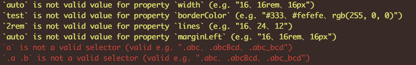
Validation
We followed the css-layout style standard. There will be a friendly reminder on the console when your code is not standardized.


