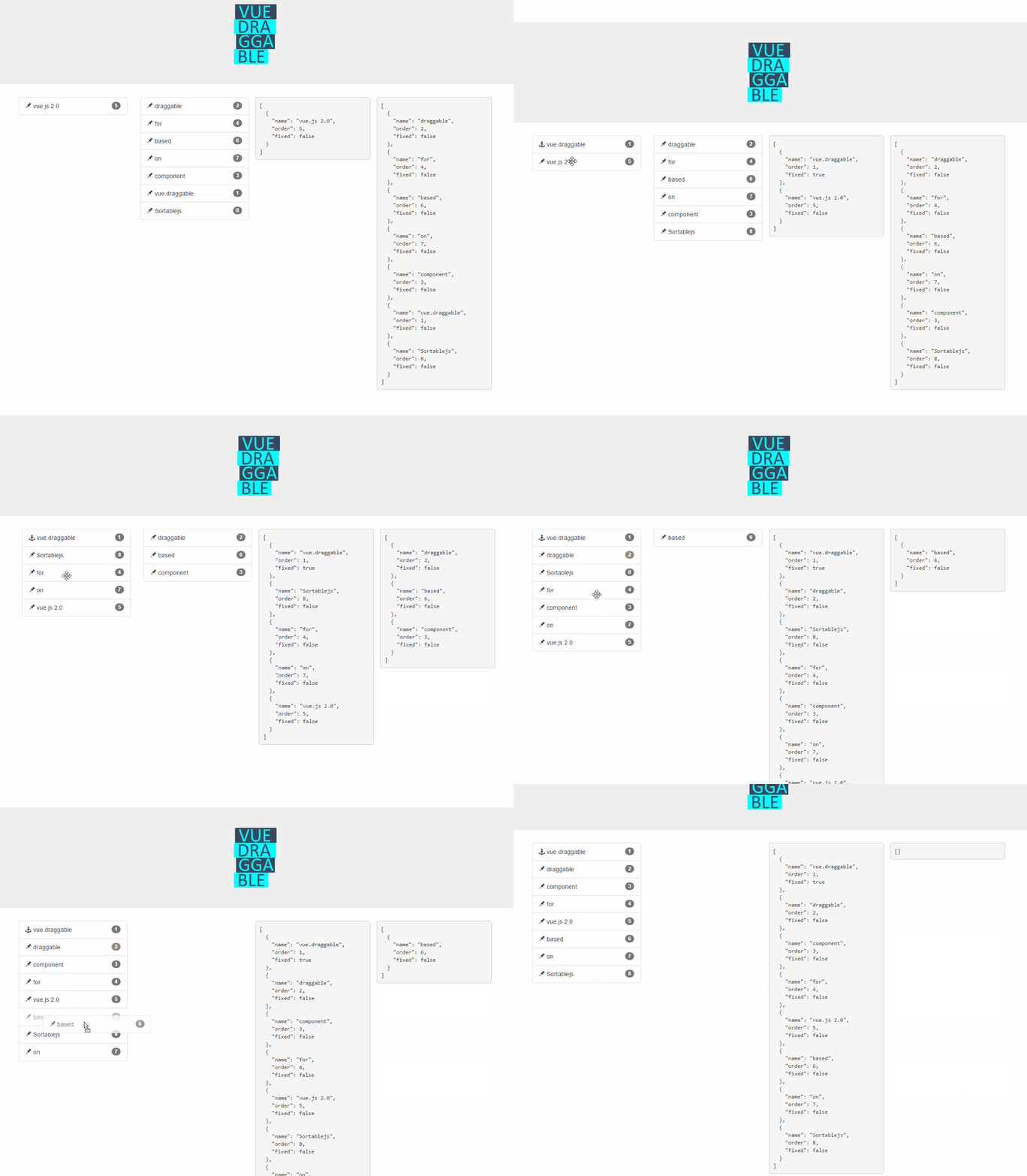
vue.draggable.next


Vue component (Vue.js 3.0) allowing drag-and-drop and synchronization with view model array.
For Vue 2 and Vue 1 version check: https://github.com/SortableJS/Vue.Draggable
Based on and offering all features of Sortable.js
Demo

Live Demos
https://sortablejs.github.io/vue.draggable.next/
Features
- Full support of Sortable.js features:
- Supports touch devices
- Supports drag handles and selectable text
- Smart auto-scrolling
- Support drag and drop between different lists
- No jQuery dependency
- Keeps in sync HTML and view model list
- Compatible with Vue.js 3.0 transition-group
- Cancellation support
- Events reporting any changes when full control is needed
- Reuse existing UI library components (such as vuetify, element, or vue material etc...) and make them draggable using
tag and componentData props
Donate
Find this project useful? You can buy me a :coffee: or a :beer:

Installation
With npm or yarn
yarn add vuedraggable@next

npm i -S vuedraggable@next
with direct link
<script src="//cdnjs.cloudflare.com/ajax/libs/vue/3.0.2/vue.min.js"></script>
<script src="//cdn.jsdelivr.net/npm/sortablejs@1.10.2/Sortable.min.js"></script>
<script src="//cdnjs.cloudflare.com/ajax/libs/Vue.Draggable/4.0.0/vuedraggable.umd.min.js"></script>
cf example section
Typical use:
<draggable
  v-model="myArray"
  group="people"
  @start="drag=true"
  @end="drag=false"
  item-key="id">
  <template #item="{element}">
    <div>{{element.name}}</div>
   </template>
</draggable>
  import draggable from 'vuedraggable'
  ...
  export default {
        components: {
            draggable,
        },
        data() {
          return {
            drag: false,
          }
        },
  ...
The item slot should be used to display items of the list. It receives the element value and the element index as slot-props.
With transition-group:
<draggable v-model="myArray" tag="transition-group" item-key="id">
  <template #item="{element}">
      <div> {{element.name}} </div>
  </template>
</draggable>
<draggable v-model="myArray" item-key="id">
  <template #item="{element}">
    <div> {{element.name}} </div>
  </template>
  <template #footer>
    <button @click="addPeople">Add</button>
  </template>
</draggable>
<draggable v-model="myArray" item-key="id">
  <template #item="{element}">
    <div> {{element.name}} </div>
  </template>
  <template #header>
    <button @click="addPeople">Add</button>
  </template>
</draggable>
With Vuex:
<draggable v-model='myList'>
computed: {
    myList: {
        get() {
            return this.$store.state.myList
        },
        set(value) {
            this.$store.commit('updateList', value)
        }
    }
}
Migrate from vue 2 version:
Breaking changes:
- Use
item slot instead of default to display elements - Provide a key for items using
itemKey props
From:
<draggable v-model="myArray">
<div v-for="element in myArray" :key="element.id">{{element.name}}</div>
</draggable>
To:
<draggable v-model="myArray" item-key="id">
  <template #item="{element}">
    <div>{{element.name}}</div>
   </template>
</draggable>
Breaking changes:
3) When using transition, you should now use the tag props and componentData to create the transition
From
<draggable v-model="myArray">
<transition-group name="fade">
<div v-for="element in myArray" :key="element.id">
{{element.name}}
</div>
</transition-group>
</draggable>
to
<draggable v-model="myArray" tag="transition-group" :component-data="{name:'fade'}">
  <template #item="{element}">
    <div>{{element.name}}</div>
  </template>
</draggable>
Props
modelValue
Type: Array
Required: false
Default: null
Input array to draggable component. Typically same array as referenced by inner element v-for directive.
This is the preferred way to use Vue.draggable as it is compatible with Vuex.
It should not be used directly but only though the v-model directive:
<draggable v-model="myArray">
list
Type: Array
Required: false
Default: null
Alternative to the modelValue prop, list is an array to be synchronized with drag-and-drop.
The main difference is that list prop is updated by draggable component using splice method, whereas modelValue is immutable.
Do not use in conjunction with modelValue prop.
itemKey
Type: String or Function
Required: true
The property to be used as the element key. Alternatively a function receiving an element of the list and returning its key.
All sortable options
Sortable options can be set directly as vue.draggable props since version 2.19.
This means that all sortable option are valid sortable props with the notable exception of all the method starting by "on" as draggable component expose the same API via events.
kebab-case property are supported: for example ghost-class props will be converted to ghostClass sortable option.
Example setting handle, sortable and a group option:
<draggable
v-model="list"
handle=".handle"
:group="{ name: 'people', pull: 'clone', put: false }"
ghost-class="ghost"
:sort="false"
@change="log"
>
</draggable>
tag
Type: String
Default: 'div'
HTML node type of the element that draggable component create as outer element for the included slot.
It is also possible to pass the name of vue component as element. In this case, draggable attribute will be passed to the create component.
See also componentData if you need to set props or event to the created component.
clone
Type: Function
Required: false
Default: (original) => { return original;}
Function called on the source component to clone element when clone option is true. The unique argument is the viewModel element to be cloned and the returned value is its cloned version.
By default vue.draggable reuses the viewModel element, so you have to use this hook if you want to clone or deep clone it.
move
Type: Function
Required: false
Default: null
If not null this function will be called in a similar way as Sortable onMove callback.
Returning false will cancel the drag operation.
function onMoveCallback(evt, originalEvent){
...
}
evt object has same property as Sortable onMove event, and 3 additional properties:
draggedContext: context linked to dragged element
index: dragged element indexelement: dragged element underlying view model elementfutureIndex: potential index of the dragged element if the drop operation is accepted
relatedContext: context linked to current drag operation
index: target element indexelement: target element view model elementlist: target listcomponent: target VueComponent
HTML:
<draggable :list="list" :move="checkMove">
javascript:
checkMove: function(evt){
    return (evt.draggedContext.element.name!=='apple');
}
See complete example: Cancel.html, cancel.js
componentData
Type: Object
Required: false
Default: null
This props is used to pass additional information to child component declared by tag props.
Value: an object corresponding to the attributes, props and events we would pass to the component.
Example (using element UI library):
<draggable tag="el-collapse" :list="list" :component-data="getComponentData()" item-key="name">
  <template #item="{element}">
    <el-collapse-item :title="element.title" :name="element.name">
        <div>{{element.description}}</div>
     </el-collapse-item>
  </template>
</draggable>
methods: {
    handleChange() {
      console.log('changed');
    },
    inputChanged(value) {
      this.activeNames = value;
    },
    getComponentData() {
      return {
        onChange: this.handleChange,
        onInput: this.inputChanged,
        wrap: true,
        value: this.activeNames
      };
    }
  }
Events
-
Support for Sortable events:
start, add, remove, update, end, choose, unchoose, sort, filter, clone
Events are called whenever onStart, onAdd, onRemove, onUpdate, onEnd, onChoose, onUnchoose, onSort, onClone are fired by Sortable.js with the same argument.
See here for reference
Note that SortableJS OnMove callback is mapped with the move prop
HTML:
<draggable :list="list" @end="onEnd">
Slots
item
The item slot is used to display one element of the list. Vue.draggable will iterate the list and call this slot for each element.
Slot props:
element the element in the listindex the element index
It is the only required slot.
<draggable v-model="myArray" item-key="id">
  <template #item="{element, index}">
    <div> {{index}} - {{element.name}} </div>
  </template>
</draggable>
Use the header slot to add none-draggable element inside the vuedraggable component.
Ex:
<draggable v-model="myArray" item-key="id">
  <template #item="{element}">
    <div> {{element.name}} </div>
  </template>
  <template #header>
    <button @click="addPeople">Add</button>
  </template>
</draggable>
Use the footer slot to add none-draggable element inside the vuedraggable component.
Ex:
<draggable v-model="myArray" item-key="id">
  <template #item="{element}">
    <div> {{element.name}} </div>
  </template>
  <template #footer>
    <button @click="addPeople">Add</button>
  </template>
</draggable>
Example


