Vue Content Skeleton Loader
Creating a loading animation with an attractive appearance and in line with the app design, for a pleasant user experience.
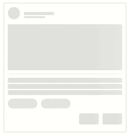
Basic Usage
Using npm
npm install vue-content-loading-skeleton
Using yarn
yarn add vue-content-loading-skeleton
import VueSkeletonLoader from 'vue-content-skeleton-loader';
import 'vue-content-skeleton-loader/dist/style.css';

<VueSkeletonLoader type="text"></VueSkeletonLoader>
Introduction
Skeleton loader provides a simple solution to provide loading variables in your application.
It prepares the user for content while data is fetched from the server or loaded asynchronously.
Props
Skeleton
|
loading
|
true
false
|
true
|
Boolean
|
|
If it is true, the skeleton loader will be displayed.
|
|
type
|
text
avatar
image
button
chip
divider
|
text
|
String
|
It is a string that specifies the type and number of your skeleton, such as text@4,
the value before @ specifies the type of skeleton and the value after that specifies the number,
and if only the type is written, the value is one.
|
|
animation
|
wave
|
wave
|
String
|
|
The animation parameter is a string; if left empty string, no animation will be displayed.
To showcase a specific animation, provide its name and globally define the corresponding keyframes.
|
|
duration
|
-
|
1.5s
|
String
|
|
The duration of the animation.
|
|
base-color
|
-
|
#0000001E
|
String
|
|
The background color of the skeleton.
|
|
highlight-color
|
-
|
#FFFFFF66
|
String
|
|
The highlight color in the skeleton animation.
|
|
border-radius
|
-
|
different for any types
|
String
Number
|
|
The border radius of the skeleton and it's different for any type.
|
|
height
|
-
|
different for any type
|
String
Number
|
|
The height of skeleton.
|
|
width
|
-
|
different for any types
|
String
Number
|
|
The width of skeleton.
|
|
direction
|
ltr
|
ltr
rtl
|
String
|
|
The direction of the animation.
|
|
skeleton-style
|
-
|
{}
|
Object
|
|
A custom style for individual skeleton elements.
|
|
skeleton-class-name
|
-
|
""
|
String
|
A custom class name for individual skeleton elements is used alongside default class names
v-skeleton-loader-${type} and vue-skeleton-loader-bone.
|
Examples
Custom animation
To set a custom animation for the VueSkeletonLoader, first, register the animation globally, then pass its
name to the component using the animation prop.
Troubleshooting
Skeleton gets width 0 when parent display is flex
In the example below, the issue is demonstrated. To resolve it, you can either set the style flex:1 for
VueSkeletonLoader or enclose the skeleton within a div element, as shown below:
<script setup lang="ts">
  import VueSkeletonLoader from 'vue-content-skeleton-loader';
  import 'vue-content-skeleton-loader/dist/style.css';
</script>
<template>
  <div class="container">
    <div class="avatar-container">
      <VueSkeletonLoader type="avatar"/>
      <div>
        <VueSkeletonLoader type="text" width="100px" height="10px"/>
        <VueSkeletonLoader type="text" width="70px" height="6px"/>
      </div>
    </div>
  </div>
</template>

<style lang="scss">
  .container {
    max-width: 400px;
    margin: 30px auto;
    padding: 12px;
    border: 2px solid #0000001E;
    border-radius: 0.25rem;

    .avatar-container {
      display: flex;
      gap: 12px;
      align-items: center;
    }
  }

</style>
License
MIT


