
Security News
US Government Forces Anthropic to Pull Claude Fable Days After Launch
Anthropic says the directive cited national security concerns over a narrow jailbreak, but offered no specific technical details.
By Sarah Gooding - Jun 13, 2026
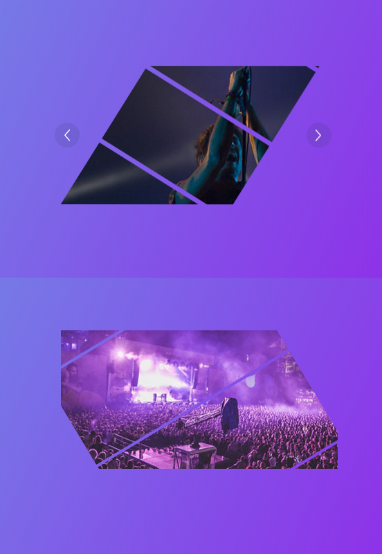
vue-piece-slider
Advanced tools
[](https://app.codacy.com/app/dreambo8563/vue-piece-slider?utm_source=github.com&utm_medium=referral&utm_content=dreambo8563/vue-piece-slider&utm_campaign=Badge_Gr


This library is a simplified Vue portal of an awesome Codrops Article by Luis Manuel (original source).
In this version, just support image type.
npm install --save animejs vue-piece-slider
Check out the Demo to see it in action.
<template>
  <div class="content" id="app">
    <Slider
      :arrow="true"
      :options="options"
      @click="click"
      class="slider"
      :list="list"
      v-model="activeIndex"
    ></Slider>
  </div>
</template>

<script>
import Slider from "vue-piece-slider"

export default {
  name: "app",
  data() {
    return {
      activeIndex: 0,
      list: [
        "./img/1.jpg",
        "./img/2.jpg",
        "./img/3.jpg",
        "./img/4.jpg",
        "./img/5.jpg"
      ],
      options: {
        angle: 30,
        extraSpacing: { extraX: 1, extraY: -20 },
        piecesWidth: 100,
        ty: 200,
        piecesSpacing: 1,
        animation: {
          duration: 2000,
          easing: "easeOutQuint"
        }
      }
    }
  },
  components: {
    Slider
  },
  methods: {
    click() {
      // eslint-disable-next-line no-console
      console.info("object")
    }
  }
}
</script>

<style lang="scss">
#app {
  font-family: "Avenir", Helvetica, Arial, sans-serif;
  -webkit-font-smoothing: antialiased;
  -moz-osx-font-smoothing: grayscale;
  text-align: center;
  color: #2c3e50;
  margin-top: 60px;
  .slider {
    width: 400px;
    height: 200px;
  }
}
</style>
| Property | Type | Default | Description |
|---|---|---|---|
list | Array | [] | The image list |
value | Number |String | 0 | The activeIndex |
arrow | Booleans | true | if to show the action arrow when hover |
| Property | Type | Default | Description |
|---|---|---|---|
angle | Number | 45 | Rotation angle for pieces. All pieces in the same item will have the same rotation angle. |
extraSpacing | Object | { extraX: 500, extraY: 200 } | Extra space that should be covered by the pieces. You can set a different value for each axis using an Object like: {extraX: 0, extraY: 0}. This is useful if angle != 0. |
piecesWidth | Func |Number | random(50, 200) | Pieces width. |
piecesSpacing | Func |Number | 5 | Separation among pieces. |
more params please follow the package of Piece
Thanks goes to these wonderful people (emoji key):
 Vincent Guo 💻 📖 🚇 |
This project follows the all-contributors specification. Contributions of any kind welcome!
FAQs
[](https://app.codacy.com/app/dreambo8563/vue-piece-slider?utm_source=github.com&utm_medium=referral&utm_content=dreambo8563/vue-piece-slider&utm_campaign=Badge_Gr
The npm package vue-piece-slider receives a total of 1 weekly downloads. As such, vue-piece-slider popularity was classified as not popular.
We found that vue-piece-slider demonstrated a not healthy version release cadence and project activity because the last version was released a year ago. It has 1 open source maintainer collaborating on the project.
Did you know?

Socket for GitHub automatically highlights issues in each pull request and monitors the health of all your open source dependencies. Discover the contents of your packages and block harmful activity before you install or update your dependencies.
Security News
Anthropic says the directive cited national security concerns over a narrow jailbreak, but offered no specific technical details.

Security News
A network of 152 Chrome live wallpaper extensions hid ad tracking and made extension-driven traffic look like Google search clicks.

Company News
Socket’s first CISO brings deep experience securing high-growth SaaS companies as open source supply chain threats accelerate.