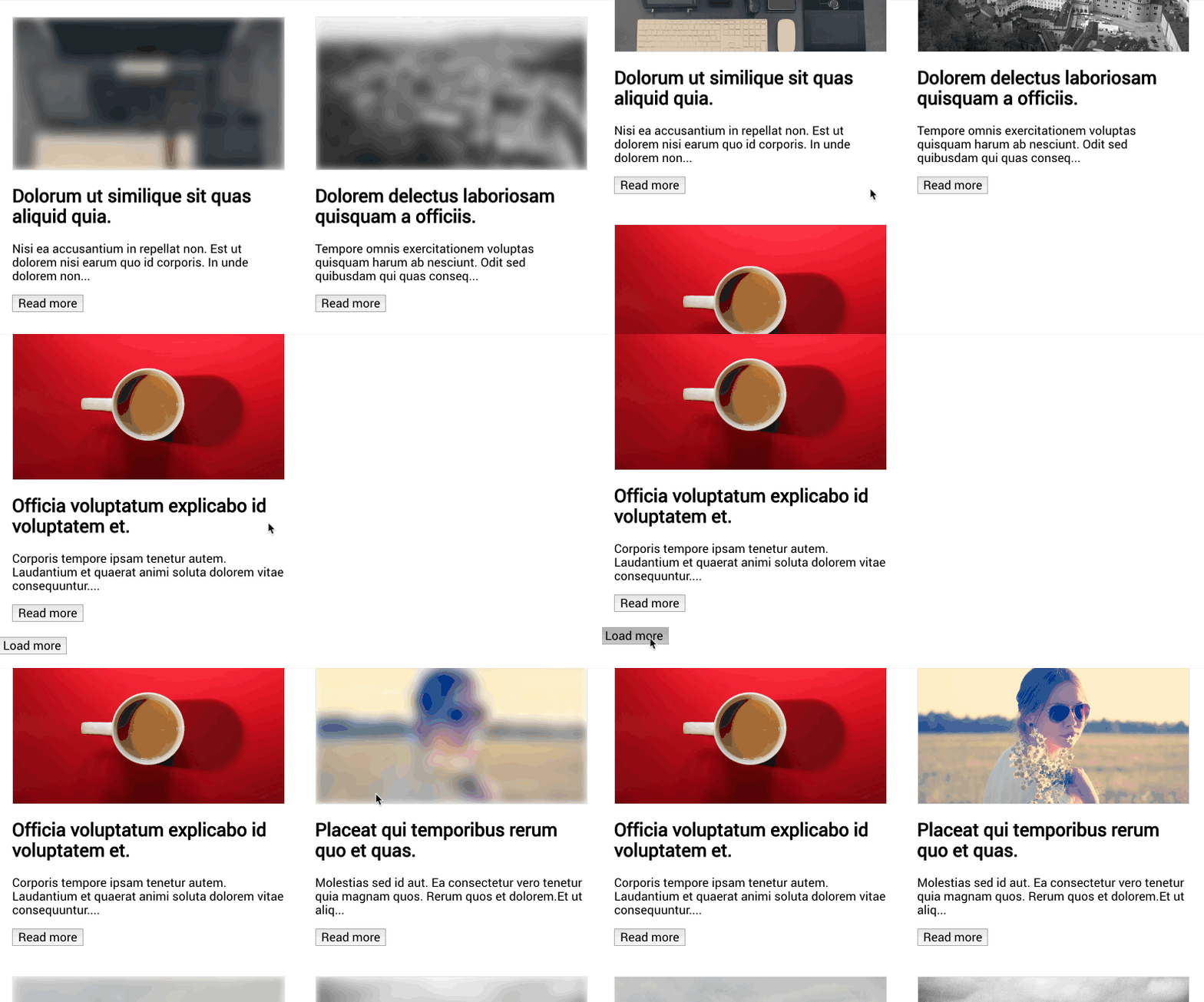
vue-progressive-image
Vue progressive image loading plugin

Installation
$ npm install vue-progressive-image
Usage
import { createApp } from "vue";
import App from "./App.vue";

import "vue-progressive-image/dist/style.css";
import VueProgressiveImage from "vue-progressive-image";

const app = createApp(App);

app.use(VueProgressiveImage);

app.mount("#app");
Progressive image
Instead of using the normal img tag to load images
<img src="https://unsplash.it/1920/1080?image=10" />
use the progressive-image component already globally available after the plugin installation
<progressive-image src="https://unsplash.it/1920/1080?image=10" />
Placeholders
To be able to show some feedback to the user as soon as you can, make sure to pass a placeholder image, which could be also 1% the size of the main image: it will be blurred so you can go crazy with optimizations here.
in this example I have a 20x80 placeholder picture while waiting for a 1920x1080, you do you.
<progressive-image
  src="https://unsplash.it/1920/1080?image=10"
  placeholder-src="https://unsplash.it/20/80?image=10"
/>
The slot
If you need to display some content or even just a loader on top of the image, you can use the default slot. A prop called isLoading can be used to show/hide any content while the images are loading.
<progressive-image src="https://unsplash.it/1920/1080?image=10">
  <template #default="{ isLoading }">
    <p v-if="isLoading">Loading...</p>
    <p v-else>lorem ipsum dolor sit amet, consectetur adipiscing elit.</p>
  </div>
</progressive-image>
Circle
This props renders the image as a responsive circle
### Object cover and object contain

These 2 options make the image act more like a background. `object-cover` will scale the image to cover the whole container, while `object-contain` scales the image so the whole images is shown. The aspect ratio of the image is respected.

```html
<progressive-image object-cover src="https://unsplash.it/1920/1080?image=10" />
<progressive-image
  object-contain
  src="https://unsplash.it/1920/1080?image=10"
/>
Select none
The image won't be selectable
<progressive-image select-none src="https://unsplash.it/1920/1080?image=10" />
Poll interval
The plugin can grab the image sizes faster than a plain image tag because it starts polling to the HTML elements until it gets the first data out: naturalWidth and naturalHeight. This makes sure that we get a ratio and the space of the image as soon as possible to avoid content jumping. This prop customizes the amount of milliseconds between each check. The default poll interval is 10ms.
<progressive-image
  poll-interval="200"
  src="https://unsplash.it/1920/1080?image=10"
/>
Blur
It is possible to adjust the level of blur applied to the placeholder image
<progressive-image
  src="https://unsplash.it/1920/1080?image=10"
  placeholder-src="https://unsplash.it/1920/1080?image=10"
  blur="30"
/>
Ratio
It is possible to manually specify the image aspact ratio when you know it. It allows the placeholder to be displayed in the correct aspect ratio. The ratio is calculated as height / width.
<progressive-image
  src="https://unsplash.it/1920/1080?image=10"
  aspect-ratio="1.5"
/>
Image fallback
In case of a loading error of the main image, it is possible to add a fallback image which can display an error image or just another image.
<progressive-image
  src="https://this_url_should_cause_an_error"
  fallback-src="https://unsplash.it/1920/1080?image=10"
/>
Events
When the image loads correctly or throws an error, an event is emitted.
<progressive-image
  src="https://this_url_should_cause_an_error"
  fallback-src="https://unsplash.it/1920/1080?image=10"
  @success="mainImageLoaded"
  @error="placeholderImageError"
/>
Component props
src
- type: String,
- required: true,
placeholder-src
fallback-src
delay
- type: [String, Number]
- default: 0
blur
- type: [String, Number]
- default: 20
alt
circle
- type: Boolean
- default: false
object-cover
- type: Boolean
- default: false
object-contain
- type: Boolean
- default: false
select-none
- type: Boolean
- default: false
aspect-ratio
- type: [String, Number]
- default: 0.5625
poll-interval
- type: [String, Number]
- default: 10
Issues and features requests
Please drop an issue, if you find something that doesn't work, or a feature request at https://github.com/MatteoGabriele/vue-progressive-image/issues
Follow me on twitter @matteo_gabriele


