Security News
Input Validation Vulnerabilities Dominate MITRE's 2024 CWE Top 25 List
MITRE's 2024 CWE Top 25 highlights critical software vulnerabilities like XSS, SQL Injection, and CSRF, reflecting shifts due to a refined ranking methodology.
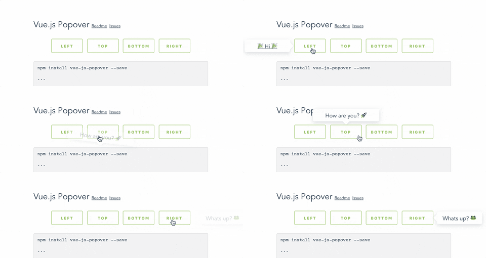
Vue.js 2+ popover component. Forked from https://github.com/euvl/vue-js-popover
Forked from https://github.com/euvl/vue-js-popover, but with better dropdown and pointer positioning.

Original package live demo here
Install:
npm install vue2-ppvr --save
Import:
import Vue from 'vue'
import Popover from 'vue2-ppvr'

Vue.use(Popover)
Use:
<button v-popover:foo>Toggle popover</button>

<popover name="foo">
  Hello
</popover>
Or:
<button v-popover="{ name: 'foo' }">Toggle popover</button>
Plugin contains a simple wrapper for Tooltip. To use it you will have to:
Set tooltip flag in your main.js:
import VPopover from 'vue2-ppvr'
Vue.use(VPopover, { tooltip: true })
Include tooltip component anywhere in the application:
<tooltip />
Assign message to any element:
<button v-popover:tooltip="'This is a string value'">My butt0n</button>
| Name | Type | Required | Description |
|---|---|---|---|
| name | String | + | ... |
| width | Number | - | ... |
| transition | String | - | ... |
| pointer | Boolean | - | If set - will show a tiny tip |
| event | "click" | "hover" | - | Type of event that will trigger showing of the popover |
| delay | Number | - | Delay in milliseconds |
You can use .left, .right, .top, .bottom modifiers to set the position of the popover.
Example:
<button v-popover:info.right>Edit (show popover right)</button>

<button v-popover.left="{ name: 'info' }">Edit</button>
Popover components have data-popover="name" argument that allows to apply styles to it.
Example:
<popover name="foo" :pointer="false">Bar</popover>
[data-popover='foo'] {
  background: #444;
  color: #f9f9f9;

  font-size: 12px;
  line-height: 1.5;
  margin: 5px;
}
FAQs
Vue.js 2+ popover component. Forked from https://github.com/euvl/vue-js-popover, but with better dropdown and pointer positioning
The npm package vue2-ppvr receives a total of 4 weekly downloads. As such, vue2-ppvr popularity was classified as not popular.
We found that vue2-ppvr demonstrated a not healthy version release cadence and project activity because the last version was released a year ago. It has 1 open source maintainer collaborating on the project.
Did you know?

Socket for GitHub automatically highlights issues in each pull request and monitors the health of all your open source dependencies. Discover the contents of your packages and block harmful activity before you install or update your dependencies.

Security News
MITRE's 2024 CWE Top 25 highlights critical software vulnerabilities like XSS, SQL Injection, and CSRF, reflecting shifts due to a refined ranking methodology.

Security News
In this segment of the Risky Business podcast, Feross Aboukhadijeh and Patrick Gray discuss the challenges of tracking malware discovered in open source softare.

Research
Security News
A threat actor's playbook for exploiting the npm ecosystem was exposed on the dark web, detailing how to build a blockchain-powered botnet.