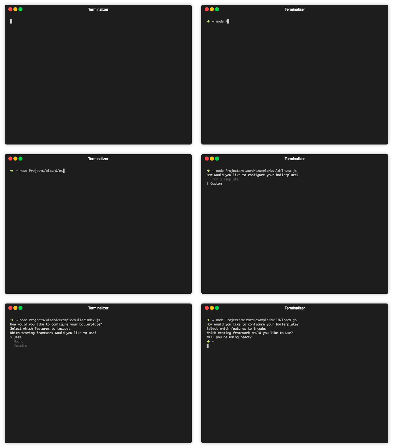
Wizard

The fastest way to build CLI setup wizards.
Installation
npm install wizard
import Wizard from 'wizard';

import questions from './questions';

const wizard = new Wizard(questions);
wizard.init().then(selections => {
  console.log(selections);
  process.exit();
});
Api
Wizard(questions, [styles, components])
Wizard represents a new setup wizard.
- questions (Object - see Questions object) containing the complete specification of your setup wizard.
- styles (Object optional - see Styles object) containing style options for your wizard.
- components (Object optional - see Custom Components) containing custom input components.
wizard.init() -> Promise<Object>
init initializes your setup wizard.
- It returns the Promise of a
selection object.
Questions Object
The Questions Object represents every step of your setup wizard. It is an infinitely nested object representing the flow of choices from the first question, to the last.
Every section of the Questions Object must have the following fields:
- question (string) Your question
- id (string) The key that the answer will be stored under.
- type (string) The input component type (See Input types).
Depending on the input type, you may be required to have:
- options (Array of
option) All options for a question (List & ListToggle inputs).
- option - (Object) Represents one choice
- name (string) Your choice.
- value (string | bool) The value your variable is asigned if chosen.
- then (string optional) Which question the user is directed to next.
- then (string) The next question (not used with input type List & ListToggle).
Example:
{
  question: 'My question',
  id: 'my-question',
  type: 'list',
  options: [
    { name: 'Answer 1', value: 'answer-1', then: 'question2' },
    { name: 'Answer 2', value: 'answer-2', then: 'question3' },
  ],
  then: {
    question2: {
      question: 'Question 2',
      id: 'question-2',
      type: 'list',
      options: [
        { name: 'Answer 1', value: 'answer-1' },
        { name: 'Answer 2', value: 'answer-2' },
      ]
    },
    question3: {
      question: 'Question 3',
      id: 'question-3',
      type: 'list',
      options: [
        { name: 'Answer 1', value: 'answer-1' },
        { name: 'Answer 2', value: 'answer-2' },
        { name: 'Answer 3', value: 'answer-3' },
        { name: 'Answer 4', value: 'answer-4' },
      ]
    }
  }
}
Styles Object
The styles object is passed in on the creation of the wizard. There are defaults that will be overridden.
{
  preserveAnswer: bool - Preserve the previous question when finished
  question: {
    color: function - The color of the question
    prefex: string - Question text prefix
    paddingLeft: int - Left padding for question
  }
  caret : {
    icon: string - The character representing the caret
    color: function - The color of the caret
    paddingRight: int - Right padding for the caret
    paddingLeft: int - Left padding for the caret
  }
  list: {
    wrapToTop: bool - Whether the caret wraps to top
    defaultColor: function - The color of non-selected items
    selectedColor: function - The color of currently selected item
    toggledColor: function - The color of toggled items
    paddingLeft: int - Left padding for the whole list
    toggle: {
      icon: string - The character representing selected items
      color: function - The color of the selected item icon
      paddingRight: int - Right padding for the selected icon
      paddingLeft: int - Left padding for the selected icon
    }
  }
}
Input Types
Right now Wizard includes the following input types:
List - A list of choices, select one with Enter
- Needs:
- options (Array of Options)
- Use it by selecting
list in your questions object: type: 'list'
ListToggle - A list of choices, select multiple with Space
- Needs:
- options (Array of Options)
- Use it by selecting
listToggle in your questions object: type: 'listToggle'
Custom Inputs
You can make your very own personalized inputs if the ones provided don't suit your needs. A Component class is available by importing it - import { Component } from 'wizard. It provides a number of methods and events to extend wizard however you wish.
Each Input must have an init and an update method.
- init() Starts your input component - This is a promise that will return the users selected or provided input.
- update() Repaints the screen. Leave empty if making a simple input.
To create a basic component:
import { Component } from 'wizard';

class MyComponent extends Component {
  constructor() {
    super();
  }

  init() {
    return new Promise(resolve => {
      this.onKeySpace = () => {
        this.write('Space Pressed!');
      }

      this.initialize('My new input!');
    });
  }

  update() {}
}
Now import it and use it:
import Wizard from 'wizard';
import MyComponent from './MyComponent';

const question = {
  question: 'Press space: ',
  id: 'space',
  type: 'myComponent',
};

const main = async () => {
  const wizard = new Wizard(questions, {}, { myComponent: MyComponent });
  const selections = await wizard.init();
  console.log(selections);
};
Methods
The Component class provides a number of methods to use when creating your input.
initialize(question) Initialize the component.
- question (string) The questions text.
write(text) Write string to screen.
- text (string) Text to write to the screen.
newline() Write a newline to the screen.
clear() Clear the components output.
cleanAndExit() Restore the cursor and gracefully exit.
Events
A number of keyPress events can be handled. The only manditory handler is for onKeyEnter. This must resolve the component and clear the screen for the next question. The following event handlers are available:
-
onKeyEnter
-
onKeyUp
-
onKeyDown
-
onKeyLeft
-
onKeyRight
-
onKeySpace
Example:
this.onKeyEnter = () => {
  this.clear();
  resolve('test');
}
We use the chalk library for coloring, and ansi-escapes for cursor manipulation. Access them through this.color and this.ansi respectively.


