Security News
Bun 1.2.19 Adds Isolated Installs for Better Monorepo Support
Bun 1.2.19 introduces isolated installs for smoother monorepo workflows, along with performance boosts, new tooling, and key compatibility fixes.
plotly_resampler: visualize large sequential data by adding resampling functionality to Plotly figures
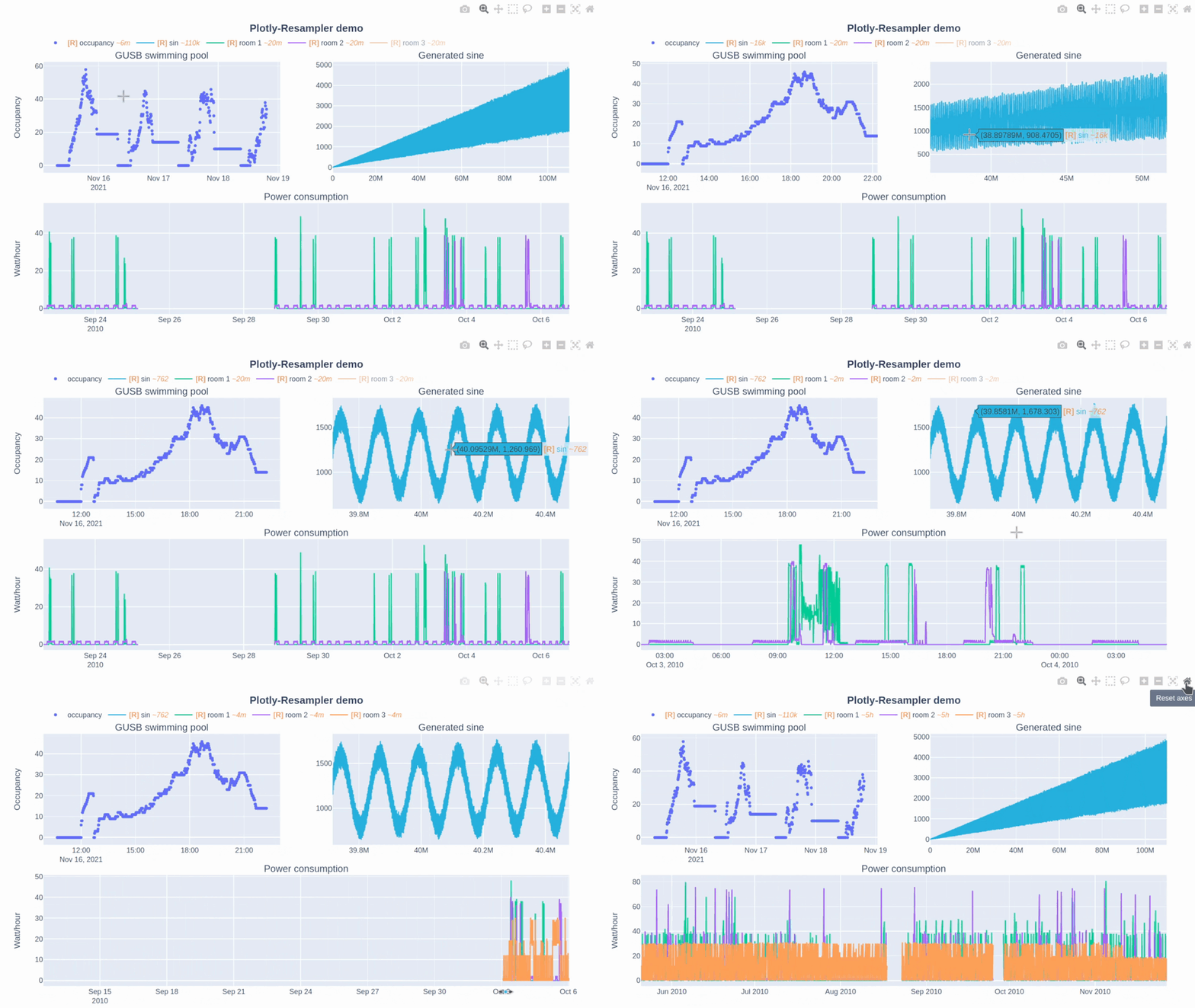
plotly-resampler improves the scalability of Plotly for visualizing large time series datasets. Specifically, our library dynamically aggregates time-series data respective to the current graph view, ensuring efficient and responsive updates during user interactions like panning or zooming via callbacks.
This core aggregation functionality is achieved by utilizing by time-series data point selection algorithms, for which plotly-resampler leverages the highly optimized implementations available in tsdownsample. Our default data aggregation method is MinMaxLTTB (and selects 1000 data points for plotting). For a deeper understanding of this method, you can consult to the algorithm's dedicated MinMaxLTTB repository and the associated research paper.

In this Plotly-Resampler demo over 110,000,000 data points are visualized!
| pip | pip install plotly-resampler |
|---|
plotly-resampler can be thought of as wrapper around plain plotly figures which adds visualization scalability to line-charts by dynamically aggregating the data w.r.t. the front-end view. plotly-resampler thus adds dynamic aggregation functionality to plain plotly figures.
❗ Important to know:
show always generates a static HTML view of the figure, prohibiting dynamic aggregation.show_dash with FigureResampler to initiate a Dash app to realize the dynamic aggregation with callbacks.IPython.display), which will also spawn a dash-web appFigureWidgetResampler, you need to use IPython.display on the object, which uses widget-events to realize dynamic aggregation (via the running IPython kernel).Other changes of plotly-resampler figures w.r.t. vanilla plotly:
register_plotly_resampler function to your notebook with the best suited mode argument.FigureResampler decorator around a plotly Figure and call .show_dash()FigureWidgetResampler decorator around a plotly Figure and output the instance in a cellAdd dynamic aggregation to your plotly Figure (unfold your fitting use case)
🤖 Automatically (minimal code overhead):
register_plotly_resampler functionImport and call the register_plotly_resampler method
Just use your regular graph construction code
code example:
import plotly.graph_objects as go; import numpy as np
from plotly_resampler import register_plotly_resampler

# Call the register function once and all Figures/FigureWidgets will be wrapped
# according to the register_plotly_resampler its `mode` argument
register_plotly_resampler(mode='auto')

x = np.arange(1_000_000)
noisy_sin = (3 + np.sin(x / 200) + np.random.randn(len(x)) / 10) * x / 1_000


# auto mode: when working in an IPython environment, this will automatically be a
# FigureWidgetResampler else, this will be an FigureResampler
f = go.Figure()
f.add_trace({"y": noisy_sin + 2, "name": "yp2"})
f
Note: This wraps all plotly graph object figures with a
FigureResampler|FigureWidgetResampler. This can thus also be used for theplotly.expressinterface. 🎉
👷 Manually (higher data aggregation configurability, more speedup possibilities):
FigureWidgetResamplerFigureWidgetResampler instance in a cellimport plotly.graph_objects as go; import numpy as np
from plotly_resampler import FigureResampler, FigureWidgetResampler
x = np.arange(1_000_000)
noisy_sin = (3 + np.sin(x / 200) + np.random.randn(len(x)) / 10) * x / 1_000
# OPTION 1 - FigureWidgetResampler: dynamic aggregation via `FigureWidget.layout.on_change`
fig = FigureWidgetResampler(go.Figure())
fig.add_trace(go.Scattergl(name='noisy sine', showlegend=True), hf_x=x, hf_y=noisy_sin)
fig
FigureResampler.show_dash() on the Figureimport plotly.graph_objects as go; import numpy as np
from plotly_resampler import FigureResampler, FigureWidgetResampler
x = np.arange(1_000_000)
noisy_sin = (3 + np.sin(x / 200) + np.random.randn(len(x)) / 10) * x / 1_000
# OPTION 2 - FigureResampler: dynamic aggregation via a Dash web-app
fig = FigureResampler(go.Figure())
fig.add_trace(go.Scattergl(name='noisy sine', showlegend=True), hf_x=x, hf_y=noisy_sin)
fig.show_dash(mode='inline')
Tip 💡: For significant faster initial loading of the Figure, we advise to wrap the constructor of the plotly Figure and add the trace data as
hf_xandhf_y
Note: Any plotly Figure can be wrapped with
FigureResamplerandFigureWidgetResampler! 🎉 But only thego.Scatter/go.Scattergltraces are resampled.
FigureResampler.show_dash() method to your local machine.FigureWidgetResampler wrapper without needing to forward a port!FigureWidgetResampler uses the IPython main thread for its data aggregation functionality, so when this main thread is occupied, no resampling logic can be executed. For example; if you perform long computations within your notebook, the kernel will be occupied during these computations, and will only execute the resampling operations that take place during these computations after finishing that computation.~<range> suffix represent the mean aggregation bin size in terms of the sequence index.reset_axis button. If you want to give feedback and discuss this further with the developers, see issue #49.The paper about the plotly-resampler toolkit itself (preprint): https://arxiv.org/abs/2206.08703
@inproceedings{van2022plotly,
  title={Plotly-resampler: Effective visual analytics for large time series},
  author={Van Der Donckt, Jonas and Van Der Donckt, Jeroen and Deprost, Emiel and Van Hoecke, Sofie},
  booktitle={2022 IEEE Visualization and Visual Analytics (VIS)},
  pages={21--25},
  year={2022},
  organization={IEEE}
}
Related papers:
👤 Jonas Van Der Donckt, Jeroen Van Der Donckt, Emiel Deprost
FAQs
Visualizing large time series with plotly
We found that plotly-resampler demonstrated a healthy version release cadence and project activity because the last version was released less than a year ago. It has 2 open source maintainers collaborating on the project.
Did you know?

Socket for GitHub automatically highlights issues in each pull request and monitors the health of all your open source dependencies. Discover the contents of your packages and block harmful activity before you install or update your dependencies.

Security News
Bun 1.2.19 introduces isolated installs for smoother monorepo workflows, along with performance boosts, new tooling, and key compatibility fixes.

Security News
Popular npm packages like eslint-config-prettier were compromised after a phishing attack stole a maintainer’s token, spreading malicious updates.

Security News
/Research
A phishing attack targeted developers using a typosquatted npm domain (npnjs.com) to steal credentials via fake login pages - watch out for similar scams.