
Security News
Oracle Drags Its Feet in the JavaScript Trademark Dispute
Oracle seeks to dismiss fraud claims in the JavaScript trademark dispute, delaying the case and avoiding questions about its right to the name.
By Sarah Gooding - Feb 07, 2025
org.webjars.npm:react-16-bootstrap-date-picker
Advanced tools
WebJar for react-16-bootstrap-date-picker


See the demo at pushtell.github.io/react-bootstrap-date-picker.
Please ★ on GitHub!
Using this module in production? We'd love to hear about it.
react-bootstrap-date-picker is compatible with React 0.14.x and 0.15.x.
npm install react-bootstrap-date-picker
var DatePicker = require("react-bootstrap-date-picker");
var App = React.createClass({
getInitialState: function(){
var value = new Date().toISOString();
return {
value: value
}
},
handleChange: function(value, formattedValue) {
this.setState({
value: value, // ISO String, ex: "2016-11-19T12:00:00.000Z"
formattedValue: formattedValue // Formatted String, ex: "11/19/2016"
});
},
componentDidUpdate: function(){
// Access ISO String and formatted values from the DOM.
var hiddenInputElement = document.getElementById("example-datepicker");
console.log(hiddenInputElement.value); // ISO String, ex: "2016-11-19T12:00:00.000Z"
console.log(hiddenInputElement.getAttribute('data-formattedvalue')) // Formatted String, ex: "11/19/2016"
},
render: function(){
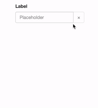
return <FormGroup>
<ControlLabel>Label</ControlLabel>
<DatePicker id="example-datepicker" value={this.state.value} onChange={this.handleChange} />
<HelpBlock>Help</HelpBlock>
</FormGroup>;
}
});
<DatePicker />DatePicker component. Renders as a React-Bootstrap InputGroup.
InputGroup properties are passed through to the input group.
Properties:
value - ISO date string representing the current value.
string"2016-05-19T12:00:00.000Z"defaultValue - ISO date string representing the default value. Cannot be set with 'value'.
string"2016-05-19T12:00:00.000Z"minDate - ISO date string to set the lowest allowable date value.
string"2016-05-19T12:00:00.000Z"maxDate - ISO date string to set the highest allowable date value.
string"2016-05-19T12:00:00.000Z"style - Style object passed to the FormControl input element.
object{width: "100%"}className - Class name passed to the FormControl input element.
stringexample-classautoComplete - autoComplete attribute passed to the FormControl input element.
stringoffautoFocus - Whether or not component starts with focus.
boolfalsedisabled - Whether or not component is disabled.
boolfalseonChange - Focus callback function.
functionvalue - ISO date string representing the selected value.
String"2016-05-19T12:00:00.000Z"formattedValue - String representing the formatted value as defined by the dateFormat property.
String"05/19/2016"onFocus - Focus callback function.
functionevent - Focus event.
EventonBlur - Blur callback function.
functionevent - Blur event.
EventdateFormat - Date format. Any combination of DD, MM, YYYY and separator.
string"MM/DD/YYYY", "YYYY/MM/DD", "MM-DD-YYYY", or "DD MM YYYY"clearButtonElement - Character or component to use for the clear button.
string or ReactClass"×"showClearButton - Toggles the visibility of the clearButton
boolfalseonClear - Defines what happens when clear button is clicked.
functionpreviousButtonElement - Character or component to use for the calendar's previous button.
string or ReactClass"<"nextButtonElement - Character or component to use for the calendar's next button.
string or ReactClass">"cellPadding - CSS padding value for calendar date cells.
string"2px"dayLabels - Array of day names to use in the calendar. Starting on Sunday.
array['Sun', 'Mon', 'Tue', 'Wed', 'Thu', 'Fri', 'Sat']monthLabels - Array of month names to use in the calendar.
array['January', 'February', 'March', 'April', 'May', 'June', 'July', 'August', 'September', 'October', 'November', 'December']calendarPlacement - Overlay placement for the popover calendar.
string or function"top"calendarContainer - Overlay container for the popover calendar. When placing the date-picker in a scrolling container, set this prop to some ancestor of the scrolling container.
document.bodyweekStartsOnMonday - OBSOLETE use weekStartsOnweekStartsOn - Makes the calendar's week to start on a specified day. 0 = Sunday, 1 = Monday, etc.
number4showTodayButton - Toggles the visibility of the today-button.
booleanfalsetodayButtonLabel - Label for the today-button
string"Today"customControl - Overwrite the default FormControl component with your own component.
React.Component<CustomControl />Methods:
Karma tests are performed on Browserstack in the following browsers:
Please let us know if a different configuration should be included here.
Locally:
npm test
On Browserstack:
BROWSERSTACK_USERNAME=YOUR_USERNAME BROWSERSTACK_ACCESS_KEY=YOUR_ACCESS_KEY npm test
FAQs
WebJar for react-16-bootstrap-date-picker
We found that org.webjars.npm:react-16-bootstrap-date-picker demonstrated a not healthy version release cadence and project activity because the last version was released a year ago. It has 0 open source maintainers collaborating on the project.
Did you know?

Socket for GitHub automatically highlights issues in each pull request and monitors the health of all your open source dependencies. Discover the contents of your packages and block harmful activity before you install or update your dependencies.
Security News
Oracle seeks to dismiss fraud claims in the JavaScript trademark dispute, delaying the case and avoiding questions about its right to the name.

Security News
The Linux Foundation is warning open source developers that compliance with global sanctions is mandatory, highlighting legal risks and restrictions on contributions.

Security News
Maven Central now validates Sigstore signatures, making it easier for developers to verify the provenance of Java packages.