Security News
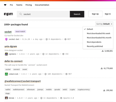
npm Updates Search Experience with New Objective Sorting Options
npm has a revamped search experience with new, more transparent sorting options—Relevance, Downloads, Dependents, and Publish Date.
@aplinkosministerija/design-system
Advanced tools
Design System library provides a set of UI components designed to streamline the development of consistent user interfaces among web applications.
You can install the design system package via npm or yarn:
npm install @aplinkosministerija/design-system
or
yarn add @aplinkosministerija/design-system
Before using our design system library, make sure to install and set up the styled-components package in your project. This package is essential for styling components within the design system, allowing for smooth integration and customization.
To use the styles provided by the design-system library, you need to import the CSS file into your main React application file (usually index.js, or App.js). This ensures that all components from the library are styled correctly. Add the following import statement to the top of your main application file:
import '@aplinkosministerija/design-system/dist/style.css';
For the library to function properly, ensure to utilize the Theme type provided by the design system library when configuring styled-components.
import { Theme } from '@aplinkosministerija/design-system';
When implementing global styles, you have the option to either create your own or import them from our library. However, if you choose to write your own global styles, it's important to remember to set the font-size to 62.5%. This adjustment is necessary because our design system relies on rem units rather than pixels. By setting the font-size to 62.5%, you can ensure consistent and predictable typography rendering across different screen sizes and devices.
In case you decide to implement your own global styles, add the following CSS to your global styles:
html {
    font-size: 62.5%;
}
Otherwise, import global styles from the library:
import { globalStyles } from '@aplinkosministerija/design-system';
const GlobalStyles = createGlobalStyle`${globalStyles(theme)}`;
Once styled-components are configured and the theme and global styles are set up, you can simply import components from the library and use them in your code.
import { Button } from '@aplinkosministerija/design-system';

const App = () => {
    return (
        <div>
            <Button onClick={() => alert('Button clicked!')}>Click me</Button>
        </div>
    );
}

export default App;
This project is licensed under the MIT License - see the LICENSE file for details.
FAQs
Shared Design System Components for React
The npm package @aplinkosministerija/design-system receives a total of 273 weekly downloads. As such, @aplinkosministerija/design-system popularity was classified as not popular.
We found that @aplinkosministerija/design-system demonstrated a healthy version release cadence and project activity because the last version was released less than a year ago. It has 0 open source maintainers collaborating on the project.
Did you know?

Socket for GitHub automatically highlights issues in each pull request and monitors the health of all your open source dependencies. Discover the contents of your packages and block harmful activity before you install or update your dependencies.

Security News
npm has a revamped search experience with new, more transparent sorting options—Relevance, Downloads, Dependents, and Publish Date.

Security News
A supply chain attack has been detected in versions 1.95.6 and 1.95.7 of the popular @solana/web3.js library.

Research
Security News
A malicious npm package targets Solana developers, rerouting funds in 2% of transactions to a hardcoded address.