Security News
pnpm 10.0.0 Blocks Lifecycle Scripts by Default
pnpm 10 blocks lifecycle scripts by default to improve security, addressing supply chain attack risks but sparking debate over compatibility and workflow changes.
@builder.io/angular
Advanced tools
Install
npm install @builder.io/angular
Add the module
import { BuilderModule } from '@builder.io/angular';

@NgModule({
  ...
  imports: [ BuilderModule.forRoot('YOUR_API_KEY') ],
  ...
})
export class MyAppModule { }
And then add the component wherever you like
<!-- The model input can be any model of yours -->
<builder-component model="page" (load)="contentLoaded($event)" (error)="contentError($event)">
  <!-- Default content inside the tag shows while the builder content is fetching -->
  <div class="spinner"></div>
</builder-component>
Then, update your model's preview URL to enable on-site editing like in this guide, and you are done!
Next, see the below info for more advanced usage, as well as this guide for creating custom models,
and this guide for SEO optimizing your content (for angular use the data from the load output to get the custom field data)
Simply replace your 404 component with something like the below to allow creating new pages in Builder easily
<!-- The model input can be any model of yours -->
<builder-component
  *ngIf="!noBuilderPageForUrl"
  model="page"
  (load)="noBuilderPageForUrl = $event ? false : true"
  (error)="noBuilderPageForUrl = true"
>
  <!-- Default content inside the tag shows while the builder content is fetching -->
  <div class="spinner"></div>
</builder-component>
<my-404-component *ngIf="noBuilderPageForUrl"> </my-404-component>
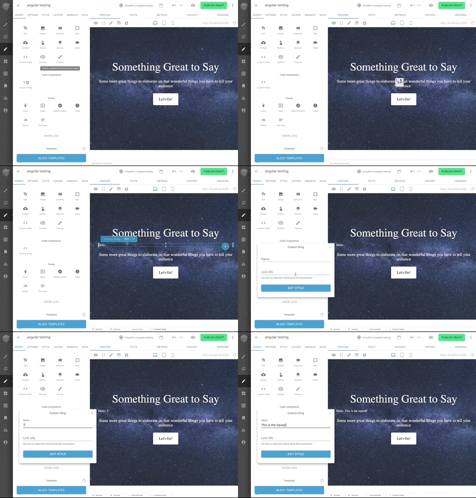
You can drag and drop to add your angular components in the Builder editor with a simple tag like below:
import { BuilderBlock } from '@builder.io/angular';
import { Component, Input } from '@angular/core';

@BuilderBlock({
  tag: 'custom-thing',
  name: 'Custom thing',
  inputs: [
    {
      name: 'name',
      type: 'string',
    },
  ],
})
@Component({
  selector: 'custom-thing',
  template: 'Hello: {{name}}',
})
export class CustomThing {
  @Input()
  name = '';
}
See here for full detail on input types available.

Use the data input for the Builder component tag to pass down data and actions to be used in the Builder editor.
See this guide for usage of your data and actions in the editor UI in Builder.
@Component({
  selector: 'my-page',
  template: '<builder-component model="page" [data]="data"></builder-component>',
})
export class MyPage {
  data = {
    someStateProperty: 'foo',
    someMethod: () => /* do something */,
    myService: this.myService
  }

  constructor(public myService: MyService) {

  }
}
Custom fields are a powerful feature when using custom models, for all sorts of customization, such as SEO optimization of your content
<builder-component model="page" (load)="contentLoaded($event)">
  <!-- Default content inside the tag shows while the builder content is fetching -->
  <div class="spinner"></div>
</builder-component>
contentLoaded(data) {
  // Data object (via the output $event) includes your custom fields, e.g. if you have a custom field named
  // "title"
  document.title = data.data.title
}
With component models you can also use Builder.io components in/around existing pages (aka it doesn't have to control the whole page). See info on making custom models for this here
<!-- The first part of your page -->
<builder-component model="my-section">Loading..</builder-component>
<!-- the rest of your page -->
You can then use queries and targeting to customize what content loads where
To see a full example integration see here for a simple Angular + Builder.io example project, or here for an Angular universal example
FAQs
Use the Builder Angular SDK to use Angular with Builder. You can get started by heading over to Builder's official documentation or digging right into the code in this directory. The official documentation provides more explicit instructions, while this R
The npm package @builder.io/angular receives a total of 1,307 weekly downloads. As such, @builder.io/angular popularity was classified as popular.
We found that @builder.io/angular demonstrated a healthy version release cadence and project activity because the last version was released less than a year ago. It has 0 open source maintainers collaborating on the project.
Did you know?

Socket for GitHub automatically highlights issues in each pull request and monitors the health of all your open source dependencies. Discover the contents of your packages and block harmful activity before you install or update your dependencies.

Security News
pnpm 10 blocks lifecycle scripts by default to improve security, addressing supply chain attack risks but sparking debate over compatibility and workflow changes.

Product
Socket now supports uv.lock files to ensure consistent, secure dependency resolution for Python projects and enhance supply chain security.

Research
Security News
Socket researchers have discovered multiple malicious npm packages targeting Solana private keys, abusing Gmail to exfiltrate the data and drain Solana wallets.