Security News
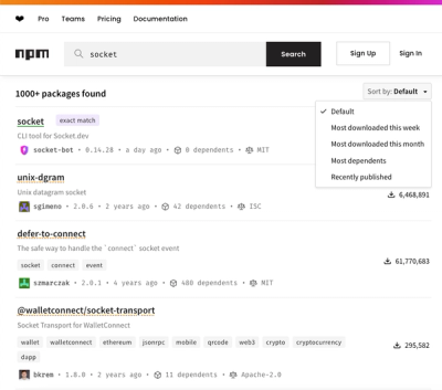
npm Updates Search Experience with New Objective Sorting Options
npm has a revamped search experience with new, more transparent sorting options—Relevance, Downloads, Dependents, and Publish Date.
@capacitor/dialog
Advanced tools
The Dialog API provides methods for triggering native dialog windows for alerts, confirmations, and input prompts
The Dialog API provides methods for triggering native dialog windows for alerts, confirmations, and input prompts
npm install @capacitor/dialog
npx cap sync
import { Dialog } from '@capacitor/dialog';

const showAlert = async () => {
  await Dialog.alert({
    title: 'Stop',
    message: 'this is an error',
  });
};

const showConfirm = async () => {
  const { value } = await Dialog.confirm({
    title: 'Confirm',
    message: `Are you sure you'd like to press the red button?`,
  });

  console.log('Confirmed:', value);
};

const showPrompt = async () => {
  const { value, cancelled } = await Dialog.prompt({
    title: 'Hello',
    message: `What's your name?`,
  });

  console.log('Name:', value);
  console.log('Cancelled:', cancelled);
};
alert(options: AlertOptions) => Promise<void>
Show an alert dialog
| Param | Type |
|---|---|
options | AlertOptions |
Since: 1.0.0
prompt(options: PromptOptions) => Promise<PromptResult>
Show a prompt dialog
| Param | Type |
|---|---|
options | PromptOptions |
Returns: Promise<PromptResult>
Since: 1.0.0
confirm(options: ConfirmOptions) => Promise<ConfirmResult>
Show a confirmation dialog
| Param | Type |
|---|---|
options | ConfirmOptions |
Returns: Promise<ConfirmResult>
Since: 1.0.0
| Prop | Type | Description | Default | Since |
|---|---|---|---|---|
title | string | Title of the dialog. | 1.0.0 | |
message | string | Message to show on the dialog. | 1.0.0 | |
buttonTitle | string | Text to use on the action button. | "OK" | 1.0.0 |
| Prop | Type | Description | Since |
|---|---|---|---|
value | string | Text entered on the prompt. | 1.0.0 |
cancelled | boolean | Whether if the prompt was canceled or accepted. | 1.0.0 |
| Prop | Type | Description | Default | Since |
|---|---|---|---|---|
title | string | Title of the dialog. | 1.0.0 | |
message | string | Message to show on the dialog. | 1.0.0 | |
okButtonTitle | string | Text to use on the positive action button. | "OK" | 1.0.0 |
cancelButtonTitle | string | Text to use on the negative action button. | "Cancel" | 1.0.0 |
inputPlaceholder | string | Placeholder text for hints. | 1.0.0 | |
inputText | string | Prepopulated text. | 1.0.0 |
| Prop | Type | Description | Since |
|---|---|---|---|
value | boolean | true if the positive button was clicked, false otherwise. | 1.0.0 |
| Prop | Type | Description | Default | Since |
|---|---|---|---|---|
title | string | Title of the dialog. | 1.0.0 | |
message | string | Message to show on the dialog. | 1.0.0 | |
okButtonTitle | string | Text to use on the positive action button. | "OK" | 1.0.0 |
cancelButtonTitle | string | Text to use on the negative action button. | "Cancel" | 1.0.0 |
FAQs
The Dialog API provides methods for triggering native dialog windows for alerts, confirmations, and input prompts
The npm package @capacitor/dialog receives a total of 26,959 weekly downloads. As such, @capacitor/dialog popularity was classified as popular.
We found that @capacitor/dialog demonstrated a healthy version release cadence and project activity because the last version was released less than a year ago. It has 8 open source maintainers collaborating on the project.
Did you know?

Socket for GitHub automatically highlights issues in each pull request and monitors the health of all your open source dependencies. Discover the contents of your packages and block harmful activity before you install or update your dependencies.

Security News
npm has a revamped search experience with new, more transparent sorting options—Relevance, Downloads, Dependents, and Publish Date.

Security News
A supply chain attack has been detected in versions 1.95.6 and 1.95.7 of the popular @solana/web3.js library.

Research
Security News
A malicious npm package targets Solana developers, rerouting funds in 2% of transactions to a hardcoded address.