Security News
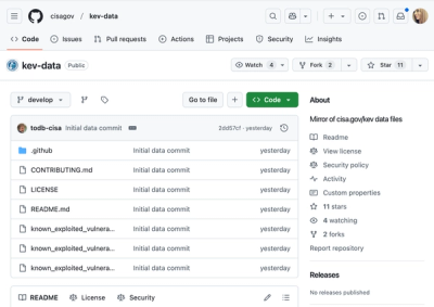
CISA Brings KEV Data to GitHub
CISA's KEV data is now on GitHub, offering easier access, API integration, commit history tracking, and automated updates for security teams and researchers.
@chakra-ui/icon
Advanced tools
@chakra-ui/icon is a package from the Chakra UI library that provides a set of customizable and accessible icons for React applications. It allows developers to easily integrate icons into their UI components with consistent styling and behavior.
Basic Icon Usage
This feature allows you to use any icon from popular icon libraries like FontAwesome by importing the icon and using it with the `Icon` component from @chakra-ui/icon. The `as` prop specifies the icon, and you can customize its size and color.
import { Icon } from '@chakra-ui/icon';
import { FaBeer } from 'react-icons/fa';
function Example() {
return <Icon as={FaBeer} w={8} h={8} color="teal.500" />;
}Custom SVG Icons
This feature allows you to create custom SVG icons by defining the SVG path within the `Icon` component. The `viewBox` and `color` props help in customizing the icon's appearance.
import { Icon } from '@chakra-ui/icon';

function CustomIcon() {
  return (
    <Icon viewBox="0 0 200 200" color="red.500">
      <path
        fill="currentColor"
        d="M100 100c-20 0-36 16-36 36s16 36 36 36 36-16 36-36-16-36-36-36z"
      />
    </Icon>
  );
}
Icon Button
This feature allows you to create buttons with icons using the `IconButton` component. The `icon` prop specifies the icon to be used, and `aria-label` provides accessibility support.
import { IconButton } from '@chakra-ui/button';
import { FaSearch } from 'react-icons/fa';

function SearchButton() {
  return <IconButton icon={<FaSearch />} aria-label="Search" />;
}react-icons is a popular library that provides a collection of icons from various icon libraries like FontAwesome, Material Design, and more. It offers a wide range of icons and is highly customizable, similar to @chakra-ui/icon.
styled-icons is a library that provides a collection of icons from various icon libraries, designed to work seamlessly with styled-components. It offers a similar level of customization and flexibility as @chakra-ui/icon.
A base React icon component for Chakra UI.
yarn add @chakra-ui/icon
FAQs
A base React component for icons
The npm package @chakra-ui/icon receives a total of 425,017 weekly downloads. As such, @chakra-ui/icon popularity was classified as popular.
We found that @chakra-ui/icon demonstrated a not healthy version release cadence and project activity because the last version was released a year ago. It has 2 open source maintainers collaborating on the project.
Did you know?

Socket for GitHub automatically highlights issues in each pull request and monitors the health of all your open source dependencies. Discover the contents of your packages and block harmful activity before you install or update your dependencies.

Security News
CISA's KEV data is now on GitHub, offering easier access, API integration, commit history tracking, and automated updates for security teams and researchers.

Security News
Opengrep forks Semgrep to preserve open source SAST in response to controversial licensing changes.

Security News
Critics call the Node.js EOL CVE a misuse of the system, sparking debate over CVE standards and the growing noise in vulnerability databases.