DayPilot Lite for Angular
DayPilot Lite for JavaScript is a library of JavaScript/HTML5 event calendar/scheduler components that can display day/week/month calendar views. This is the Angular version of DayPilot Lite.
What's New
Release History
UI Builder
Customize the scheduling components using an online UI Builder application and download a ready-to-run Angular project.
Online Demo
Online Demo
Features
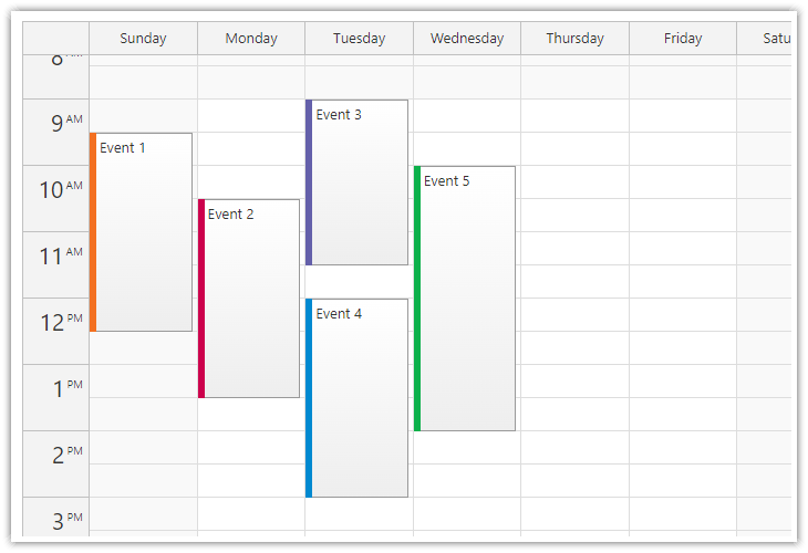
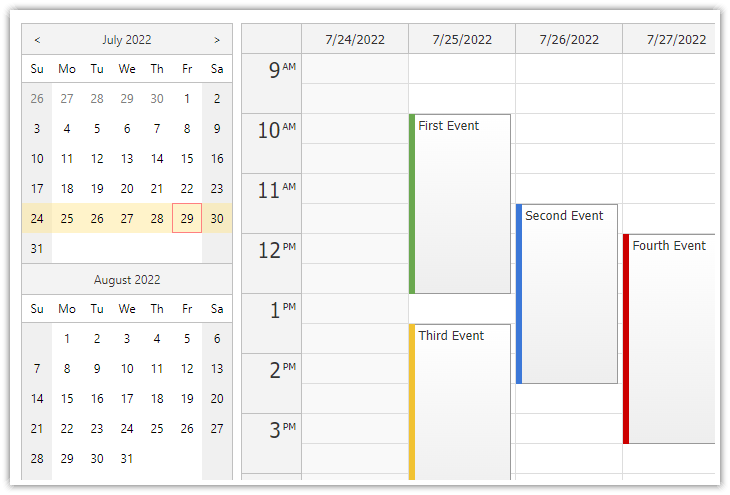
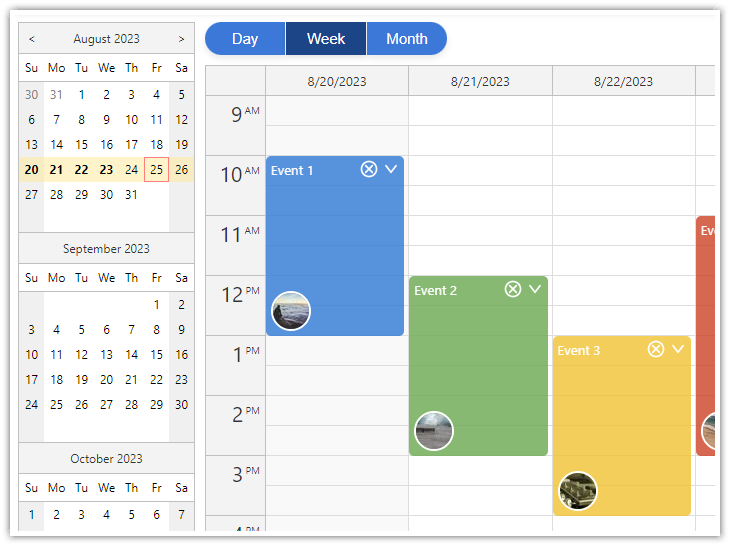
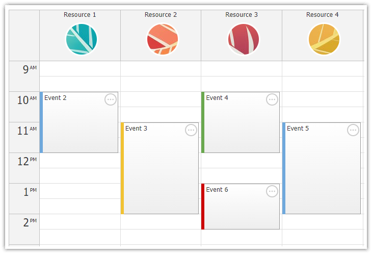
- Calendar/scheduler views: day, week, work week, month, resource calendar
- Event creation using drag and drop
- Drag and drop event moving and resizing
- Integrated delete icon
- Event duration bar with customizable color
- Date picker with free/busy days highlighting, free-hand range selection, day cell customization
- CSS themes (use theme builder to create your own theme)
- Event customization (text, HTML, colors...)
- Built-in XSS protection
- Localization support
- TypeScript definitions
Tutorials
Angular Appointment Calendar Tutorial
Open-Source Angular Appointment Calendar Component (TypeScript + PHP/MySQL)
Simple appointment scheduling application built using Angular. The calendar view is created using DayPilot Pro Angular Calendar component. The server-side backend is created using PHP and stores events in a MySQL or SQLite database.
Angular Day/Week/Month Views
Angular Calendar: Day/Week/Month Views (Open-Source)
Angular project that displays an event calendar component with day, week and month views that share the same data and can be easily switched. A date picker component is used to switch the current date and highlight busy days.
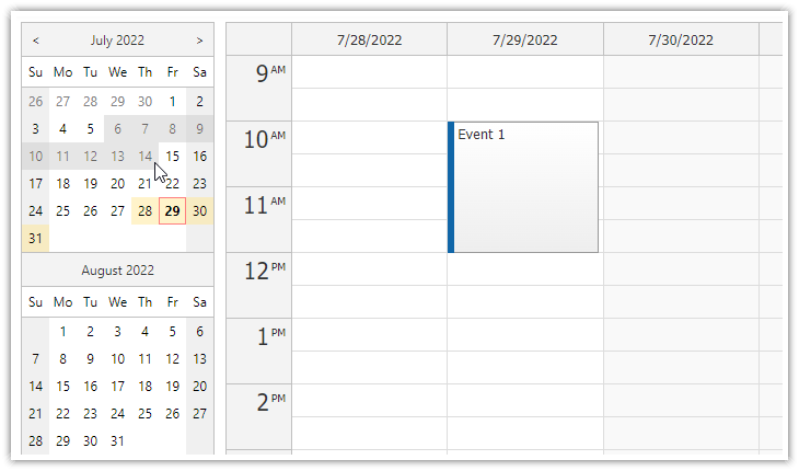
Angular Resource Calendar Tutorial
Angular Resource Calendar (Open-Source)
Angular application that shows how to create a resource calendar Angular component that displays event data in multiple columns. The resource calendar supports drag and drop out of the box.
Angular Date Picker Tutorial
Angular Date Picker with Drag & Drop Range Selection (Open-Source)
How to activate the free-hand date range selection mode in the Angular date picker component (Navigator).
Angular Calendar Date Switching Tutorial
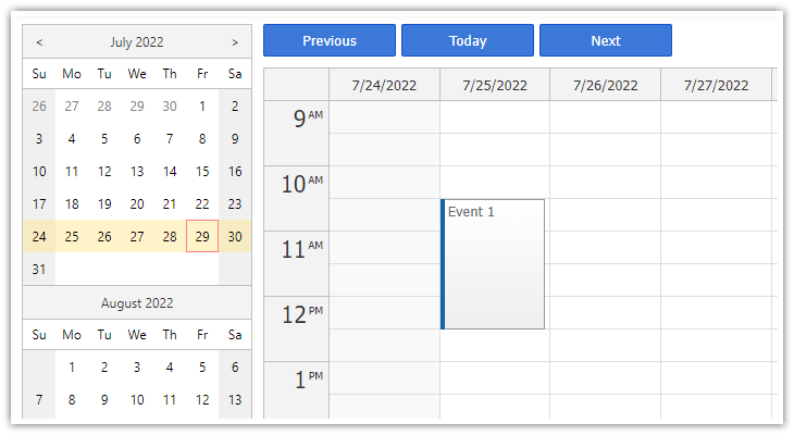
Angular Calendar: Date Switching
How to integrate Angular event calendar component with a date picker and navigation buttons for changing the visible week.
Angular Calendar Undo/Redo
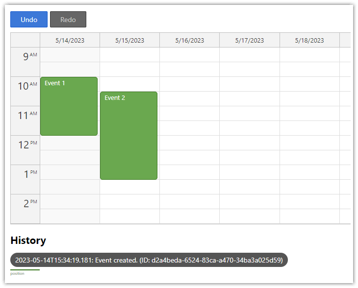
Angular Calendar with Undo/Redo (Open-Source)
How to implement undo/redo functionality the for the open-source Angular Calendar component.
Example
import {Component, ViewChild, AfterViewInit} from "@angular/core";
import {DayPilot, DayPilotCalendarComponent} from "@daypilot/daypilot-lite-angular";
import {DataService} from "./data.service";
@Component({
selector: 'calendar-component',
template: `
<daypilot-calendar [config]="configCalendar" [events]="events" #calendar></daypilot-calendar>
`,
styles: [``]
})
export class CalendarComponent implements AfterViewInit {
@ViewChild("calendar") calendar!: DayPilotCalendarComponent;
events: DayPilot.EventData[] = [];
configCalendar: DayPilot.CalendarConfig = {
viewType: "Week",
onTimeRangeSelected: async (args) => {
const modal = await DayPilot.Modal.prompt("Create a new event:", "Event 1");
const dp = args.control;
dp.clearSelection();
if (!modal.result) { return; }
dp.events.add(new DayPilot.Event({
start: args.start,
end: args.end,
id: DayPilot.guid(),
text: modal.result
}));
}
};
constructor(private ds: DataService) {
}
ngAfterViewInit(): void {
this.loadEvents();
}
loadEvents(): void {
const from = this.nav.control.visibleStart();
const to = this.nav.control.visibleEnd();
this.ds.getEvents(from, to).subscribe(result => {
this.events = result;
});
}
}
Documentation
CSS Themes
The Theme Designer lets you create and download your own CSS theme using an online visual tool.
License
Apache License 2.0


