Security News
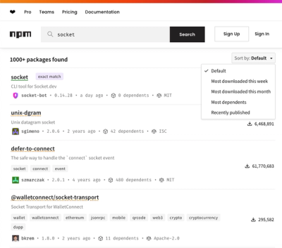
npm Updates Search Experience with New Objective Sorting Options
npm has a revamped search experience with new, more transparent sorting options—Relevance, Downloads, Dependents, and Publish Date.
@dbp-toolkit/common
Advanced tools
You can install these components via npm:
npm i @dbp-toolkit/common
First you need to import the class of the element you want to add, for example Button.
Import {Button} from '@dbp-toolkit/common';
Then add the new element to scopedElements and give it a name
static get scopedElements() {
    return {
        ...
        'dbp-button': Button,
        ...
    }
}
Finally, add it to the render() function inside return html.
<dbp-button>...</dbp-button>
The toolkit icons can be seen in ./toolkit/packages/common/assets.
For valid icon names see: LineIcons
<script type="module" src="https://unpkg.com/@dbp-toolkit/common@0.2.8/dist/components.js"></script>
<dbp-icon style="color: red" name="menu-down"></dbp-icon>
Variables like --dbp-override-icon-<icon-name> can be used to override the icons.
Example CSS: html { --dbp-override-icon-cloud: url(/icons/cloud.svg); }
You can use this web component to show translated html.
<script type="module" src="https://unpkg.com/@dbp-toolkit/common@0.2.8/dist/components.js"></script>
<dbp-translated subscribe="lang">
    <div slot="de">
        Dieser Text ist Deutsch und wird Englisch werden wenn man die Sprache auf Englisch stellt.
    </div>
    <div slot="en">
        This text is English and will be German if the language is changed to German.
    </div>
</dbp-translated>
You can use this web component to show content in a modal.
This webcomponent has two function which can be called from outside: open() - which opens the modal and close() - which closes the modal.
You can add content to 3 slots: header, content and footer. The header and footer are optional.
Slotted content can be styled from ouside with css.
<script type="module" src="https://unpkg.com/browse/@dbp-toolkit/common@0.3.5/src/modal.js"></script>

<dbp-button type="is-primary" id="modal-trigger-basic"
    value="open modal"
    no-spinner-on-click
    @click="${() => this._('#my-modal-basic').open() }"></dbp-button>

<dbp-modal id="my-modal-basic" class="modal modal--basic" modal-id="my-modal-basic" title="The title of the modal" subscribe="lang">
    <div slot="header" class="header">
        <h3>Person name</h3><dbp-icon name="cog"></dbp-icon>
    </div>
    <div slot="content">
        <p>Lorem ipsum dolor sit amet, consectetur adipiscing elit, sed do eiusmod tempor incididunt ut labore et dolore magna aliqua.
        Ut enim ad minim veniam, quis nostrud exercitation ullamco laboris nisi ut aliquip ex ea commodo consequat.</p>
    </div>
    <menu slot="footer" class="footer-menu">
        <dbp-button @click="${() => { this._('#my-modal-basic').close(); }}">Cancel</dbp-button>
        <dbp-button type="is-primary">Submit</dbp-button>
    </menu>
</dbp-modal>
lang (optional, default: de): set to de or en for German or English
<dbp-modal lang="de"></dbp-modal>modal-id(default: modal-id, should unique): this is the modal css selector id
<dbp-modal modal-id="my-modal-123"></dbp-modal>title (optional): sets the modal title
<dbp-modal title="This is my modal"></dbp-modal>width, height, min-width, min-height (optional): set the size of a modal
<dbp-modal width="15px" height="100%"></dbp-modal>You can customize the modal with the following css variables:
--dbp-modal-min-width : set modal min width
--dbp-modal-min-height : set modal min height
--dbp-modal-max-width : set modal max width
--dbp-modal-max-height : set modal max height
--dbp-modal-header-height : set modal header height
--dbp-modal-footer-height : set modal footer height
--dbp-modal-animation:
- You can set animation on modal opening.
- The value can be mmFadeIn, mmFadeOut, mmSlideIn, mmSlideOut
open() opens a specific modal
this._('#my-modal-webcomponent-id').open();close() closes a specific modal
this._('#my-modal-webcomponent-id').close();dbp-modal-closed a event which is triggered if the modal is closed. in the detail attribute there is the modal-id of the closed modal.
<dbp-modal @dbp-modal-closed="${(event) => { this.doSomething(event); }}"></dbp-modal>If slots are used in web components then it is best to derive your component class from
DBPLitElement
and subscribe to the attribute html-overrides everywhere you use it with subscribe="html-overrides".
This way integrators who are using topics or activities are able to globally override these slots in their root html.
Example of the part of an index.html file for overriding the auth-info text in all Nextcloud
file pickers of the signature topic:
<dbp-signature html-overrides="global-override"></dbp-signature>

<template id="global-override">
    <template id="dbp-nextcloud-file-picker">
        <div slot="auth-info">
            <dbp-translated subscribe="lang">
                <div slot="de">
                    Deutscher Text mit <a href="#ein-link">einem Link</a>
                </div>
                <div slot="en">
                    English text with <a href="#a-link">a link</a>
                </div>
            </dbp-translated>
        </div>
    </template>
</template>
By using html-overrides="global-override" in the topic dbp-signature you are able to define
a template with id="global-override" that can hold one or more other templates for different components.
In our case we have a template id="dbp-nextcloud-file-picker", because we want to override slots
in the component dbp-nextcloud-file-picker inside the signature topic.
You can define one or more slots in that template that should be overridden.
In our example we only want to override the slot auth-info, that holds additional text to add in
the Nextcloud file picker component.
We are using the dbp-translated component to insert translated text at the specified position
in the Nextcloud file picker.
The css rules are added to the styles() function in the json file corresponding to a particular activity.
static get styles() {
        return [
            commonStyles.getThemeCSS(),
            css`
                .hidden {
                    display: none;
                }
                .button-style {
                    --dbp-override-secondary-surface: #3793A5;
                }

            `,
        ];
    }
FAQs
Unknown package
The npm package @dbp-toolkit/common receives a total of 89 weekly downloads. As such, @dbp-toolkit/common popularity was classified as not popular.
We found that @dbp-toolkit/common demonstrated a healthy version release cadence and project activity because the last version was released less than a year ago. It has 0 open source maintainers collaborating on the project.
Did you know?

Socket for GitHub automatically highlights issues in each pull request and monitors the health of all your open source dependencies. Discover the contents of your packages and block harmful activity before you install or update your dependencies.

Security News
npm has a revamped search experience with new, more transparent sorting options—Relevance, Downloads, Dependents, and Publish Date.

Security News
A supply chain attack has been detected in versions 1.95.6 and 1.95.7 of the popular @solana/web3.js library.

Research
Security News
A malicious npm package targets Solana developers, rerouting funds in 2% of transactions to a hardcoded address.