Security News
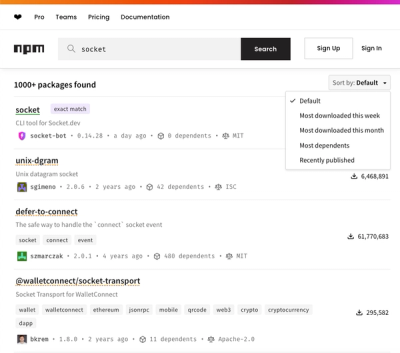
npm Updates Search Experience with New Objective Sorting Options
npm has a revamped search experience with new, more transparent sorting options—Relevance, Downloads, Dependents, and Publish Date.
@dcos/ui-kit
Advanced tools
UI Kit is a collaboration between D2iQ's product design team and engineering team. UI Kit provides tools for engineers to build applications that follow the standards and guidelines of the D2DS Design System.
Install dependencies (Node v16+, NPM 7+)
npm i
Start the Storybook server locally then visit http://localhost:6006/
npm start
ESLint is used for linting within the project. We suggest installing the ESLint extension in your preferred code editor.
For more detailed information, see CONTRIBUTING.md.
To generate a new component run the command:
npm run create:component <ComponentName>
npm test
Use test:watch if you want the tests to run automatically when a file changes:
npm run test:watch
Pass parameters to the test engine (in this case jest) to run a single spec, for example, badge:
npm run test -- --watch badge
Important guidelines to follow for testing:
For more on this topic, and examples we recommend Better Specs.
import React from "react";
import Badge from '../badge';
import renderer from 'react-test-renderer';

describe('Badge', () => {
  it("match default badge component", () => {
    expect(renderer
    .create(<Badge>default</Badge>)
    .toJSON()).toMatchSnapshot()
  });
});
To make it easier to select DOM nodes of our components in integration tests, DOM nodes have a data-cy attribute.
data-cy ValuesParent nodes: The value of data-cy for component's parent node is the same as the component name, and should be camelCased. For example: The parent node for <PrimaryButton> will have data-cy="primaryButton".
Child nodes: If a child node has a data-cy added, there will be a dash between the parent node's name and a string to describe the child node. For example: The footer element of a <DialogModal> will have data-cy="fullscreenModal-footer"
States and variants: If a node has a special "state", data-cy will prepend a string describing that state after a dot.
For example:
<TextInput disabled> will have data-cy="textInput textInput.disabled"<TextInput> with an error will have data-cy="textInput textInput.error"For more information on writing selectors, see the Cypress guide.
We follow Conventional Commit formatting rules, as they provide a framework to write explicit messages that are easy to comprehend when looking through the project history and enable automatic change log generation.
These Guidelines got written based on AngularJS Git Commit Message Conventions.
<type>[optional scope]: <description>

[optional body]

[optional footer]
After your PR is merged into main, semantic-release will automatically cut a release if one of your commits is of type feat, fix, or perf.
Build:
npm run dist
To copy UI Kit into an existing project, run the following:
cp -r dist/ ./<project>/node_modules/@dcos/ui-kit/
Replace <project> with the associated host project name and folder structure.
After running the copy command above, restart the host application.
FAQs
D2iQ UI Kit
We found that @dcos/ui-kit demonstrated a not healthy version release cadence and project activity because the last version was released a year ago. It has 5 open source maintainers collaborating on the project.
Did you know?

Socket for GitHub automatically highlights issues in each pull request and monitors the health of all your open source dependencies. Discover the contents of your packages and block harmful activity before you install or update your dependencies.

Security News
npm has a revamped search experience with new, more transparent sorting options—Relevance, Downloads, Dependents, and Publish Date.

Security News
A supply chain attack has been detected in versions 1.95.6 and 1.95.7 of the popular @solana/web3.js library.

Research
Security News
A malicious npm package targets Solana developers, rerouting funds in 2% of transactions to a hardcoded address.