Extended Component Library
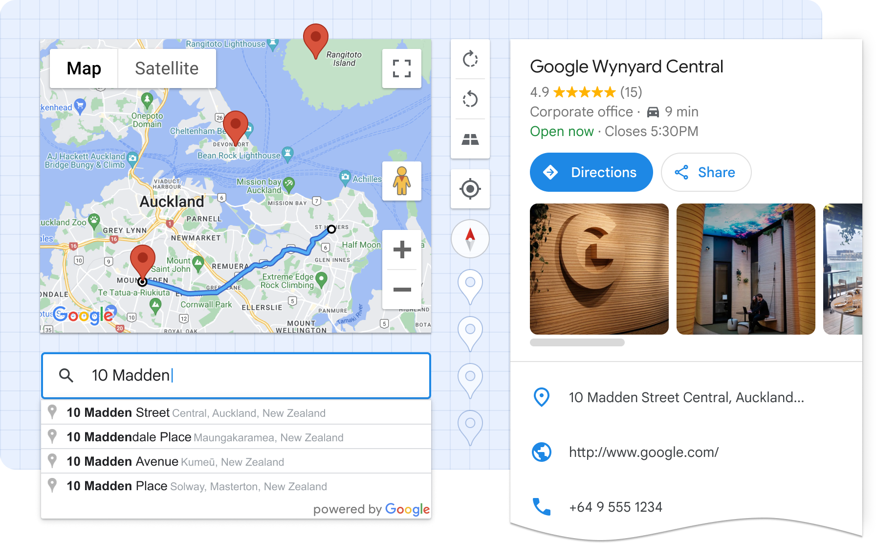
Google Maps Platform’s Extended Component Library is a set of Web Components that helps developers build better maps faster, and with less effort. It encapsulates boilerplate code, best practices, and responsive design, reducing complex map UIs into what is effectively a single HTML element.
Ultimately, these components make it easier to read, learn, customize, and maintain maps-related code.

Installation
Loading the library
For applications that bundle their code
For best performance, use a package manager and import only the components you need. This package is listed on NPM as
@googlemaps/extended-component-library. Install it with:
npm i @googlemaps/extended-component-library
Then import any components you use in your application:
import '@googlemaps/extended-component-library/overlay_layout.js';
To load all components
Alternatively, we provide a CDN-hosted bundle that you can include directly in your HTML file as a module script:
<script type="module" src="https://unpkg.com/@googlemaps/extended-component-library"></script>
When using the CDN-hosted bundle, all components are available globally, and don’t require further imports. Please note that unpkg is unaffiliated with Google Maps Platform and using their CDN may come with its own terms and expectations.
Getting your API key
The components in this library make use of Google Maps Platform APIs. To start, you'll need to sign up for Google Maps Platform and create an API key. Then, place an API Loader element somewhere in the root of your app's HTML, specifying your API key:
<gmpx-api-loader key="YOUR_API_KEY"></gmpx-api-loader>
When you sign up, by default, all APIs will be enabled, but you can opt to enable only the APIs needed for each component by referencing the “APIs and pricing" section in that component's documentation.
Usage
This library contains a set of Web Components, usable anywhere in the HTML of your web app. Web components are supported in all modern browsers and expose a framework-agnostic mechanism for encapsulating UI and functionality.
This example shows how to display information about a particular place, purely in HTML:
<script type="module" src="https://unpkg.com/@googlemaps/extended-component-library"></script>
<gmpx-api-loader key="YOUR_API_KEY"></gmpx-api-loader>
<gmpx-split-layout>
<gmpx-place-overview slot="fixed" place="ChIJ39Y-tdg1fYcRQcZcBb499do"></gmpx-place-overview>
<gmp-map slot="main" center="43.880,-103.459" zoom="10" map-id="DEMO_MAP_ID">
<gmp-advanced-marker position="43.880,-103.459"></gmp-advanced-marker>
</gmp-map>
</gmpx-split-layout>
Web Components are also designed to be used with JavaScript. Here’s an example showing how you can add a pan-to-marker action:
<script type="module" src="https://unpkg.com/@googlemaps/extended-component-library"></script>
<gmpx-api-loader key="YOUR_API_KEY"></gmpx-api-loader>
<gmp-map id="my-map" center="33.15,-96.20" zoom="10" map-id="DEMO_MAP_ID">
<gmp-advanced-marker class="pannable" gmp-clickable position="33.15,-96.20"></gmp-advanced-marker>
</gmp-map>
<script>
window.addEventListener('load', () => {
const mapElement = document.getElementById('my-map');
const markers = document.querySelectorAll('gmp-advanced-marker.pannable');
markers.forEach((marker) => {
marker.addEventListener('gmp-click', () => {
mapElement.innerMap.panTo(marker.position);
});
});
});
</script>
Frameworks
Web Components work well with most popular frontend frameworks such as Angular, React, or Vue.js. Refer to your framework’s documentation for instructions on how to use custom elements.
React: The Extended Component Library ships with native React components for easy integration. Please see React Support to get started, then refer to the example app.
Angular: Angular works well with Web Components. See the Angular example app to get started.
Components available with Maps JS SDK
Map and marker components can be used with the Extended Component Library, or on their own. See the guide for more information on Web Components in the Maps JS SDK.
| Component | Description |
|---|
<gmp-map> | The map component displays a map on a webpage, and can wrap other map-related components such as markers inside the map component in HTML. |
<gmp-advanced-marker> | The marker component displays a pin on the map at specified coordinates. |
Inventory of components
| Component | Description |
|---|
<gmpx-api-loader> | The API loader component loads the Google Maps Platform libraries necessary for Extended Components. |
<gmpx-icon-button> | The icon button component is used for actions in the UI that help users get things done with a single tap. It contains an icon and a text label. |
<gmpx-overlay-layout> | The overlay layout component allows you to display information in a responsive panel view that sits on top of main content, like a map or a list. You might use this to show a modal dialog, more details about a place, or settings. |
<gmpx-place-overview> | The place overview component displays detailed information about millions of businesses, including opening hours, star reviews, and photos, plus directions and other actions in a premade UI in 5 sizes and formats. |
<gmpx-place-picker> | The place picker component is a text input that allows end users to search Google Maps’ global database for a specific address or place using autocomplete. |
<gmpx-route-overview> | The route overview component renders a route on a <gmp-map> component, including origin and destination markers, an outlined polyline, and viewport management. |
<gmpx-split-layout> | The split layout component allows you to display custom HTML information in a responsive panel view alongside main content. In a narrow container, such as a mobile viewport, the panel will be shown below the main content. |
<gmpx-store-locator> | The store locator component displays an experience where your website's users can browse a list of locations, find the nearest one, and view details. |
| Address Validation | Components for integrating the Address Validation API with your web app. |
| Place building blocks | The place data provider component, along with individual place details components, lets you choose how to display Google Maps place information like opening hours, star reviews, and photos in a new, custom view. |
| Route building blocks | The route data provider component, along with the route marker and polyline components, lets you choose how to display a route on a map using custom markers and polyline styles. |
Styling and theming
To change the look and feel of components, you’ll use CSS custom properties. Each component’s documentation will indicate which CSS custom properties it supports for styling.
For example, the Place Picker component exposes the --gmpx-color-surface property to adjust the background color of the text input. You could use the following CSS to set this color to blue for all Place Pickers on the page:
body {
  --gmpx-color-surface: blue;
}
Global theming options let you consistently customize the color and typography for components in your application. You can choose a font and color scheme to match your brand, or default to the look of Google Maps. These are available as global style tokens, applicable across multiple components. This table lists the global style tokens used in the library: these are a good starting point to consistently adjust the look and feel of components on your page.
| CSS custom property | Default | Description |
|---|
--gmpx-color-surface | #fff | Surface theme color, used as a background. |
--gmpx-color-on-surface | #212121 | Color used for text and other elements placed on top of the surface color. |
--gmpx-color-on-surface-variant | #757575 | Color used for supporting metadata and other elements placed on top of the surface color. |
--gmpx-color-primary | #1976d2 | Primary theme color used for interactive text and elements, like buttons and icons. Also used to highlight an active or selected state like in a focused text field’s border. |
--gmpx-color-on-primary | #fff | Color used for text or icons on top of a --gmpx-color-primary background. |
--gmpx-font-family-base | 'Google Sans Text', sans-serif | Typeface for body text, captions, and labels. |
--gmpx-font-family-headings | 'Google Sans Text', sans-serif | Typeface for headings. |
--gmpx-font-size-base | 0.875rem | Baseline font size, from which other text elements in a component are scaled. For most users with default settings, this will be 14px. |
Localization
Your application can override the set of string literals used in the Extended Component Library with the setStringLiterals() utility function:
import {setStringLiterals} from '@googlemaps/extended-component-library/utils/localize.js';

setStringLiterals({'PLACE_CLOSED': 'Cerrado'});
Refer to /src/base/strings.ts for the full list of available terms.
Terms of Service
This library uses Google Maps Platform services, and any use of Google Maps Platform is subject to the Terms of Service.
For clarity, this library, and each underlying component, is not a Google Maps Platform Core Service.
Attribution
As a reminder, you must comply with all applicable attribution requirements for the Google Maps Platform API(s) and SDK(s) used by the Extended Component Library.
Support
This library is offered via an open source license. It is not governed by the Google Maps Platform Technical Support Services Guidelines, the SLA, or the Deprecation Policy (however, any Google Maps Platform services used by the library remain subject to the Google Maps Platform Terms of Service).
This library adheres to semantic versioning to indicate when backwards-incompatible changes are introduced. Accordingly, while the library is in version 0.x, backwards-incompatible changes may be introduced at any time.
If you find a bug, or have a feature request, please file an issue on GitHub. If you would like to get answers to technical questions from other Google Maps Platform developers, ask through one of our developer community channels. If you'd like to contribute, please check the Contributing guide in the GitHub repository.


